Key facts
- Founded
- 1899
- Founded by
- Giovanni Agnelli
- Country
- Italy
- Headquarters
- Turin, Italy
- Parent company
- Stellantis
- Legal name
- FCA Italy S.p.A.
- Famous models
- 500, Panda, Punto, 124 Spider, Tipo
- Slogan
- “Driven by Passion”
- Website
- www.fiat.com
Fiat Brand History
Fiat was established on 11 July 1899 by Giovanni Agnelli in Turin, Italy under the full name Fabbrica Italiana di Automobili Torino. The company’s headquarters remain in Turin where it has operated continuously since its founding. Fiat is currently a subsidiary of FCA Italy S.p.A. and forms part of the Stellantis group while maintaining its core identity centered on Italian style, innovation, growth, and the “dolce vita” design philosophy.
Fiat Logo Evolution
1899–1931: Early Ornate and Art-Deco Period
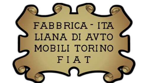
- Design: Gold rectangle with vignettes and full company name, black stylish wordmark with elongated lines, Art-Deco gold lettering, horizontal oval, circular logo, silver framing with leaves, ornate gold silver frames with taller bolder lettering
- Colors: Gold, black, light blue, dark blue, monochrome, red, white, blue to red backgrounds
- Changes: Progressive shift from rectangular vignettes to playful wordmarks, Art-Deco ornaments, oval and circular shapes, addition of leaves and ornate framing
- Context: Early industrial expansion led to increasingly artistic and ornate logo versions
1932–1968: Shield and Trapezoid Era
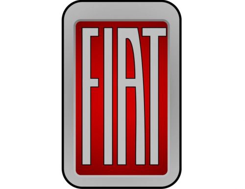
- Design: Vertically oriented rectangle with rounded corners, rectangular to shield-like forms, crest-like badge with arched top and triangular bottom, trapezoid with narrow bottom, horizontally striped background
- Colors: Red background, light gray lettering with black outline, thick silver frame, gray framing, silver lettering, bolder lettering, gradient silver frame
- Changes: Transition from rounded rectangle to shield forms, adoption of crest shape, narrowing base into trapezoid, addition of horizontal stripes and thicker frames
- Context: Period of corporate standardization and post-war recovery emphasized stable geometric identities
1965–2006: Geometric and Minimalist Period
- Design: Circular badge with minimalist frame, four connected rectangles with one letter per cell, blue white rectangle version, five thick diagonal lines, five lines on parallelogram with rounded ends, 3D four-parallelogram, blue circle with thick frame, 3D rectangle logo, 3D gradient lettering on white
- Colors: Silver frame, bright yellow lettering with white outline, gradient background, black and silver, blue and white, turquoise, blue with silver glossy, thick silver frame
- Changes: Return to circular format, strict geometric rectangle grid, extreme minimalism with only diagonal lines, addition of 3D effects and glossy elements
- Context: Era of modernization involved balancing minimalism, 3D rendering, and geometric revival
2006–Present: Contemporary Shield Logo

- Design: Chrome shield on Fiat Bravo with white lettering on red inside silver circle, vertically elongated modern typeface, updated version with straightened letter lines
- Colors: Red background, silver chrome framing, scarlet-red palette
- Changes: 2006 redesign featured elongated typeface and 3D gradient; 2020 update straightened lines and refreshed color
- Context: Launched to represent “ongoing change” while reconnecting with early visual heritage and Italian elegance
Fiat Logo Design Themes and Symbolism
Across more than a century Fiat has maintained elongated custom “FIAT” lettering that symbolizes upward movement and progress. The brand’s color palette has predominantly featured red and silver since the 1930s, with earlier use of blue, white, and gold. Shape evolution moved from rectangles and ovals through circles and shields to minimal lines and back to a modern circular shield. These elements consistently express Italian style, innovation, and the “dolce vita” philosophy. Fiat maintains one of the most redesigned logos in automotive history, always balancing heritage with modernity.
Historical Events and Fiat Logo Changes
Several key milestones directly influenced Fiat visual identity updates. The 1899 founding prompted creation of the first logo containing the full company name. Ornate Art-Deco designs from 1901 through the 1920s reflected early industrial expansion. Introduction of circular logos in 1921 coincided with brand maturation. The 1932–1968 period of shield and trapezoid shapes aligned with standardization and post-war recovery. A major geometric redesign using four rectangles occurred in 1968 during modernization. The 2006 contemporary shield logo was introduced on the Fiat Bravo to signal new corporate direction under FCA. The 2020 color update reinforced focus on Italian identity and emotional design.
This comprehensive timeline of Fiat logo history provides clear reference for understanding how the brand’s emblem evolved while preserving its core Italian character.