Key facts
- Founded
- 1919
- Founded by
- André-Gustave Citroën
- Country
-
 France
- Headquarters
- Saint-Ouen-sur-Seine, France
- Parent company
- Stellantis
- Legal name
- Automobiles Citroën
- Famous models
- 2CV, DS, C3, C4, Berlingo
- Slogan
- “Nothing Moves Us Like Citroën”
- Website
- www.citroen.com/en
What the Citroën logo means
Each chevron in the Citroën logo is a gear tooth. The shape copies the V-shaped teeth of a herringbone, or double-helical, gear, and there are two of them because they stand for two gears in mesh.
The idea is older than the car company. In 1900, aged 22, André Citroën bought the patent for a chevron-shaped milling gear in Łódź, Poland. Around 1901 he and his partners opened a business to make these gears. A tooth cut in a V runs smoother and quieter than a straight one, and because each half of the V is angled the opposite way, the sideways push of one half cancels the other.
When he began building cars in 1919, he took the double chevron as his badge, and Citroën’s heritage site calls it a symbol of the success he had already found.
In short: one chevron is one gear tooth, two chevrons are two gears working together, and every Citroën logo since 1919 has kept the pair.
Citroën logo history: every version since 1919
The Citroën logo has had ten official versions since 1919, plus one used only in advertising. Where sources give different years, both are noted.
1919–1921: Yellow chevrons in an oval
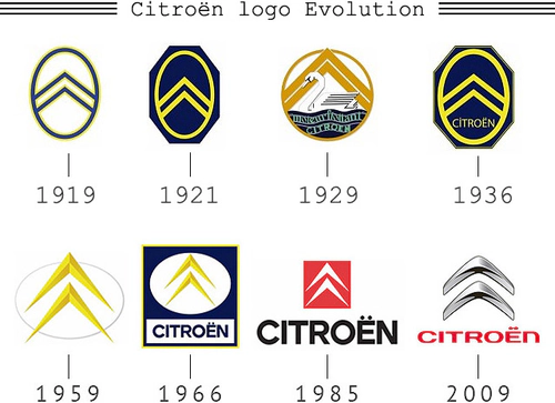
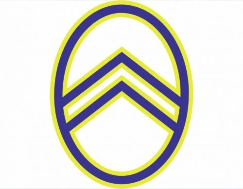
Citroën Origins describes the first Citroën logo as yellow chevrons in a yellow oval on a blue background, with the name “A. Citroën” written underneath. The drawing above is a later rendering that shows the blue as a ring around a white centre.
1921–1932: Blue octagon
In the early 1920s the oval moved onto a solid blue octagon and its yellow lines became thicker. The “A.” before the name was dropped. Wikipedia dates the change to 1921, while logo galleries give 1922.
1932–1935: The swan
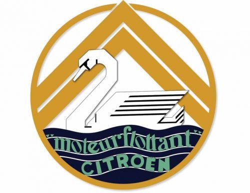
For about three years Citroën ran a second logo next to the octagon. A swan glides in front of the chevrons, above water lettered “moteur flottant” in a wave shape. The swan advertised Citroën’s floating engine mounting and served as a figurehead on some Rosalie models. It was not the first Citroën wordmark: the name had been on the logo since 1919.
1936–1959: Octagon with the name
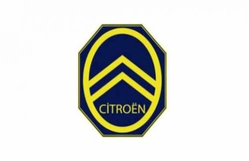
From the mid-1930s until 1959 the blue octagon had a yellow frame, and CITROËN was set in capitals below the chevrons, inside the octagon. Sources disagree on whether it started in 1935 or 1936. Michelin took control of Citroën in December 1934, but no source ties this redesign to the takeover.
1959–1966: Big yellow chevrons, no name
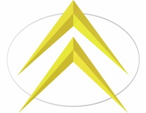
In 1959 the chevrons were redrawn as large shapes with a raised, three-dimensional look and placed on a white oval with a thin outline. The blue was gone, and so was the name. Citroën agencies used yellow chevrons, while its dealerships used gold.
1966–1985: Blue square
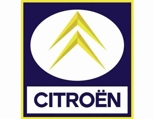
Around 1966 the chevrons went back into a white oval, which now sat on a blue square with a yellow border. Underneath was a white panel with CITROËN in bold blue letters. Citroën Origins ends this version in 1984, Wikipedia in 1985.
1985–2009: White chevrons on red
In 1985 the oval left the Citroën logo. Flat white chevrons now filled a red square, paired with a large black CITROËN wordmark. Citroën Origins dates this logo to 1984. It stayed in use until 2009.
2009–2016: Rounded 3D chevrons
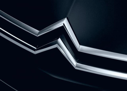
On 5 February 2009 the chevrons became rounded, silver and three-dimensional, with no frame around them. The name moved below in red, set in a new typeface. Landor Associates designed the logo together with Citroën’s in-house design team.
2016–2022: Flat grey
From late 2016 the same chevrons were flattened into a two-dimensional grey mark with a new custom typeface. The rollout ran through 2017, which is why Citroën Origins calls it the 2017 version. Some logo galleries add a darker grey logo for 2019–2022, but Wikipedia and Citroën Origins treat 2016 to 2022 as one version.
2021–2022: Wordmark-first advertising logo
Alongside the grey badge, Citroën used a second logo in advertising and corporate material. It puts a large uppercase CITROËN first, with a small solid chevron emblem to its left, in black on white. Logopedia, a fan-edited logo wiki, dates its first use to a C3 Aircross ad on 6 June 2021.
2022–present: Vertical oval
The current logo brings back the oval of 1919, this time standing upright, with wider chevrons and a wide uppercase wordmark. It is the brand’s tenth logo. The section below covers it in detail.
Why Citroën changed its logo
Citroën has given a reason for some of its redesigns and not for others. This table lists only what is on record.
| Year | Change | Reason on record |
|---|---|---|
| 1919 | First double chevron | The founder’s symbol of his success with chevron gears |
| Early 1920s | Blue octagon | None published |
| 1932 | Swan logo, used in parallel | To promote the new floating engine mounting |
| Mid-1930s | Octagon with the CITROËN name | None published, and no source links it to Michelin |
| 1959 | Redrawn chevrons, name removed | None published |
| 1966 | Oval on a blue square | None published |
| 1985 | White chevrons on a red square | To give the brand new vitality and a modern feel, launched with the film “Les chevrons sauvages” |
| 2009 | Rounded silver 3D chevrons | A new identity for the 90th anniversary year, launched on the founder’s birthday and meant to give the brand a modern image in line with its new models |
| 2016 | Flat grey | A simpler mark with a new typeface and many color variations |
| 2021 | Wordmark-first alternative | Advertising and corporate use only |
| 2022 | Vertical oval | A new identity that reworks the 1919 oval, with chrome-free signage for recyclability and a flat design that works on screens |
The redesigns also span three owners. Michelin controlled Citroën from late 1934 until Peugeot took over in 1974–1976, so the mid-1930s octagon, the 1959 chevrons and the 1966 square all came under Michelin. The 1985 red square and the 2009 and 2016 logos belong to the PSA years. The 2021 advertising logo and the 2022 oval arrived after Citroën became part of Stellantis in January 2021.
The one thing that has never changed is the pair of chevrons. Every version has them, including the swan and the 2021 advertising logo.
The current Citroën logo (2022)
The current Citroën logo is a pair of wider chevrons inside a vertical oval, revealed on 27 September 2022. It made its debut on the Oli, an electric concept car.
The logo Citroën unveiled that day was created by Stellantis Design Studio working with Citroën’s internal design team. The project took 14 months and produced 54 native logo files and a bespoke family of 12 fonts.
What changed from the flat grey logo:
- Shape: the oval returns, drawn upright and softer, as a reworking of the 1919 original.
- Chevrons: wider and more prominent than before.
- Lettering: a new wordmark that evolved from Citroën’s own proprietary fonts.
- Finish: chrome-free signage, which is easier to recycle, and a flat graphic that suits digital screens.
Colors, fonts and file formats
The Citroën logo moved from yellow and blue to red and white, then to silver, grey and today’s single color.
- Colors: yellow and blue from 1919 to 1959, yellow chevrons on white from 1959, white on red from 1985, silver chevrons with a red name in 2009 and grey from 2016. The 2022 logo is most often shown in black, but it also appears in red, white and blue. The identity adds Monte Carlo Blue, a heritage color from the 2CV and the DS, and Infra-Red, which replaced the earlier red.
- Fonts: new typefaces arrived with the 2009 and 2016 logos. Logopedia names the 2021 advertising face Citroën Black. The 2022 wordmark comes from the bespoke 12-font family.
- Files: you can get the Citroën logo PNG from the download button at the top of this page. Hex codes listed on some logo sites are pulled automatically from images and are not an official Citroën palette.
The Citroën name in the sky and on the Eiffel Tower
Before the Citroën logo was famous, the company made the name itself the advertisement. On 4 October 1922 a plane wrote “Citroën” in smoke over Paris, the first sky-writing done by airplane. From 1925 to 1934 the Eiffel Tower carried CITROËN in lights, which Guinness recorded as the largest advertising sign. Both put the founder’s surname, spelled with its diaeresis, high above the capital of France.
Frequently asked questions
Does Citroën still exist?
Yes. Citroën is an active brand of Stellantis. Its cars still carry the double chevron, and the oval logo unveiled in 2022 began appearing on production models and in corporate use from mid-2023.
Is Citroën French or German?
Citroën is French. It was founded in Paris in 1919, and its head office is still in the Paris area, in Saint-Ouen-sur-Seine, after an earlier spell in Rueil-Malmaison. The two dots over the e can look German, but they belong to the official French spelling of the brand name.
What does the word "Citroën" mean?
Citroën is a family name. The car company is named after its founder, André-Gustave Citroën, who had already put the name on his gear-making firm, Citroën, Hinstin et Cie, around 1901. So the brand name points to the founder and his family rather than describing a product or an idea.