Key facts
- Founded
- 1906
- Founded by
- Vincenzo Lancia, Claudio Fogolin
- Country
- Italy
- Headquarters
- Turin, Italy
- Parent company
- Stellantis
- Legal name
- Lancia Automobiles S.p.A.
- Famous models
- Delta, Stratos, Fulvia, Aurelia, Ypsilon
- Website
- www.lancia.com
Brand Overview
Lancia was founded on 27 November 1906 in Turin, Italy by Vincenzo Lancia and Claudio Fogolin. The name Lancia means spear in Italian. The brand represents Italian elegance combined with innovation, and its visual identity has evolved continuously through changes to its core symbols of the spear, steering wheel, and flag.
The Lancia symbol has remained centered on these foundational elements since 1911 while adapting its style across more than a century. Today the brand is owned by Stellantis through Lancia Automobiles S.p.A.
Lancia Logo Evolution
 1906–1911
 1907–1911
 1911–1929
 1929–1950
 1950–1957
 1957–1974
 1972–1981
 1981–2001
 2001–2007
 2007–2022
 2022–Present
1906–1911: First Logo
The very first Lancia logo appeared as a solid black rectangular banner featuring a thin double outline and heavy white serif lettering where the letter L was noticeably larger. This design established the brand’s earliest visual presence in the automotive industry.
- Design: Rectangular banner format with double outline
- Colors: Black and white
- Changes: Introduction of the brand name in serif typography
- Context: Used during the founding period of the company
1907–1911: Script Wordmark
A script wordmark version followed shortly after the founding logo. This design featured gold lettering with elongated extensions on the first and last letters, conveying an elegant and sophisticated impression suitable for the new Italian manufacturer.
- Design: Flowing script typography
- Colors: Gold on dark background
- Changes: Move to more ornate letterforms
- Context: Early branding before core symbols were introduced
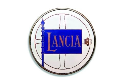
1911–1929: Core Symbols Introduced
The foundational Lancia emblem was created in 1911 by Carlo Biscaretti di Ruffia, a friend of Vincenzo Lancia. This design brought together the spear, steering wheel, and flag for the first time, establishing symbols that would define the brand identity for over a century.
- Design: Steering wheel, blue flag, spear flagpole, enlarged first letter with pointed serifs
- Colors: Gold, bright blue, white
- Changes: Introduction of all three core symbols
- Context: Result of personal friendship between founder and illustrator
1929–1950: Shield Design
The triangular shield element first appeared in 1929 and has remained a constant feature of the Lancia car logo to the present day. The steering wheel was placed inside a blue shield with refined bolder contours and balanced composition.
- Design: Steering wheel enclosed in shield frame
- Colors: Blue shield, gold details, white background
- Changes: Addition of shield element around existing symbols
- Context: Major structural update to the emblem
1950–1957: Color Refresh
This period brought a brighter color approach to the Lancia symbol. Acid-yellow replaced the previous gold while the blue became lighter, creating stronger contrast with white lettering.
- Design: Flat design approach
- Colors: Acid yellow, lighter blue, white
- Changes: Shift from metallic gold to brighter yellow tones
- Context: Mid-century visual update
1957–1974: Silver and Blue
The design moved to a two-tone silver and blue scheme. The steering wheel became more abstract with only the circle shown within a shield-shaped frame while silver details dominated except for the blue rectangular banner.
- Design: Abstract circle-only steering wheel
- Colors: Silver and blue two-tone
- Changes: Geometric simplification of elements
- Context: Reflected the maturing brand identity
1972–1981: Simplified Banner
A simplified rectangular banner version appeared using only blue and white. This design focused on clean presentation with white lettering on a blue background and more uniform letter sizing.
- Design: Rectangular banner format
- Colors: Blue and white only
- Changes: Removal of complex symbols in some versions
- Context: Further simplification of the visual identity
1981–2001: Vignelli Refinement
Designer Massimo Vignelli created a refined version of the Lancia logo that stylized all historical elements while maintaining continuity. This was the first time the letter L was resized to match the other letters.
- Design: Stylized shield, spear, steering wheel and flag
- Colors: Calmer deeper blue
- Changes: Harmonized letter sizing across the wordmark
- Context: Update during the Fiat era
2001–2007: Glossy Update
This iteration introduced darker blue tones along with gloss and gradient effects. The design achieved a more voluminous and sharp visual quality with stronger contrast.
- Design: Enhanced three-dimensional appearance
- Colors: Darker blue with gradient
- Changes: Addition of gloss and depth effects
- Context: Modernization of the existing elements
2007–2022: Modern Redesign
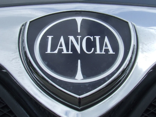
A significant redesign was presented at the Geneva Motor Show in 2007 by Robilant Associati. The Lancia emblem featured a simplified steering wheel with two spikes rather than four spokes, along with an enlarged wordmark.
- Design: Stylized elements with spear and flag removed but weapon ends visible inside steering wheel
- Colors: Royal blue shield with thick silver frame
- Changes: Major aesthetic revolution coinciding with new legal entity formation
- Context: Part of Fiat Group reorganization
2022–Present: New Era
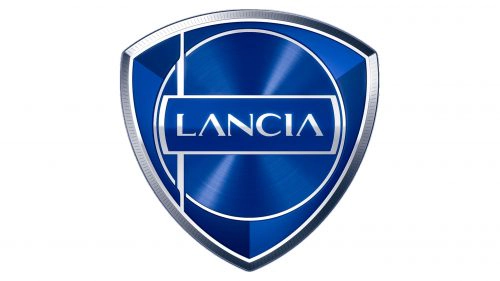
The latest Lancia logo marks the New Era as part of the Pu+Ra (Pure + Radical) Design language. This minimalist redesign uses lighter blue shades, an extra-thin silver ring for the steering wheel, and a completely new sans-serif typeface.
- Design: Thinner longer sharper spear and flag handle, futuristic sans-serif with distinctive A treatment
- Colors: Lighter glossier blue with silver accents
- Changes: Complete shift from serif to sans-serif typography
- Context: Cornerstone of Lancia Renaissance preparing for electric era
Direct Links Between Brand Events and Logo Changes
Several key moments in the company’s history directly influenced updates to the Lancia logo. The 1911 friendship between Vincenzo Lancia and illustrator Carlo Biscaretti di Ruffia led to the creation of the iconic spear, steering wheel and flag emblem.
The introduction of the triangular shield in 1929 established an element that continues today. The 1957 shift to geometric simplification and blue-silver coloring reflected the brand’s maturing identity.
The 1981 redesign by Massimo Vignelli preserved continuity while stylizing elements. The 2007 major update coincided with the creation of Lancia Automobiles S.p.A. and group reorganization.
The 2022 logo launch serves as a cornerstone of the Lancia Renaissance under Stellantis. This redesign was introduced alongside the Pu+Ra Design language and supports the brand’s preparation for new markets and an electric future.
Lancia Logo Meaning and Legacy
The Lancia logo meaning is deeply connected to the brand name itself, as Lancia translates to spear in Italian. This weapon appears as a core symbol throughout the logo evolution, originally serving as a flagpole and later stylized within the steering wheel circle.
The consistent presence of the steering wheel represents the automotive nature of the company while the flag and shield elements add layers of Italian heritage and strength. From ornate early designs to the current minimalist approach, the Lancia emblem has balanced tradition with progress for over one hundred years.
Visual Assets
For those seeking high-quality visual references, the Lancia logo history shows a clear progression from detailed ornate designs to sleek modern interpretations. The current Lancia car logo maintains the essential symbols while adopting contemporary aesthetics suitable for the electric vehicle era.
Design enthusiasts often look for Lancia logo images to study this evolution of Italian automotive branding. The brand’s commitment to visual refinement across all eras makes its logo history particularly interesting for both historians and graphic designers.