Key facts
- Founded
- 1949
- Founded by
- Carlo Abarth
- Country
- Italy
- Headquarters
- Turin, Italy
- Parent company
- Stellantis
- Legal name
- Abarth & C. S.p.A.
- Famous models
- 500, 595, 695, 124 Spider, Grande Punto
- Website
- www.abarth.com
Brand Overview
Abarth & C. S.p.A. was founded on 31 March 1949 in Bologna by Carlo Abarth, who was born Karl Albert Abarth in Austria on 15 November 1908. The company later moved its operations to Turin on 9 April 1951. It began as an independent racing and tuning brand focused on Fiat-based performance parts.
The brand remained independent until 1971. Fiat acquired Abarth on 31 July 1971. In 2007 the brand was re-established as an independent unit under the Fiat Group, now part of Stellantis. Its headquarters have been located in Turin, Italy, since the early 1950s.
Logo Symbolism and Meaning
The core Abarth symbol is a scorpion. Carlo Abarth selected this creature because it is his zodiac sign and because its unique, ugly appearance made it unlikely to be imitated. The scorpion represents grit, strength, power, and a brutal character.
A shield shape forms the base of the Abarth emblem, symbolizing victory and prestige. Italian flag colors were added later to emphasize national identity. A lightning bolt variant using the Italian tricolor has also appeared occasionally.
Abarth Logo Evolution
1949–1954: First Logo
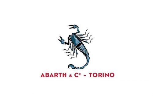
This first Abarth car logo was created by Carlo Abarth himself immediately upon founding the company. The design established the scorpion as the central brand symbol from day one.
- Design: Blue scorpion with black outline
- Colors: Blue, black, red
- Changes: None, this was the original version
- Context: Founding era in 1949
Carlo Abarth chose the scorpion for the Abarth symbol because of his zodiac sign. The bright confident lines reflected the optimism of the newly established brand.
1954–1958: Shield Introduction
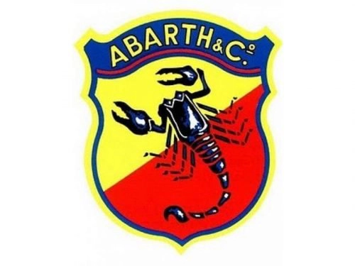
The introduction of the shield shape in 1954 marked an important development in Abarth logo history. This format became the foundation for all future versions of the Abarth badge.
- Design: Shield shape with scorpion centered
- Colors: Yellow, red, blue
- Changes: Transition from wordmark-dominant design to shield format
- Context: Early standardization period
The shield design reinforced the brand’s association with victory and prestige while keeping the blue scorpion as the focal point.
1955–1958: Alternative Gothic Variant
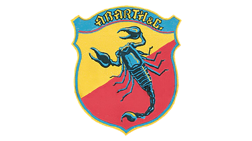
A parallel experimental version appeared during the same period as the shield introduction. This Abarth logo variant featured different color and typography choices.
- Design: Sky blue scorpion and gothic inscription
- Colors: Sky blue, black, yellow
- Changes: Replaced dark blue with sky blue and introduced gothic font
- Context: Minor color and typography experiment
This version demonstrates the brand’s willingness to explore different visual expressions while maintaining the core scorpion element.
1958–1969: Geometric Simplification
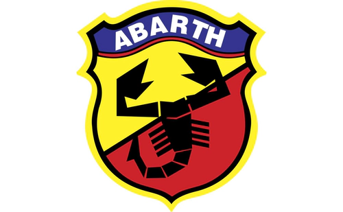
Mid-period refinement brought cleaner and more geometric forms to the Abarth emblem. The design focused on simplicity and stronger visual impact.
- Design: Geometric black scorpion with simplified wordmark
- Colors: Black, white, light blue
- Changes: More geometric scorpion and reduced color palette
- Context: Refinement during the late 1950s and 1960s
This era of Abarth logo evolution emphasized clarity and bold graphic qualities.
1969–2007: Italian Identity Emphasis
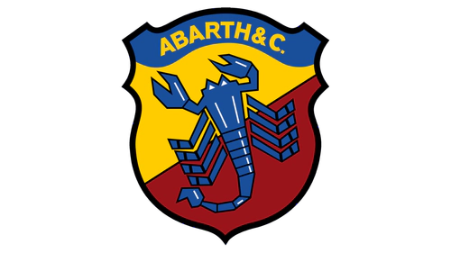
After the Fiat acquisition period began, the Abarth car symbol received an update that strengthened its Italian identity. Italian flag colors were integrated into the design.
- Design: Return of blue scorpion with national colors
- Colors: Blue, red, white, green
- Changes: Addition of Italian flag colors to the wordmark
- Context: Post-acquisition period emphasizing national roots
A 1971 experimental variant briefly used a purple scorpion on yellow and orange background during this time.
2007–Present: Modern Redesign
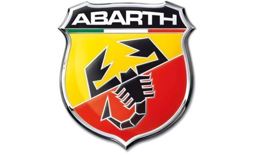
The 2007 rebirth of Abarth as an independent unit brought a complete visual refresh of the Abarth logo. The modern design maintains the scorpion while adopting a sleek, masculine appearance suitable for contemporary use.
- Design: Curved shield with abstract geometric black scorpion
- Colors: Red, yellow, black, white, gray, Italian tricolor accents
- Changes: Abstract scorpion, custom sans-serif typeface, diagonal background split
- Context: Launched with the re-establishment of Abarth & C. S.p.A. in 2007
This current version of the Abarth badge is only slightly refined since its introduction. The modern Abarth logo transparent background variants are popular for reference and design use.
Color Palette Evolution
Red, yellow, black, and blue for the scorpion have remained consistent throughout Abarth logo history. White, green, silver-gray outlines, and metallic accents were added over time. The current palette centers on yellow, red, and black with white lettering, gray outlines, and Italian tricolor accents.
Direct Links Between Brand Events and Logo Changes
Several key milestones directly influenced the development of the Abarth car logo. The founding in 1949 prompted Carlo Abarth to create the first scorpion logo.
The early growth phase in 1954 led to the introduction of the shield shape that remains central to the current Abarth emblem. The Fiat acquisition in 1971 coincided with the period when Italian flag colors received stronger emphasis from 1969 onward.
Finally, the 2007 brand rebirth resulted in the complete modern redesign featuring the abstract scorpion that is still used today. This timeline shows how corporate developments have shaped Abarth logo evolution across more than seven decades.
The Abarth symbol continues to represent the brand’s racing heritage and Italian performance character through its distinctive scorpion emblem.