Key facts
- Years active
- 1985–2010
- Founded by
- General Motors
- Country
- United States
- Headquarters
- Detroit, Michigan, United States
- Parent company
- General Motors
- Legal name
- Saturn Corporation
- Famous models
- S-Series, Ion, Vue, Aura, Sky
- Slogan
- “A Different Kind of Company. A Different Kind of Car.”
Saturn Brand History
Saturn Corporation was officially founded as a General Motors subsidiary on January 7 1985. The brand was established by Roger B. Smith with headquarters first in Spring Hill Tennessee from 1985 to 2007 and later in Detroit Michigan until 2010. It was named after the planet Saturn and the NASA Saturn rockets used between 1966 and 1973.
The brand was marketed with the theme of a different kind of car company featuring independent manufacturing dealer network and focus on small and budget cars. Production of the first Saturn vehicles began in 1990 for the 1991 model year. The brand reached peak popularity between 1993 and 1999.
Saturn Logo Evolution
1985 – 2010: Saturn Emblem with Wordmark
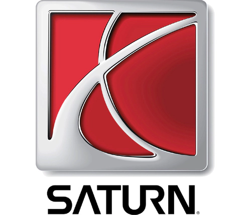
The Saturn logo remained consistent throughout the brands entire 25-year existence from 1985 to 2010 with no major redesigns documented. It was created simultaneously with the brand founding in 1985 to establish a unique visual identity separate from other GM divisions.
- Design: Silver square frame containing red background with two silver curved lines forming an X-like pattern inside the square
- Colors: Red and silver primary with black for the wordmark
- Changes: No documented logo redesigns occurred despite changes in vehicle platforms and corporate integration
- Context: The red and silver Saturn emblem reinforced the different kind of car company positioning and logo was used on vehicles dealerships and marketing from 1990 onward
The Saturn car logo featured custom lettering where the horizontal bar of the A and U is absent. The curved lines mirror the astrological symbol for Saturn while also evoking the orbit path of a flying rocket. This Saturn symbol was described as modern bold and standing out among car manufacturer logos.
The Saturn emblem was intended to appear bright creative and distinct from other automotive logos with emphasis on style and design. The design of the Saturn badge was criticized because the planet Saturn is traditionally associated with yellow while red is more commonly linked to Mars. The Saturn car symbol aligned with the brands space heritage through its visual reference to NASA Saturn rockets.
The Saturn logo meaning combines astrological connection with space heritage. Throughout its history the Saturn logo png and related assets reflected this single consistent design. The Saturn logo history shows the emblem entered a legacy phase after the brands discontinuation on October 31 2010.