Key facts
- Founded
- 1862
- Founded by
- Adam Opel
- Country
-
 Germany
- Headquarters
- Rüsselsheim am Main, Germany
- Parent company
- Stellantis
- Legal name
- Opel Automobile GmbH
- Famous models
- Corsa, Astra, Mokka, Grandland, Crossland
- Slogan
- “The Future Is Everyone's”
- Website
- www.opel.com
Opel logo meaning: what the Blitz in a ring stands for
The Blitz, German for “lightning,” is drawn as a horizontal bolt shaped like a stretched letter Z inside a ring. The name comes from Opel’s Blitz truck, which a nationwide competition in Germany named in 1930.
The zig-zag comes from that truck’s badge, where “Opel” and “Blitz” ran in two jagged stripes, reduced to a single bolt by the 1950s. The ring came from the cars: from the mid-1930s they carried a stylized airship as a hood ornament, and from about 1937 the airship flew through a ring in the emblem. In autumn 1963 the bolt took the airship’s place, and the Opel emblem has kept that layout ever since.
Opel itself links the bolt to electricity, which suits a brand going electric. Readings such as “speed” or “precision” come from logo blogs, not from Opel. Similar badges are collected under car logos with circles.
What does the name “Opel” mean?
Opel is a family name: the surname of Adam Opel, who founded the company in Rüsselsheim am Main in 1862. It is not an acronym; the legal name, Opel Automobile GmbH, was built around the surname. The first logo was simply his initials, an A inside an O.
Opel logo history: every version from 1862 to today
The table covers every known version, and the sections below picture the main ones. The large Opel logo at the top is the 2023 version; the switcher under it shows older ones.
| Period | Version | What changed |
|---|---|---|
| 1862–late 1880s | Founder’s initials | Bronze-brown A inside a red O |
| c.1888 | Heraldic crest | Grey plate: crown, two lions, “Adam Opel” |
| 1889–1890s | Ornate oval | Lettering only, “Opel” on a diagonal band |
| Late 1880s–1890s | Cyclist and Victoria oval | Cyclist below a Victoria figure |
| 1899 | Motorwagenfabrik shield | Black shield, white lettering; lasted months |
| 1899–1902 | Fahrräder insignia | Coral red and cream, arched “Opel” |
| 1902–1906 | First “Opel eye” | Red-and-white pointed oval radiator badge |
| 1906–1909 | Column panel | Gold and black, “Opel” between columns |
| 1909–1910 | Gold script | Name only, set diagonally |
| 1910–mid-1930s | Blue laurel eye | Laurel wreath around a blue field |
| 1920s | Yellow-and-black eye | Same eye in new colors |
| 1928 | Four-square monogram | One letter of OPEL per square |
| c.1928–1930 | Eye in a circle | Eye briefly set in a colored circle |
| 1930 | Blitz truck logo | Jagged lightning stripes for the truck name |
| c.1930 | ”Blitz Rad” badge | Yellow badge with no bolt; origin unclear |
| 1936–1937 | Opel Blitz logotype | Truck lettering joined by a Z-like flash |
| c.1937–1947 | Airship through a ring | Stylized zeppelin crossing a ring |
| 1947–1954 | Airship with a fin | Slimmer airship with a dorsal fin |
| 1954–1963 | Winged airship | Gold airship, OPEL outside the ring |
| 1937–1970 | ”Opel egg” (dealers) | White-and-yellow split oval for signs |
| Late 1963–1964 | First Blitz in a ring | Bolt replaces the airship |
| 1964–1970 | Framed square | Blitz ring plus OPEL, for advertising |
| 1970–1978 | Yellow square | Shorter bolt tails, yellow field |
| 1978–1987 | Brighter yellow | Stronger yellow, inner frame |
| 1987–2002 | Pale yellow in white | Smaller yellow field, larger OPEL |
| 1991–1995 | Black-disc car badge | Ring and bolt on a solid black circle |
| 2002–2007 | 3D silver emblem | Chrome effect, yellow nameplate |
| 2007–2009 | Deeper 3D | More volume and gradients |
| 2009–2017 | Name in the ring | OPEL in the ring’s upper arc |
| 2017–2020 | Flat black | Flat ring and bolt, no name |
| 2020–2023 | Thin ring, spaced name | Finer lines, Opel Next lettering |
| 2023–present | Sharper Blitz | Bolt intersects the ring |
1862–late 1880s: Founder’s initials
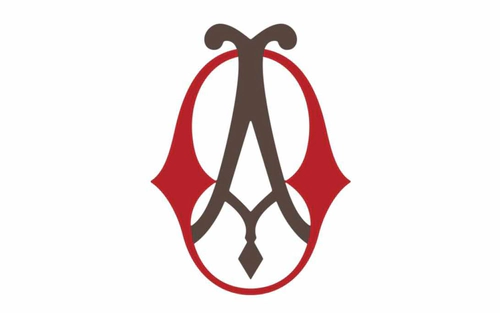
The original Opel logo was a monogram of Adam Opel’s initials, a bronze-brown A standing inside a red O. It was cast into the iron housings of his sewing machines and stayed in use until the late 1880s, about 25 years.
1889–1890s: Bicycle-era ovals
High-wheel bicycles joined the range in 1886, and the marks grew more decorative. This oval carries only lettering; another showed a cyclist under Victoria, the Roman goddess of victory. From around 1889 the bicycles were also called Blitz, though no lightning was drawn.
1899: Motorwagenfabrik shield
Opel built its first car in 1899, and that year a black shield read “Opel Motorwagenfabrik Rüsselsheim a. Main.” It lasted only a few months. By 1902 a small red-and-white oval, the first “Opel eye,” sat on the radiators.
1910–mid-1930s: Blue laurel “Opel eye”
This pointed oval set angular OPEL letters on a blue field inside a laurel wreath, a nod to the wreaths handed to race winners. It was reportedly sketched by Grand Duke Ernst Ludwig of Hesse and, with small changes, lasted into the mid-1930s.
1930: First Blitz truck logo
When the new light truck was named in 1930, it got the first Opel logo with a drawn lightning flash. This black-and-silver plate sets BLITZ in a jagged stripe between two lightning bolts. In 1935 Opel built a plant in Brandenburg for the trucks.
c.1937–1947: Airship through a ring
The shape in the ring is a stylized airship, or zeppelin, which grew more abstract and gained a dorsal fin in the 1950s. Some logo sites call it a rocket, but Opel’s real rocket cars, the RAK models of 1928–29, never appeared in a logo.
Late 1963–1964: First Blitz in a ring
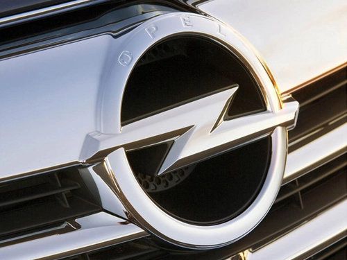
In late 1963 the abstract airship became a lightning bolt, and every new Opel passenger car delivered from that autumn, the 1964 model year, wore it in a circle. This first version, a black bolt with a silver edge, reportedly lasted only a few months.
1964–1970: Framed-square advertising logo
Advertising combined the ring and bolt with the OPEL name in a framed square, while the cars wore the circular badge alone. Accounts disagree on whether the name sat above or below the ring. The bolt still had long, pointed tails.
1970–1987: Yellow square and shorter tails
A 1970 corporate-design reform shortened the bolt’s tails so the badge fit a yellow square beside the blue square of General Motors. These were Opel’s first firm design rules. In 1978 the yellow grew brighter, and the script lettering was dropped around 1981.
1987–2002: Pale yellow in a white square
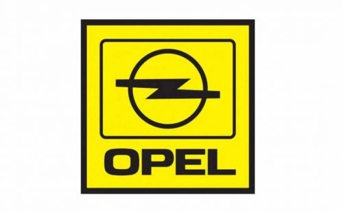
From 1987 the yellow shrank to a pale field inside a black-outlined white square, and the OPEL name grew. On the cars the Opel badge was a metal ring and bolt, set on a solid black disc from 1991 to 1995.
2002–2007: 3D silver emblem
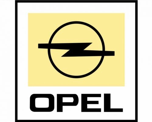
In 2002 the emblem went three-dimensional: a silver ring and bolt with no lettering inside, above a bright-yellow OPEL nameplate. In 2007 Opel deepened the shading and added gradients to both.
2009–2017: Name in the ring
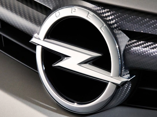
The next badge moved OPEL into the upper arc of a chrome ring. It debuted on the Insignia in October 2008 and in advertising in September 2009. Press reports credit the redesign to a team led by GM Europe’s design chief, Mark Adams.
2017–2020: Flat black Blitz
In 2017, the year PSA took over, Opel’s communications switched to a flat monochrome design: a black ring and bolt with no name and no 3D effect. It is the simplest black-and-white Opel logo.
2020–2023: Thin ring and wide-spaced name
In autumn 2020 Opel redrew the symbol with finer lines and set OPEL below it in widely spaced capitals, in its new Opel Next typeface, made with Monotype. The flat badge reached production cars from 2021, including the Mokka and Crossland.
2023–present: Sharper Blitz intersecting the ring
The new Opel logo was revealed in mid-2023, ahead of the IAA Mobility show in Munich, and reached production cars in 2024. In Opel’s words, the sharper bolt intersects the ring; it is not split in two, as some sites claim. Design vice president Mark Adams calls it the icon of Opel’s “Bold and Pure” design approach.
Why the Opel logo is different in the UK
In the UK, Opel’s cars are sold as Vauxhalls and wear the Vauxhall griffin instead of the Blitz. General Motors bought Vauxhall in 1925, and in the 1970s and 1980s the two ranges merged: most Vauxhalls are Opels with right-hand drive and the griffin badge. In the mid-1970s the griffin was redrawn in a red square to sit beside Opel’s yellow square and GM’s blue one. Both went to PSA in 2017 and to Stellantis in 2021. Ireland differs: Opel was GM’s only brand there from the 1980s, so Irish cars carry the Blitz.
Opel logo PNG: download and black-and-white version
The Opel logo PNG at the top of this page is the current 2023 emblem: a black bolt and ring above the OPEL name, on a transparent background. Because the artwork is black, place it on white or a light color. For a black-and-white Opel logo without the name, the closest match is the flat 2017–2020 design above. As a trademark, it suits reference and editorial use, not anything implying a link with Opel.
Opel colors, font and slogan
Today’s Opel logo is plain black and white, but yellow has run through the brand for decades: the white-and-yellow “Opel egg” on dealer signs from 1937, the yellow square from 1970 to 2002, and a neon-yellow accent since 2020. The wordmark has used the Opel Next typeface since the 2020 redesign. Opel’s slogans:
- 2002–2007: “Fresh thinking – better cars”
- 2007–2009: “Discover Opel”
- 2009–2017: “Wir leben Autos” (“We live cars”)
- Since 2017: “The Future Is Everyone’s”
Frequently asked questions
What was Opel originally known for?
Sewing machines. Adam Opel started the business in 1862 to make them, and his monogram was cast into their iron frames. In 1886 Opel added high-wheel bicycles. After his death in 1895, his widow Sophie and their sons ran the company, and in 1899 it built its first car with Friedrich Lutzmann.