Key facts
- Years active
- 1926–2010
- Founded by
- General Motors
- Country
- United States
- Headquarters
- Pontiac, Michigan, United States
- Parent company
- General Motors
- Famous models
- GTO, Firebird, Grand Prix, Bonneville, Solstice
- Slogan
- “We Build Excitement”
Pontiac Brand Overview
Pontiac operated as an American automotive brand from 1926 until 2010. The brand was established in Pontiac Michigan and named after Chief Pontiac the Odawa leader. It began as a companion make to Oakland automobiles by General Motors in 1926 and became an independent division in 1931 after Oakland was discontinued.
The company focused primarily on the North and South American markets including the United States Canada Mexico and Latin America. Pontiac positioned itself as the performance division of General Motors and used the tagline We build excitement to appeal to buyers seeking affordable performance-oriented vehicles. The brand remained a GM subsidiary until its official closure on October 31 2010 due to financial restructuring and declining demand.
Pontiac Logo Evolution
The Pontiac logo underwent several distinct changes across its 84-year history while preserving connections to its namesake heritage.
1926–1930: Oakland Companion Shield
- Design: Red and blue shield placed inside a gold frame
- Colors: Red blue and gold
- Changes: Included the Oakland wordmark
- Context: Used immediately after the brand was named in 1926
1926–1959: Native American Profile
- Design: Detailed profile of a Native American man
- Colors: Bright red shield with white and gold elements
- Changes: Stylized and modernized after 1930 with variations for emblems and advertising
- Context: Core visual identity for over 30 years based on the brand’s namesake heritage
1959–2002: Arrowhead Dart Emblem
- Design: Red arrowhead pointing downwards featuring a thin black frame and white star
- Colors: Red black and white
- Changes: Brand name added at bottom in sans-serif font in 1981
- Context: Replaced earlier portrait to emphasize performance and innovation
2002–2004: 3D Dart Refinement
- Design: Arrowhead with increased dimensionality
- Colors: Silver frame added to previous scheme
- Changes: Thicker frame in silver creating 3D effect
- Context: Part of broader modernization before the final design
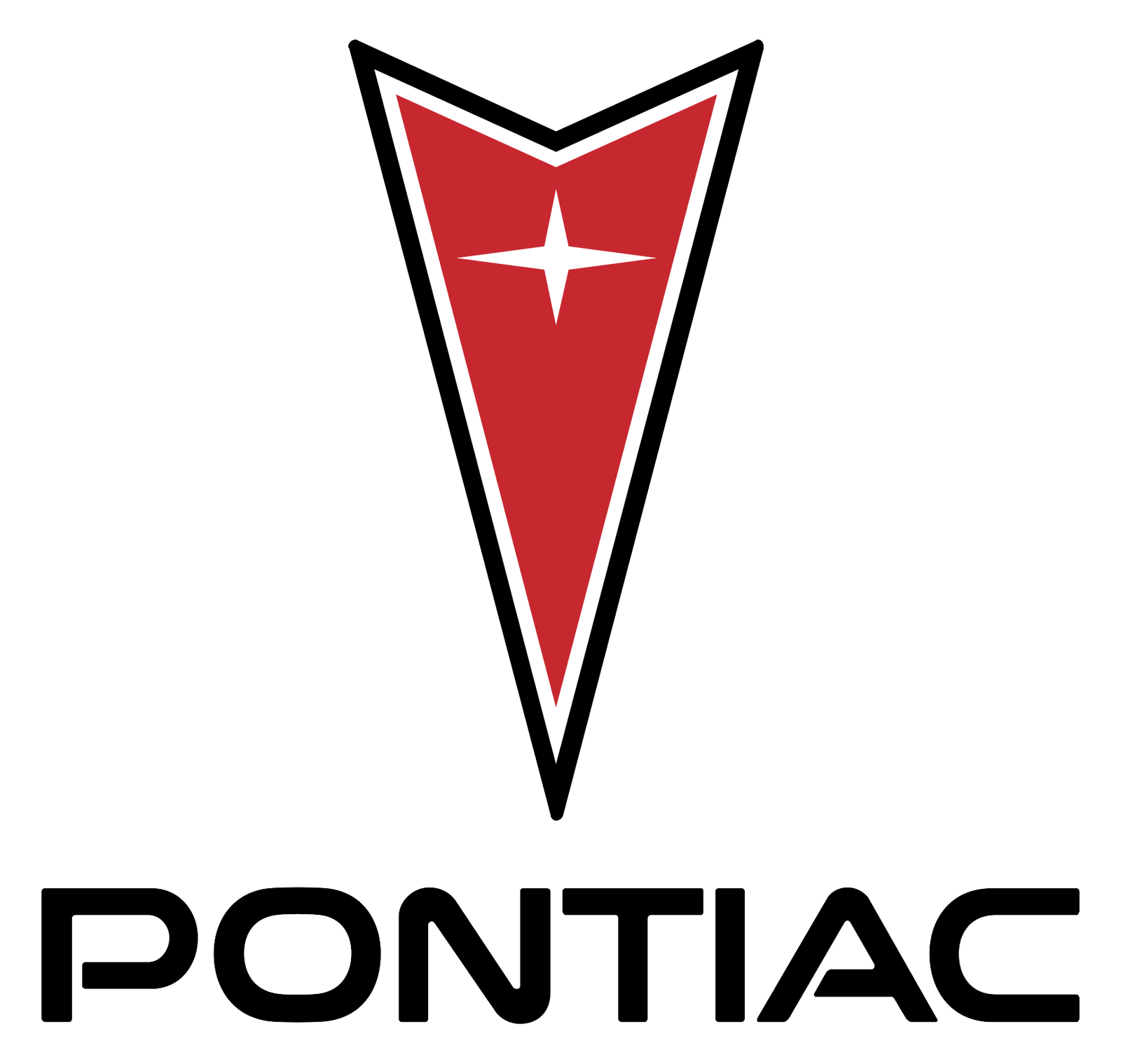
2004–2010: Modern Glossy Arrowhead
- Design: Vertically stretched triangular crest resembling an arrowhead with four-pointed star
- Colors: Dark red background with silver frame star and accents plus black and white elements
- Changes: Glossy finish voluminous silver frame and triangular cut-out at top border
- Context: Updated wordmark in modern sans-serif all-caps with open P and A letters
Pontiac Logo Symbolism and Design Meaning
The arrowhead or dart served as the core symbol across multiple eras of the Pontiac logo. A recurring four-pointed star appeared at the top of the arrowhead throughout later designs. All versions maintained ties to Native American heritage connected to Chief Pontiac.
Design philosophy balanced historical legacy with modern evolution. The final symbol used a sleek triangular crest with star dark red field and silver frame to convey motion and performance. The consistent color scheme of red silver black and white represented elegance passion and power.
Pontiac Logo History and Brand Milestones
Several key events directly influenced changes to the Pontiac logo. Brand creation in 1926 led to immediate adoption of the shield and Native American profile. Oakland’s discontinuation in 1931 allowed Pontiac to become a standalone division while continuing the Indian head with refinements.
The 1956-1959 period marked a major shift to performance image that replaced the Native American head with the arrowhead emblem. Addition of the wordmark occurred in 1981 during the mature performance era. Modernization efforts between 2002 and 2004 introduced 3D and glossy finishes before the brand ended in 2010.
Pontiac maintained strong loyalty to its Native American heritage throughout its history while evolving from a literal portrait to an abstract symbolic arrowhead. The Pontiac symbol ultimately represented performance and forward motion across more than eight decades as the performance division of General Motors.