Key facts
- Founded
- 1903
- Founded by
- David Dunbar Buick
- Country
- United States
- Headquarters
- Detroit, Michigan, United States
- Parent company
- General Motors
- Famous models
- Century, LeSabre, Riviera, Enclave, Encore
- Slogan
- “When Better Automobiles Are Built, Buick Will Build Them”
- Website
- www.buick.com
Buick Brand Overview
Buick traces its origins to David Dunbar Buick, who founded the Buick Auto-Vim and Power Company in 1899 before establishing the Buick Motor Company in 1903. The brand became part of General Motors in 1908 and maintains its headquarters in Detroit, Michigan. Its identity reflects Scottish heritage through symbols drawn from the family crest featuring a deer, cross, and checkered diagonal elements.
Buick Logo Evolution
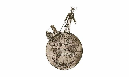 1904–1905
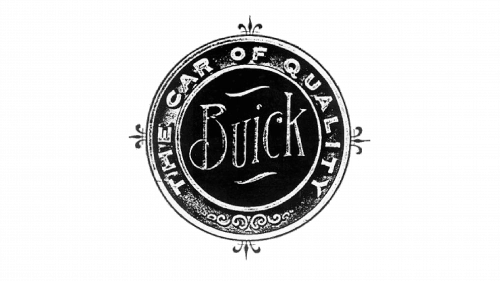 1905–1911
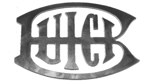 1911–1913
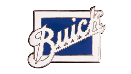 1913–1930
 1937–1939
 1939–1942
 1942–1947
 1947–1949
 1949–1959
 1959–1975
 1975–1980
 1980–2002
 2002–2015
 2015–2022
 2022–Present
1904 – 1905: Man-on-Globe Symbol
- Design: Figure of a man positioned on top of a globe
- Colors: Sepia tones
- Changes: Used for approximately one year only
- Context: Earliest visual mark for the newly established Buick Motor Company
1905 – 1911: Wordmark in Circle with “The Car of Quality”
- Design: Thick circular frame with central wordmark
- Colors: Not specified in primary sources
- Changes: Moved from symbolic illustration to textual presentation
- Context: Emphasized quality positioning during the brand’s early growth period
1911 – 1913: Wordmark Inside Enlarged Letter B
- Design: Wordmark enclosed within oversized B
- Colors: Not specified in primary sources
- Changes: Reduced complexity of the previous circular layout
- Context: Brief transitional design before the square era
1913 – 1930: Diagonal Cursive on Two-Colored Square
- Design: Square background with diagonal white script
- Colors: Red and blue
- Changes: Adopted bold color blocking and diagonal orientation
- Context: Longest-used early logo reflecting the brand’s pre-Depression era
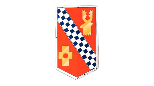
1937 – 1939: First Family Crest
- Design: Shield-shaped crest drawn from Scottish heraldry
- Colors: Orange-terracotta background with gold elements
- Changes: First use of family crest symbolism
- Context: Established direct visual connection to founder David Dunbar Buick’s Scottish ancestry
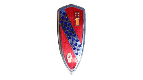
1939 – 1942: Narrower Crest with Arched Top
- Design: Narrow crest with arched top
- Colors: Calm red background
- Changes: Narrower proportions and more powerful color
- Context: Continued development of heritage-based crest design
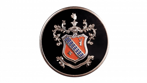
1942 – 1947: Crest on Black Circle with Ornaments
- Design: Crest enclosed in black circle with ornaments
- Colors: Black, gold, white, and blue
- Changes: Added circular frame and modified pattern
- Context: Wartime and immediate postwar styling adaptation
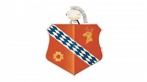
1947 – 1949: Wide Orange Crest without Frame
- Design: Clean wide crest shape
- Colors: Orange background
- Changes: Simplified by removing frame and decorative elements
- Context: Postwar return to core crest identity
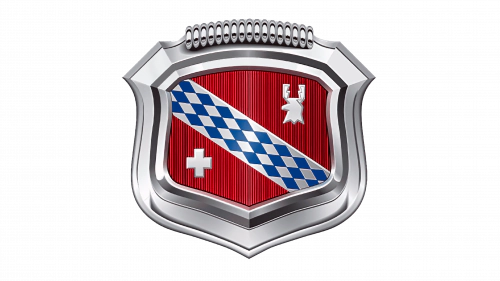
1949 – 1959: Silver Tones with Thick Frame
- Design: Crest with added thick frame
- Colors: Silver and red
- Changes: Color shift from gold to silver
- Context: Final evolution of the single crest before the tri-shield era
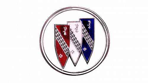
1959 – 1975: Introduction of Tri-Shield
- Design: Three shields in circular enclosure
- Colors: Blue, white, and red
- Changes: Replaced single crest with tri-shield concept
- Context: Major redesign tied to launch of three new models and lasting connection to family coat of arms
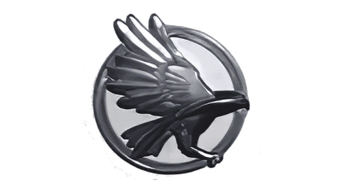
1975 – 1980: Hawk Symbol Period
- Design: Hawk illustration with accompanying wordmark
- Colors: White hawk and lettering on red background
- Changes: Departure from shield concept for limited time
- Context: Period of brand experimentation during late 1970s
1980 – 2002: Refined Tri-Shield on Blue Background
- Design: Cleaner three-shield emblem
- Colors: Blue background with silver and red accents
- Changes: Restoration of tri-shield with simplified internal details
- Context: Emphasis on brand continuity after experimental period
2002 – 2015: Monochrome Silver 3D Effect
- Design: Silver tri-shield with 3D rendering
- Colors: Monochrome silver
- Changes: Simplified color palette and added dimensionality
- Context: Modernization effort for the new millennium
2015 – 2022: Elegant Tri-Shield Refinement
- Design: Polished tri-shield composition
- Colors: Silver with selective color accents
- Changes: Subtle refinement of proportions and finish
- Context: Preparation for final modernization while honoring history
2022 – Present: Modernized Tri-Shield
- Design: Frameless tri-shield with geometric typography
- Colors: Predominantly silver with minimal additional tones
- Changes: Removal of frame and adoption of contemporary geometry
- Context: Latest modernization that strengthens heritage connection while updating appearance
Symbolism and Meaning of the Buick Logo
The tri-shield that forms the core of the Buick emblem is a direct reference to the historical coat of arms of the Buick family from Scotland. Original crest elements included a golden buck or deer head, a gold cross, and a diagonal checkered banner. These heraldic features established the foundation for the brand’s visual identity.
Silver coloring in the Buick logo represents purity, dignity, sophistication, and grandeur. Black elements convey a dynamic attitude and excellence. Although the three shields were initially introduced to honor specific models, they have evolved into a permanent link to the founder’s Scottish heritage.
Buick Logo History and Design Changes
Major changes to the Buick logo have been driven by specific milestones. The 1937 introduction of the family crest aimed to establish heritage. The 1959 creation of the tri-shield coincided with the launch of three new models. A brief experimental hawk design appeared in 1975, followed by a return to the tri-shield in 1980 for brand continuity.
The 2002 redesign focused on simplification through a monochrome silver treatment. The 2022 update further modernized the Buick symbol by removing the frame and adopting cleaner geometric forms while preserving the essential three-shield structure. This continuous evolution maintains visual ties to the original family crest introduced by David Dunbar Buick.