Key facts
- Founded
- 1911
- Founded by
- William C. Durant
- Country
- United States
- Headquarters
- Detroit, Michigan, United States
- Parent company
- General Motors
- Legal name
- General Motors Truck Company
- Famous models
- Sierra, Yukon, Canyon, Acadia, Hummer EV
- Slogan
- “We Are Professional Grade”
- Website
- www.gmc.com
GMC Brand History
GMC began as the Grabowsky Motor Company in 1900. It was acquired by General Motors in 1911 and renamed General Motors Truck Company. The brand has remained under continuous General Motors ownership since that date.
Over the decades the company has gone through several formal names. From 1911 until 1943 it operated as General Motors Truck Company. It then became the GMC Truck & Coach Division from 1943 to 1998 before simplifying to simply GMC in 1998. The three-letter designation now stands for General Motors Company while remaining distinct from the parent corporation.
GMC has maintained a consistent product focus throughout its history. The company has specialized in trucks, pickup trucks, SUVs, crossovers, motorhomes and commercial vehicles from its earliest days through to the present.
GMC Logo Evolution
1911–1947: Tire Roundlet Logo
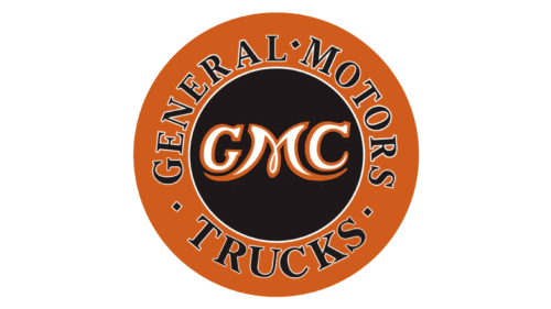
The first official logo after the 1911 acquisition by GM took the form of a round emblem resembling a tire. This design featured a black center with a thin white outline and an orange outer ring.
- Design: Circular shape modeled after a tire with curved lettering
- Colors: Orange, black and white
- Changes: Introduced the GMC acronym in white gothic-style letters
- Context: Marked the official beginning of the GMC identity under General Motors
The outer ring carried the words General Motors Trucks in black serif font. This roundel established the three letters GMC as the central element that would remain in every subsequent logo.
1947–1960: Bold Red Block Logo
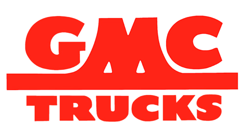
A major simplification occurred in 1947 when GMC adopted a bold red block logo. The new design used strong, blocky red lettering that created an immediate visual impact.
- Design: Block capital letters with extended lines on the M
- Colors: Bright red throughout
- Changes: Removed the circular shape and introduced a standardized red color
- Context: Coincided with corporate restructuring and a move toward simplicity
The word Trucks appeared in smaller red letters beneath the main GMC letters. This version represented a clear shift toward a more direct and powerful visual statement.
1960–1967: Volumetric Silver Logo
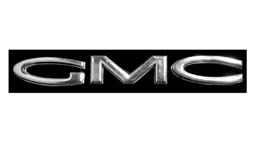
The 1960s brought a move toward modern metallic styling with the introduction of a silver 3D emblem. This design featured wide, simple-style letters rendered with shading and light specks to create depth.
- Design: Three-dimensional volumetric lettering
- Colors: Silver with black background
- Changes: Shift from flat red to metallic silver with 3D effects
- Context: Part of a broader modernization effort during this period
The silver letters were often placed on a plain black rectangle. This approach introduced premium metallic finishes that would influence later designs.
1975–1979: Clean Rectangular Badge
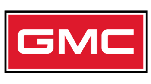
A cleaner corporate approach emerged in 1975 with the adoption of a red rectangle logo. This design placed white GMC letters inside a red field with thin white and black double borders.
- Design: Angular sans-serif font within a rectangular frame
- Colors: Red field with white lettering and black accents
- Changes: Return to red as the dominant color with added geometric structure
- Context: Part of a corporate image cleanup initiative
The wide angular font conveyed a sense of engineering precision and strength. This version restored red as the primary brand color after the silver interlude.
1979–2014: Red Metallic Logotype
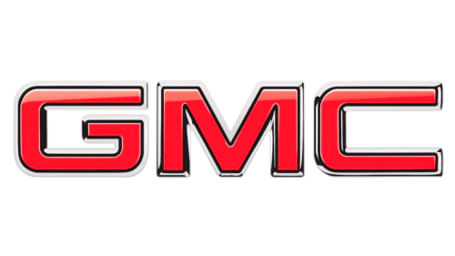
In 1979 GMC removed the rectangular frame and focused on the letters themselves. The new logo featured red GMC lettering with metallic edges and black and white shading to create a volumetric appearance.
- Design: Standalone 3D logotype without enclosing shape
- Colors: Red with metallic grey and black shading
- Changes: Elimination of the rectangle to emphasize the letters
- Context: Aligned with the ongoing simplification of the brand name to GMC
This approach refined the three-dimensional effect while keeping the focus squarely on the GMC acronym. The design would serve the brand for more than three decades.
2014–Present: Contemporary GMC Logo
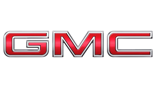
A subtle but noticeable update arrived in 2014 with the current GMC logo. This version builds on the 1979 metallic letters while making them darker, wider and more intensely shaded.
- Design: Broader letter proportions with enhanced 3D rendering
- Colors: Darker red with stronger metallic shading
- Changes: Increased shading intensity and wider borders
- Context: Refresh during a period of growth in the SUV and truck market
The contemporary GMC logo maintains the established red metallic style while increasing visual impact. It continues the evolution that has kept the three letters GMC as the sole central element since 1911.
GMC Logo Design Philosophy
The GMC symbol has consistently used geometric, wide lettering with squared angles since the 1970s. This typography choice communicates engineering precision, strict shapes and raw strength appropriate for trucks and commercial vehicles.
Red has served as the primary color since the 1940s and became fully standardized in the 1970s. Supporting colors of white, black and metallic silver provide contrast and dimensional depth across different eras.
The core symbolism of the GMC emblem emphasizes raw power, brutal utility and no-frills strength. This visual language directly aligns with the brand’s focus on trucks and commercial vehicles throughout its history.
Relationship Between Corporate Changes and Logo Updates
Several GMC logo changes have coincided with important corporate milestones. The 1911 acquisition by General Motors led directly to the introduction of the first official roundel logo featuring the GMC name.
The 1947 corporate restructuring period brought the major simplification to bold red block letters. The 1960s modernization effort introduced the shift to 3D silver metallic styling that reflected broader industry trends.
A corporate image cleanup in 1975 produced the clean red rectangle design. The period from 1979 to 1998, when the name simplified to GMC, saw the removal of the rectangular frame and greater focus on the red metallic letters themselves.
The 2014 update to darker shading and wider proportions occurred during a time of expansion in the SUV and truck segments. These direct links between brand events and visual identity changes demonstrate how the GMC badge has evolved in step with the company’s development.
The GMC car logo has maintained remarkable consistency in its central element. From the original 1911 round emblem to the current version, the three letters GMC have remained the only constant symbol across more than a century of history. This continuity helps distinguish the GMC emblem within the automotive landscape while reinforcing its truck-focused heritage.
For those seeking visual references, the GMC logo evolution shows a clear progression from ornate early designs to the streamlined and powerful modern interpretation used today. The various iterations of the GMC badge provide insight into how the brand has presented itself across different eras of automotive history.