Key facts
- Years active
- 1982–2011
- Founded by
- Kim Woo-choong
- Country
- South Korea
- Headquarters
- Bupyeong-gu, Incheon, South Korea
- Parent company
- General Motors
- Legal name
- Daewoo Motor Co., Ltd.
- Famous models
- Matiz, Lanos, Nubira, Leganza, Espero
Daewoo Brand History
Daewoo was established in 1967 as part of the Daewoo Group in South Korea. The automotive division began with a partnership with General Motors in 1978 before operating independently as Daewoo Motors from 1982 to 2002. The company was acquired by General Motors in 2002 and automotive operations under the Daewoo name ended in 2011.
The name Daewoo logo meaning centers on the concept of the great universe. This philosophical foundation remained consistent even as the visual identity developed over time.
Daewoo Logo Evolution
1967–1974: Original Logo

The first Daewoo logo was used during the initial seven years of the company’s history.
- Design: Horizontally stretched oval medallion with narrow rectangular arch in center resembling Russian letter “П” (Latin “P”)
- Colors: Plain black strokes with distinctive contours
- Changes: This was the original emblem before any shell symbolism appeared
- Context: Applied in the early development period of the brand
1974–1978: First Redesign

This update introduced the seashell symbolism that would define the Daewoo symbol for decades.
- Design: Blue oval with thin slightly curved stripe cut out from central part, forming abstract stylized geometric shell
- Colors: Deep shade of blue for both graphical element and lettering
- Changes: First appearance of seashell-inspired elements
- Context: Occurred during early modernization of the company
1978–1994: Second Major Update

The 1978 redesign coincided with the formal establishment of automotive manufacturing focus and refined the Daewoo car logo.
- Design: Oval containing five thicker “rays”; geometric sans-serif typeface with distinctive “A” shape
- Colors: Lighter blue
- Changes: Reduced number of internal stripes for clearer shell representation
- Context: Used throughout the expansion period under the Daewoo Motors name
1994–2002: Modernization Phase

During independent operation the Daewoo emblem became more elegant and progressive.
- Design: Horizontally stretched shell resembling a flower; modern sans-serif wordmark with softened angles; “A” shaped as triangle with open contour
- Colors: Blue (primary)
- Changes: Logo became more modest yet retained the flower-like shell form
- Context: Implemented while the company operated without the previous joint venture
2002–2016: Final Logo
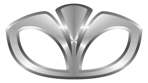
After the ownership change the brand adopted a more sophisticated Daewoo car symbol that continued in use beyond the original company.
- Design: Elongated and rounded central shell part with increased flower resemblance; three-dimensional emblem; strict geometric sans-serif wordmark
- Colors: Silver (for 3D emblem) and blue (for flat lettering); glossy metallic surface
- Changes: Added three-dimensional styling and refined the shell to look more like a flower
- Context: Introduced following the 2002 acquisition
Design Philosophy and Symbolism
The central concept of the Daewoo logo has always been universe and seashell symbolism. Blue represents the universe and peace while silver symbolizes loyalty, unity, and reliability in later versions.
Typography evolved from custom geometric sans-serif in early versions to a bold straight minimalist sans-serif in the final version. All iterations maintained the seashell or oval form with internal elements that gradually became more flower-like.
Connection Between Logo Changes and Company Milestones
Logo updates were directly tied to major stages in the company’s development. The 1974 redesign occurred during early diversification while the 1978 update aligned with the formal automotive manufacturing focus.
The 1994 redesign was introduced during the period of independent operation after the initial GM partnership ended. The final 2002 update coincided with the acquisition and reflected a new era for the Daewoo badge.
This consistent pattern shows how the Daewoo logo evolution mirrored the brand’s growth and ownership transitions while preserving its philosophical seashell foundation. The visual identity remained a clear representation of the “Great Universe” concept across more than four decades.