Key facts
- Founded
- 1899
- Founded by
- Louis Renault, Marcel Renault, Fernand Renault
- Country
- France
- Headquarters
- Boulogne-Billancourt, France
- Legal name
- Renault S.A.
- Famous models
- Clio, Mégane, Captur, Twingo, Scénic
- Slogan
- “Renault, Passion for life”
- Website
- renaultgroup.com
Brand Overview and Founding
Renault was founded in 1899 as Société Renault Frères in France by Louis Renault, Marcel Renault and Fernand Renault. The brothers presented their first car in 1897 which entered sales the following year. This established the beginning of a continuous history as a French mass-market automobile manufacturer.
The early brand name derived directly from the three founding brothers. Their initials appeared in the first emblems, creating the foundation for the Renault car logo that would evolve over the decades.
Renault Logo Evolution
 1899–1906
 1906–1919
 1919–1923
 1923–1925
 1925–1930
 1930–1945
 1945–1946
 1946–1958
 1958–1967
 1967–1972
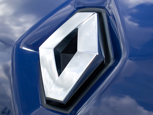 1972–1982
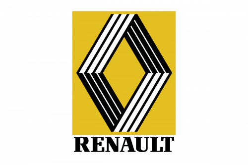 1982–1990
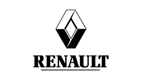 1990–2004
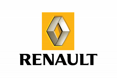 2004–2007
 2007–2015
 2015–2021
 2021–Present
The Renault logo history reflects more than a century of design changes. From the first monogram to the enduring diamond motif introduced in 1925, each era responded to industrial developments and historical context. The Renault symbol has maintained a recognizable identity while adapting its visual style.
1899-1906: Initial Monogram Logo
- Design: Initials of the three Renault brothers in an oval medallion
- Colors: Not specified in early versions
- Changes: First official logo for the newly founded company
- Context: Created for Société Renault Frères at the start of operations
1906-1919: Gear Wheel Emblem
- Design: Car illustration within circular gear frame
- Colors: Not specified in early versions
- Changes: Moved away from monogram to representational imagery
- Context: Reflected growing industrial character of automobile production
1919-1923: Tank Inspired Emblem
- Design: Round emblem with tank-inspired brutal style
- Colors: Not specified
- Changes: Shift to a more austere and powerful appearance
- Context: Direct response to the company’s tank production during 1914-1918
1923-1925: Grille Celebration Logo
- Design: Round icon focused on grille pattern with central text
- Colors: Not specified
- Changes: Increased emphasis on the wordmark
- Context: Bridge period before the introduction of the diamond shape
1925-1930: First Diamond Logo
- Design: Angular rhombus with brand name centered
- Colors: Yellow color introduced in 1946
- Changes: Adoption of the diamond shape as core identity element
- Context: Marked the beginning of the enduring diamond motif
1930-1945: Thick Lined Diamond
- Design: Diamond featuring thick parallel lines and central banner
- Colors: Black dominant with white lettering
- Changes: Increased boldness and contrast in line work
- Context: Continued development of the diamond as the Renault car symbol
1945-1946: Post-War Shield Logo
- Design: Diamond on shield with geometric ornaments
- Colors: Black sans-serif text on shield
- Changes: Incorporated complete legal name after 1946 nationalization
- Context: Reflected the creation of Regie Nationale Renault
1946-1958: Crest Removed Diamond
- Design: Simple diamond without surrounding crest
- Colors: Yellow, white and black
- Changes: Removal of shield elements for cleaner appearance
- Context: Post-war modernization of the visual identity
1958-1967: Narrower Elegant Diamond
- Design: Narrower diamond form with elegant proportions
- Colors: Maintained yellow and black palette
- Changes: Refined proportions and more delicate details
- Context: Move toward more sophisticated visual presentation
1967-1972: Yellow Square Diamond
- Design: Square frame with negative space rhombus
- Colors: Bright yellow with white and black
- Changes: Innovative use of negative space to create the diamond
- Context: Experimental approach to the Renault emblem
1972-1982: Vasarely 3D Diamond
- Design: 3D diamond with strong angular construction
- Colors: Focused on dimensional shading
- Changes: Complete removal of text from the emblem itself
- Context: Artistic collaboration that added depth and dynamism
1982-1990: Refined 3D Diamond
- Design: Softer refinement of the 3D diamond form
- Colors: Darker yellow with white accenting
- Changes: Improved dimensional qualities and typography
- Context: Evolution of the Vasarely concept with greater elegance
1990-2004: Stronger 3D Diamond
- Design: Enhanced 3D diamond with supporting wordmark
- Colors: Strong contrast in the dimensional elements
- Changes: Increased visual strength and presence
- Context: Direct predecessor to the modern identity
2004-2007: Modernized Emblem
- Design: Updated emblem with square background treatment
- Colors: Yellow square with silver and black elements
- Changes: Introduction of silver coloring for the diamond
- Context: Further contemporary refinement of the identity
2007-2015: Elegant Wordmark Era
- Design: Sophisticated typographic treatment
- Colors: Maintained core brand colors
- Changes: Focus on elegant letterform construction
- Context: Emphasis on high-quality typographic presence
2015-2021: Minimalistic Modern Era
- Design: Clean minimalistic approach with bolder elements
- Colors: Yellow used to add energy and approachability
- Changes: Simplified overall design language
- Context: Response to contemporary design trends
2021-Present: Monochrome Diamond
- Design: Two-line construction forming interwoven diamond
- Colors: Monochrome treatment as primary version
- Changes: Removal of logotype from primary emblem
- Context: Progressive and simplified representation of the brand
Renault Samsung Motors
Samsung Motors was founded in South Korea in 1994 with technical assistance from Nissan. Vehicle sales began in 1998 shortly before the Asian financial crisis. In September 2000 the company became a subsidiary of Renault through the acquisition of an 80.1 percent majority stake, with Samsung retaining 19.9 percent minority ownership. It was renamed Renault Samsung Motors at that time.
This subsidiary uses a separate circular storm’s eye marque logo distinct from the main Renault diamond. Its corporate logo adapts elements from the Samsung Group identity. The entity has also been referred to as Renault Korea Motors in some contexts.
Key Relationships in Brand History
The founders Louis, Marcel and Fernand Renault directly inspired the original brand name and early monogram logos used from 1899 to 1906. World War I tank production between 1914 and 1918 influenced the brutal round emblem adopted for the period 1919-1923.
Nationalization in 1946 created Regie Nationale Renault, which appeared in the full legal name on the temporary shield logo of 1945-1946. The 1925 decision to adopt the diamond shape established an enduring symbol that has remained central to the Renault emblem through all subsequent redesigns.
The 2000 acquisition of Samsung Motors created the Renault Samsung Motors subsidiary and introduced its distinct logo separate from the main brand identity. These relationships illustrate how historical events and strategic decisions have shaped both the Renault logo meaning and the company’s structure over time.
The diamond motif introduced in 1925 continues as the core visual element in the Renault car logo, representing more than nine decades of consistent brand symbolism across numerous redesigns. This visual continuity stands as a central aspect of Renault logo history.