Key facts
- Founded
- 1810
- Founded by
- Jean‑Pierre Peugeot, Jean‑Frédéric Peugeot
- Country
- France
- Headquarters
- Poissy, France
- Parent company
- Stellantis
- Legal name
- Automobiles Peugeot
- Famous models
- 205, 206, 308, 3008, 508
- Slogan
- “Motion & Emotion”
- Website
- www.peugeot.com
Founding and Origins
Peugeot was founded in 1810 by Jean-Pierre II Peugeot and Jean-Frédéric Peugeot who transformed the family mill in Hérimoncourt near Montbéliard in the Doubs region of Franche-Comté into a steel mill. The company initially produced tools, springs and saw blades. This industrial context required symbols of strength, sharpness and durability that would later define the Peugeot emblem.
The brand remained focused on steel manufacturing for decades before entering automotive production around 1907. The lion first appeared on saws and was registered as the Peugeot trademark in 1858 at the Conservatoire des Arts et Métiers.
Origin and Meaning of the Lion Symbol
The lion was chosen in 1850 as the emblem for Peugeot steel products. Goldsmith Justin Blazer from Montbéliard designed the initial Peugeot symbol. The animal represented the strength, speed, flexibility and bite of the saw blade while also serving as the heraldic symbol of the Franche-Comté region.
Core symbolism associated with the Peugeot badge includes power, loyalty, courage and majesty. The lion is traditionally shown in a rampant position standing on its hind legs with forelegs raised and facing left. This Peugeot symbol has remained the central and continuous element of the brand identity since 1850 linking its industrial roots directly to its automotive era.
Peugeot Logo Evolution
 1810–1858
 1858–1889
 1889–1910
 1910–1925
 1925–1936
 1936–1948
 1948–1957
 1957–1968
 1968–1975
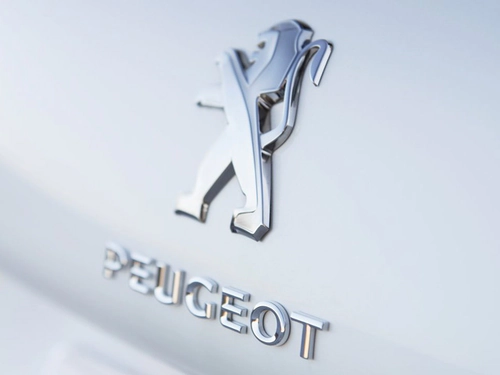 1975–1998
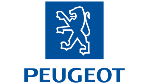 1998–2010
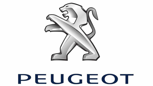
 2010–2021
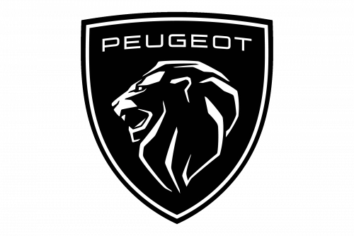
 2021–Today
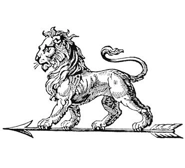
1810-1858: Early Industrial Lion
- Design: Lion image engraved on saws
- Colors: Monochrome appropriate for tool engraving
- Changes: Introduction of the lion as company emblem
- Context: Steel manufacturing in Franche-Comté requiring symbols of strength
1858-1889: Darker Lion with Jo Lettering
- Design: Darker lion with enhanced detailing
- Colors: Increased use of black
- Changes: Official registration as Peugeot brand trademark
- Context: Continued use on industrial tools and products
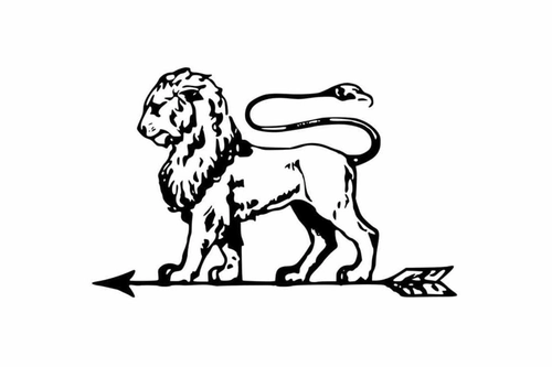
1889-1910: Lion on Arrow in Coat of Arms
- Design: Lion on arrow within coat-of-arms frame
- Colors: Traditional heraldic tones
- Changes: Structured frame and arrow element added
- Context: Final industrial period before full automotive adoption
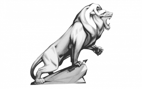
1910-1925: Voluminous 3D Roaring Lion
- Design: 3D roaring lion with gradients
- Colors: Light gray gradients for volume
- Changes: Shift to more realistic three-dimensional style
- Context: Early automotive period with lion appearing on cars around 1907
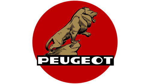
1925-1936: Lion with PEUGEOT Wordmark Banner
- Design: Lion positioned with rectangular banner
- Colors: Black lion and banner
- Changes: Addition of prominent wordmark
- Context: Continued automotive branding development
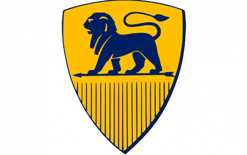
1936-1948: Yellow and Blue Crest with Standing Lion
- Design: Crest pointing downward with profile lion
- Colors: Dark yellow and blue
- Changes: Introduction of distinct color scheme
- Context: Pre-war and wartime period logo usage
1948-1957: Franche-Comté Inspired Shield
- Design: Rounded shield with lion element
- Colors: Heraldic tones
- Changes: Lion relocated to bonnet position
- Context: Post-war redesign reflecting regional heritage
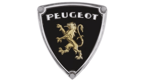
1957-1968: Lion Head with PEUGEOT Above Shield
- Design: Lion head focus with wordmark above
- Colors: Varied according to application
- Changes: Simplification of shield element
- Context: Mid-century modernization of brand identity
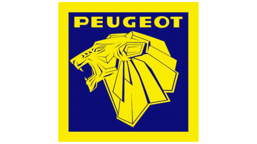
1968-1975: Flat Minimalist Lion Head
- Design: Flat minimalist lion head
- Colors: Gold to chrome variations
- Changes: Dramatic simplification and modernization
- Context: Move toward cleaner industrial design aesthetics
1975-1998: Lion Outline on Colored Background
- Design: Silver outline silhouette with ridge line
- Colors: Silver on black then blue backgrounds
- Changes: Birth of the outline style with later refinements
- Context: Long-running modern era spanning over two decades
1998-2010: White Lion on Blue Square
- Design: Enlarged lion with visible paws on square frame
- Colors: White lion on blue square
- Changes: New square format and increased lion scale
- Context: Late 20th century update before digital era
2010-2021: 3D Metallic Lion with Refined Wordmark
- Design: 3D metallic lion silhouette
- Colors: Metallic tones with blue wordmark
- Changes: Return to dimensional styling with modern refinement
- Context: Early 21st century branding before current crest
2021-Today: Modern Black Crest with Stylized Lion
- Design: Stylized profile lion in heraldic crest
- Colors: Black with white outlines
- Changes: Streamlined and simplified modern crest format
- Context: Contemporary update for 21st-century challenges
Brand Legacy
The Peugeot logo history demonstrates remarkable continuity with the lion remaining constant while the surrounding elements evolved from realistic three-dimensional representations to minimalist outlines and finally to a modern heraldic crest. Logo changes often coincided with major product generations or regulatory requirements such as the 1957 ban on external protrusions that influenced inlaid coat-of-arms designs.
Peugeot transitioned from steel manufacturing in the 1850s to automotive production in the late 19th century with the lion consistently symbolizing the brand core values of strength and elegance. The Peugeot emblem continues to connect the company’s industrial origins in Franche-Comté directly to its present identity.
Users seeking Peugeot logo png, Peugeot logo transparent or Peugeot logo hd can reference the chronological images above which illustrate the complete Peugeot logo evolution from 1810 to the present day. The Peugeot car symbol has maintained its recognizable lion form across more than 170 years of continuous brand history.