Key facts
- Founded
- 1933
- Founded by
- Yoshisuke Aikawa
- Country
- Japan
- Headquarters
- Nishi-ku, Yokohama, Japan
- Legal name
- Nissan Motor Co., Ltd.
- Famous models
- Leaf, Altima, Rogue, Patrol, Z
- Slogan
- “Innovation that excites”
- Website
- www.nissan-global.com
Nissan logo meaning: the rising sun and the bar
The Nissan logo is a sun crossed by a horizontal bar that carries the company name, a design Nissan inherited from its own Datsun marque. Nissan’s brand guidelines call the badge “a symbol that represents the rising sun and our birthplace.” In other words, the Nissan symbol points straight back to Japan, the Land of the Rising Sun.
Each part of the original badge has a documented meaning:
- Red circle: the rising sun, the hinomaru disc of the Japanese flag.
- Cobalt-blue bar: the sky. It was not chosen to signal “reliability,” a reading that still circulates online.
- Name across the sun: founder Yoshisuke Aikawa’s motto “Shisei tenjitsu o tsuranuku,” which Nissan explains as the idea that a strong enough belief can pierce even the sun.
According to Japanese sources, the original Datsun badge was drawn by Ryozo Yoshizaki and Tsunesaburo Tanaka, who took a hint from the Chevrolet emblem. A story repeated on many sites is wrong: Nissan did not create the emblem in 1932 by consolidating Datsun, because the company was only founded in December 1933. Nissan’s guidelines show about 22 historic badges, with Nissan and Datsun marks mixed together and no dates given. The circle also puts Nissan among the car logos with circles, although here the circle began as the sun.
What does Nissan mean in Japanese?
Nissan is short for Nihon Sangyo (日本産業), which means “Japan Industries.” It was the Tokyo Stock Exchange abbreviation for the holding company that Yoshisuke Aikawa headed from 1928. Read character by character, 日産 can suggest “sun” and “production,” but the name does not mean “sun product” or “birth of the sun.” The first character simply stands for Japan and the second for industry. The popular “Ni-San, two-three” reading is wordplay, not the origin.
Aikawa is Nissan’s founder. His holding companies, Nihon Sangyo and Tobata Casting, set up Jidosha Seizo Co., Ltd. in Yokohama on 26 December 1933, and it was renamed Nissan Motor Co., Ltd. in June 1934. The roots go further back, to Masujiro Hashimoto’s Kwaishinsha Motor Car Works, founded in Tokyo in 1911. Its 1914 DAT car took its name from the investors Den, Aoyama and Takeuchi, and the American engineer William R. Gorham later became DAT’s chief designer. In the early 1930s a small DAT model called Datson, “son of DAT,” became Datsun, because “son” sounds like the Japanese word for loss. For other makers from the same country, see our list of Japanese car brands.
The current Nissan logo (2020 to today)
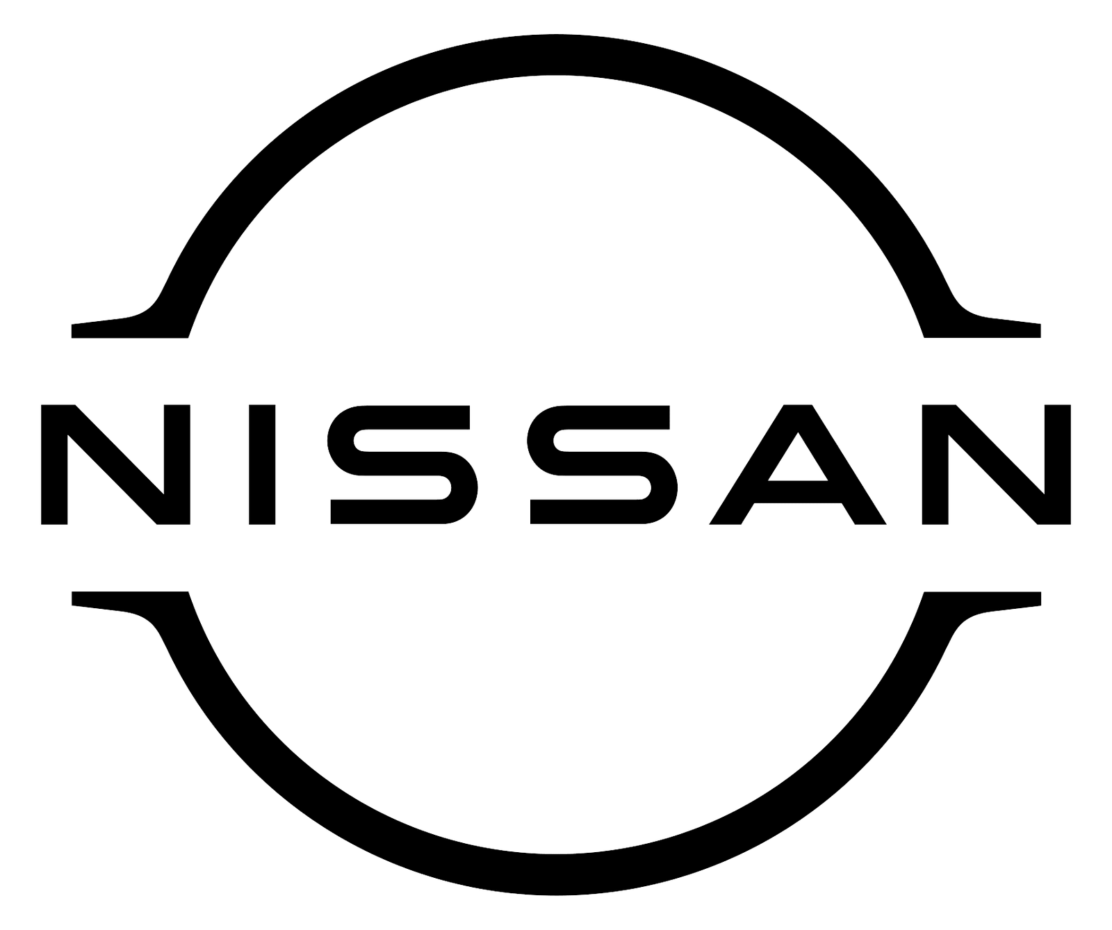
The new Nissan logo, introduced on 15 July 2020, is a flat, thin-line design in which the NISSAN name splits the circle into two arches. It has no chrome, no bevels and no banner box.
Work on it began in summer 2017, when Nissan’s head of global design, senior vice president Alfonso Albaisa, started studying a change of logo. A team under Tsutomu Matsuo, who was deputy general manager of the advanced design department, worked from three keywords Albaisa set: “thin, light and flexible.” Because the badge had to light up on Nissan’s electric cars, the team drew the illuminated version first and then derived the 2-D logo from it. The lit badge uses 20 LEDs, one for each year between logo redesigns. The overall shift is from a hard-edged, industrial look to one that reads well on screens. The Nissan Ariya was the first car to carry it.
Nissan publishes four official iterations of the logo:
- Flat black, the primary logo
- Flat white, the secondary flat logo
- 2-D with shadow, for marketing use
- 3-D with shadow, for marketing use
The primary version is black on a light background, and the whole system is monochrome, so the red sun and blue bar are gone. The name is set in widely spaced sans-serif capitals, and the tips of the arches taper to points. In digital and video use the logo moves and pulses, and Nissan’s guidelines include logo films and “playful logos.” On the grille, the Nissan car logo can light up on electric models, while other models get the flat badge.
Nissan logo history and evolution
 1930s
1930s 1930s
1930s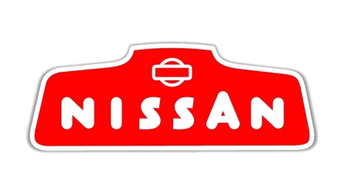 Undated
 Undated
 Undated
 Undated
 Undated
 Undated
 Undated
 1983
1983 Pentagram era
 Undated
 1990s
1990s 2001
2001 2013
2013 2020
2020
The Nissan logo history survives as a sequence of about 22 badges in Nissan’s own brand guidelines, with Nissan and Datsun marks side by side and no dates attached. Logo sites give different years for the same badges, so we group them by decade and order instead of inventing exact spans. In Nissan’s own sequence, the circle drops out for a run of lettering badges and returns in the later ones.
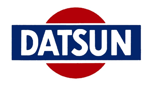
Before Nissan: the Datsun sun badge (1930s)
The emblem began on Datsun cars. Their badge was a solid red disc with a wide cobalt-blue bar that ran past its edges, and white DATSUN letters in the bar. Much later, outside Japan, Datsun cars were rebadged as Nissan between 1982 and 1984, and in some markets the switch finished by 1986.
1930s to 1940s: the first NISSAN badges
Nissan’s earliest badges from the 1930s reused the Datsun formula: a red disc, a navy banner with a white outline, and bold, rounded white NISSAN capitals. Cars sold under the Nissan name appeared from 1937.
That year the company also adopted a separate corporate emblem, used on items such as share certificates: a sun with a single bar through it, framed by a stylized version of the character 日.
The next badge in the sequence is a red six-sided shape with a raised hump in the middle. A small sun-and-bar emblem sits on the hump, above widely spaced white capitals with an oversized A.
1950s: red rectangle and angular lettering
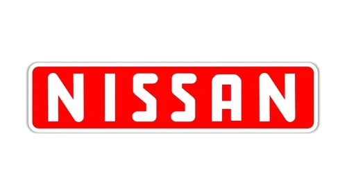
Then the circle disappears. One badge is a red rounded rectangle with a white frame, filled edge to edge by tall, bold white NISSAN capitals.
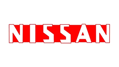
Another drops the frame and sets the name in square-cut red capitals, with a thin white strip running through the letters.
1960s: cursive script and italic
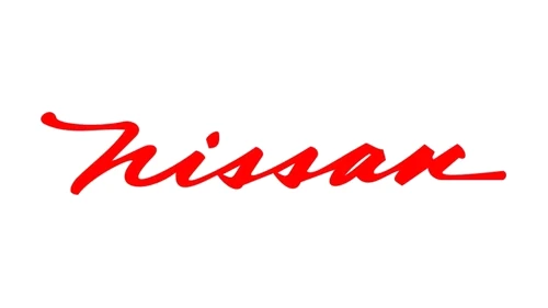
Two softer lettering badges follow. The first is a connected lower-case “nissan” script with long swashes on the first and last letters, red on paper and chrome on the cars.
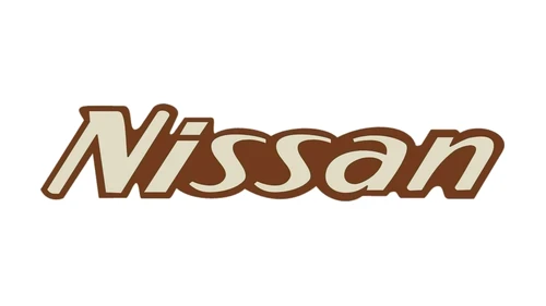
The second is a heavy, rounded italic “Nissan” with a capital N. Nissan’s own collage shows it in cream and gold, while some logo sites draw it in brown.
1970s: serif capitals in a black box, then a bold sans plate
A more formal badge sets widely spaced silver serif capitals inside a long black rectangle with a thin silver border.
It was followed by heavy black sans-serif capitals on a silver or white plate. Neither of these badges has a circle.
1983: the Pentagram sun-and-bar logo
The sun and bar returned with a Nissan logo that Colin Forbes of the design firm Pentagram created in 1982, with lettering by the type designer Matthew Carter. Nissan introduced it in 1983, the company’s 50th anniversary, and kept it until the 2001 redesign. It brought back the red sun and the blue band with white NISSAN capitals, and the corporate version places a small sun badge beside a NISSAN wordmark on a blue band. Carter’s lettering stayed on Japanese dealer signs and katakana model names until 2007.
On the cars, the same idea became a solid chrome disc crossed by a dark banner with raised chrome letters.
Late 1980s and 1990s: plain wordmark and the open ring
A plain black NISSAN wordmark, with no circle, bar or frame, also appears in the sequence.
Before 2001, the Nissan logo on the cars opened up into a thin chrome ring with an empty center, crossed by a NISSAN banner wider than the ring. Nissan’s guidelines show three ring badges of this kind. They belong to one badge family, not to the separate 1990, 1992 and 1998 redesigns listed on some logo sites.
2001: the 3-D chrome ring
The 2001 Nissan logo is a thick, bevelled chrome ring crossed by a silver banner with black NISSAN capitals in a new, wider typeface. It was developed in house during Carlos Ghosn’s turnaround of the company and first appeared on production cars on the Cima (F50) and Primera (P12). It served as Nissan’s brand logo for about 20 years, until 2020.
2013: refined badge and corporate logo
The chrome badge was subtly refined in the early 2010s, and the change is hard to spot next to the 2001 version.
In 2013 Nissan also introduced a steel-blue NISSAN MOTOR COMPANY corporate logo with the Nissan, INFINITI and Datsun badges in a row beneath it. Datsun had just been relaunched that July for emerging markets. The corporate logo switched to “Corporation” later in 2013 and stayed in use until early 2020.
2020: the flat two-arch logo
On 15 July 2020 the flat Nissan logo replaced the chrome ring as the brand logo. The name now splits a thin circle into two arches, as described in the section on the current logo above.
Nissan logo PNG, white and transparent versions
The Nissan logo PNG behind the download button at the top of this page is the current black flat logo on a transparent background. Nissan’s own files come from its US newsroom’s “Company Logos” channel at usa.nissannews.com, which carries the brand logo and the Nissan wordmark, while its brand guidelines at nissanbrandceg.com explain how each version is used. We do not offer a vector file.
Which version to use:
- Black on light backgrounds: the primary flat logo, right for most documents and web pages.
- White on dark backgrounds: the secondary flat logo. Together with the black one, it gives you a black and white Nissan logo pair for one-color print.
- Chrome ring: only to show a car that still wears the pre-2020 badge.
The logo is Nissan’s trademark, so keep it to personal or editorial use and follow Nissan’s guidelines for anything commercial.
Nissan Z, GT-R, NISMO and INFINITI logos
Nissan’s performance models and its luxury brand carry their own marks, next to or instead of the main badge.
Nissan Z logo
The Nissan Z logo on the current car is a “Z” badge on the C-pillar, set beside the rear quarter glass in the same place as on the first-generation S30 Z of 1969. Nissan also hid a Z logo on the side of the automatic transmission case, which you can see only from underneath the car. When the Z powers up, the digital dashboard greets the driver with an animated Z logo.
Nissan GT-R logo
The Nissan GT-R logo belongs to a model line, not a separate brand. The GT-R name first ran on the Skyline GT-R, built from 1969 to 1973 and again from 1989 to 2002, and then on the standalone GT-R (R35), made from 2007 until August 2025. The name is often typed without the hyphen, so the Nissan GTR logo is the same badge. We found no reliable source for the “bold red R” logo described elsewhere, so we do not show one.
NISMO logo
The NISMO logo belongs to Nissan’s motorsport and performance brand. Since April 2022 NISMO has been part of Nissan Motorsport & Customizing, after a merger with Autech. Only the current NISMO logo could be verified; the 1984, 1998 and 2008 logo eras listed on some sites have no source behind them.
INFINITI logo
INFINITI is Nissan’s luxury brand, sold since 1989, and its logo is a design of its own rather than a version of the Nissan badge.
Frequently asked questions
Does Nissan have two logos?
In practice, yes. The flat two-arch logo introduced in 2020 is Nissan's official brand logo, but the new badge has been fitted to cars gradually since 2021. That is why many Nissans on the road still wear the 3-D chrome ring from 2001. Both are genuine Nissan logos; the chrome one is simply the previous generation.
What was the original Nissan logo?
The first badges with the NISSAN name, used in the 1930s, copied the Datsun emblem. They showed a red sun disc with a dark blue banner across it and the name in white capitals. The design itself started on Datsun cars, which belonged to the same group of companies, not to a rival maker.
When did Nissan change its logo?
Nissan changed its badge many times, but three changes stand out in the Nissan logo history. The 1983 Pentagram logo brought back the red sun and blue band, the 2001 logo turned it into a chrome ring, and the flat logo arrived on 15 July 2020. Earlier badges changed often but carry no official dates.
What color is the Nissan logo?
Today the Nissan logo is monochrome: black on light backgrounds, white on dark ones. The original sun badge was red and blue, the red for the sun and the blue for the sky. From 2001 to 2020 the badge was chrome and silver with black letters, and for years the company also used a red wordmark.
Are Nissan and INFINITI the same company?
Yes. INFINITI is Nissan's own luxury brand, and Nissan has sold cars under it since 1989. It has its own name and logo, but the cars come from the same company. Nissan in turn has been allied with Renault since March 1999, and Mitsubishi joined that alliance in 2016, although INFINITI stays a Nissan brand.
What does NISMO mean?
NISMO is short for Nissan Motorsports International. It was formed on 17 September 1984, when Nissan merged its two motorsport departments at the Oppama and Omori works into one company. In April 2022 it combined with Autech to form Nissan Motorsport & Customizing, so NISMO no longer exists as a separate company.
What is Nissan's slogan?
Nissan's slogan is "Innovation that excites," the tagline shown on the company's official US website, nissanusa.com. It is an advertising line, not part of the brand identity, so it never appears inside the badge. It is also separate from founder Yoshisuke Aikawa's motto about a strong belief that penetrates the sun, which the logo expresses.
What country is Nissan from?
Nissan is from Japan. Its head office is in Nishi-ku, Yokohama, the same city where Yoshisuke Aikawa set up the company in 1933. The Japanese origin is built into the brand, since the name is short for Nihon Sangyo, "Japan Industries," and the red circle in the badge is the rising sun of the Japanese flag.