Key facts
- Founded
- 1966
- Founded by
- Romanian government
- Country
- Romania
- Headquarters
- Mioveni, Romania
- Parent company
- Renault Group
- Legal name
- Automobile Dacia S.A.
- Famous models
- Duster, Sandero, Logan, Spring, Jogger
- Website
- www.dacia.com
Brand History
Dacia was founded in September 1966 as Uzină de Autoturisme Pitești, abbreviated as UAP. The brand name derives from the historical region of Dacia that makes up much of present-day Romania. Its headquarters are located in Mioveni, Argeș, Romania.
Ownership changed significantly when Renault completed an initial acquisition in 1990. The company fully became a subsidiary of the Renault Group in 1999. In 2021 it joined Renault’s Dacia-Lada business unit.
The main theme of the brand’s development has been its transformation from a state-owned Romanian manufacturer using traditional heraldic branding into a modern, minimalist, value-oriented brand. This evolution emphasizes robustness, simplicity, and a connection to nature.
Dacia Logo Evolution
1966–1978: Original UAP Heraldic Crest
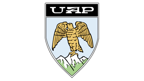
- Design: Traditional crest shape with custom lettering spelling UAP
- Colors: Black, silver, light sky-blue, brown, green, white
- Changes: Unique contour on the letter A within the silver custom lettering
- Context: Eagle symbolized strength and determination while the mountain landscape honored Romania
1978–1990: 3D Metallic UAP Logo
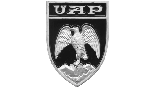
- Design: Simplified and more abstract representation of the eagle and mountains
- Colors: Black and metallic silver
- Changes: Enhanced three-dimensional appearance and better legibility of the UAP lettering
- Context: This update marked a modernization effort before the Renault acquisition and name change
1990–1997: First Dacia Monochrome Crest
- Design: Traditional crest contouring with double black and white outline
- Colors: Strictly black and white
- Changes: Replaced UAP lettering with old-style Dacia lettering that retained elongated upper bars on A letters
- Context: The new Dacia symbol coincided directly with the ownership transition and name change
1997–2003: Blue and White Crest
- Design: Crest without outline and enlarged white inscription
- Colors: Blue and white
- Changes: Removed crest outline and increased size of the lettering while preserving the distinctive A contours
- Context: The update added freshness and improved recognizability of the Dacia car logo
2003–2008: Geometric Pattern Shield
- Design: Shield shape containing a geometric pattern of numerous right angles below the text
- Colors: Bright blue, lighter blue, gray, and white
- Changes: Thick gray outline around the crest and a sharp pointed typeface for the wordmark
- Context: The change reflected ongoing modernization following full integration into the Renault Group
2008–2020: Modern Metallic Shield
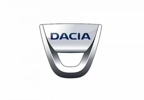
- Design: Metallic shield with rounded bottom and repeating internal shield cutout
- Colors: Glossy metallic silver combined with blue lettering that featured a delicate white outline
- Changes: Refined lines and slightly elevated shades were applied in 2015 for a stronger professional look
- Context: The design served the brand for over a decade and bridged earlier crests with later minimalist approaches
2020: Simplified Logotype Only
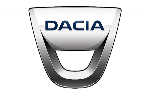
- Design: Plain uppercase lettering without any surrounding shield or crest
- Colors: Black text on white background
- Changes: Complete removal of the silver emblem that had defined previous eras
- Context: The logotype acted as a short-term bridge before the major 2021 rebranding
2021–Present: New Geometric Emblem
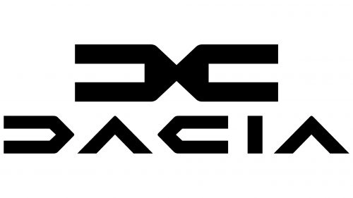
- Design: Abstract geometric emblem formed by two mirrored C-like shapes placed back-to-back, paired with a custom minimalist sans-serif logotype
- Colors: Solid black thick lines for emblem and logotype, brand palette shifted to khaki-green, dark green, terracotta, sand with orange and bright green accents
- Changes: Removed closing strokes on D and A letters, created mirror-image C and D characters, eliminated all previous crest and shield elements
- Context: Inspired by mechanical objects such as gears and tools, the new Dacia emblem reflects simplicity, authenticity, and connection to nature
Direct Links Between Brand Events and Logo Changes
Several corporate milestones directly triggered updates to the Dacia logo history. The 1990 Renault acquisition led to both the immediate name change from UAP to Dacia and the introduction of the first monochrome crest. Full integration into the Renault Group in 1999 initiated a period of gradual modernization that produced the 2003 and 2008 logo updates.
The 2021 strategic repositioning around the themes of essential, robust, and outdoors values resulted in the complete shift to the current geometric black emblem and nature-inspired color palette. Overall the progression has moved from detailed national heraldic symbolism featuring an eagle and mountains toward abstract, modern, minimalist geometry that communicates simplicity and strength.
The brand’s visual identity continues to evolve while maintaining its core Romanian origins and focus on accessible, reliable vehicles. Users searching for Dacia logo png, Dacia logo transparent, Dacia logo hd, or Dacia logo images can reference this timeline to understand how the Dacia car symbol developed across more than five decades.
Dacia badge designs from different periods demonstrate the brand’s journey from state-owned heritage to contemporary value-driven positioning. The current Dacia symbol encapsulates the manufacturer’s commitment to robustness and simplicity while the full Dacia logo evolution provides context for its present minimalist geometric approach.