Key facts
- Founded
- 2018
- Founded by
- Chery Automobile Co., Ltd.
- Country
- China
- Headquarters
- Wuhu, Anhui, China
- Parent company
- Chery Automobile
- Famous models
- Dashing, X70, X90, Traveller
- Website
- jetourglobal.com
Jetour Brand Overview
Jetour was officially launched in 2018 by Chery as a new automotive brand. The brand name Jetour carries the meaning of “victory trail” in Chinese. Its core positioning focus has centered on cars for traveling through the Travel+ strategy.
The brand maintains a fully independent subsidiary relationship with Chery while actively developing its own visual and market identity. Since its founding, Jetour has emphasized creating a unique presence in the automotive sector.
Jetour Logo Evolution
2018 – Today: Original Jetour Logo
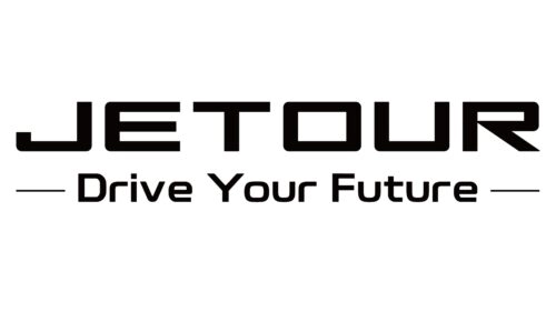
The Jetour logo was created in 2018 specifically for the brand launch. It features a two-line inscription where the upper line with the brand name is significantly enlarged. The design has remained consistent from 2018 to the present day.
- Design: Bold geometric sans-serif typeface with thick strokes, straight cuts, and a unique modified contour of the letter R
- Colors: Primary strict black-and-white palette; secondary white on red background variant
- Changes: None since introduction, used both with and without the tagline
- Context: Introduced simultaneously with the 2018 brand launch to support the Travel+ travel-oriented positioning
The primary Jetour logo includes the tagline “Drive Your Future” on the bottom line, decorated with two thin long horizontal lines on both sides. This tagline directly reinforces the brand values established at founding. The logo can appear as a glossy silver voluminous badge on vehicles.
Typography and Visual Identity
The Jetour logo uses a stable geometric sans-serif typeface with thick lines. Its closest commercial font matches are Ginza Heavy and Sci Fi Bronze Regular, adjusted with the modified R character. This typographic choice contributes to the overall sharp and confident appearance of the Jetour car logo.
The visual identity employs black and white to reflect stability, confidence, and professionalism. The white on red variant adds passion and energy. These elements create a cohesive Jetour emblem that supports the brand’s independent image from its parent company Chery.
The bold uppercase sans-serif style with its clean cuts delivers a modern yet professional look. This approach helps the Jetour symbol communicate reliability while aligning with the brand’s travel-focused philosophy established in 2018.
Jetour Logo Meaning and Legacy
The Jetour logo meaning is closely tied to the brand name that translates as “victory trail.” Combined with the “Drive Your Future” tagline, the visual identity communicates forward motion and exploration. This directly supports the Travel+ strategy that was adopted shortly after the 2018 launch.
Since its introduction, the Jetour logo has played a key role in helping the brand establish an independent image. The strong, bold design helps distinguish Jetour while maintaining a professional automotive presence.
The logo design successfully captures the brand’s core values of confidence and movement. Its enduring use from 2018 to today demonstrates the strength of the original concept created at the time of founding.