Key facts
- Founded
- 1997
- Founded by
- Wuhu Municipal Government
- Country
- China
- Headquarters
- Wuhu, China
- Legal name
- Chery Automobile Co., Ltd.
- Famous models
- Tiggo, Arrizo, QQ, Fulwin
- Website
- www.cheryinternational.com
Chery Brand History
Chery Automobile Co. Ltd. was founded in January 1997 in Wuhu, Anhui Province, China at the initiative of local government officials. The company operates as a government-owned Chinese state enterprise with primary ownership held by the governments of Anhui and Wuhu. Yin Tongyue has served as a key figure since his appointment as technical director in 1996 and later as Chairman.
The automaker produced its first vehicle in 1999 and gained the ability to sell vehicles nationwide in 2001 through a SAIC license, at which point export activities began. Chery established an internal R&D department in 2003 and received its national passenger car production license the same year. By August 2007 the company had produced its millionth vehicle. In 2012 it was named among China’s Top 10 Innovative Enterprises. A major visual identity update occurred in 2013 as the brand reached a more mature stage, followed by its latest logo redesign in 2023.
Chery Logo Evolution
1997: Prelaunch Logo
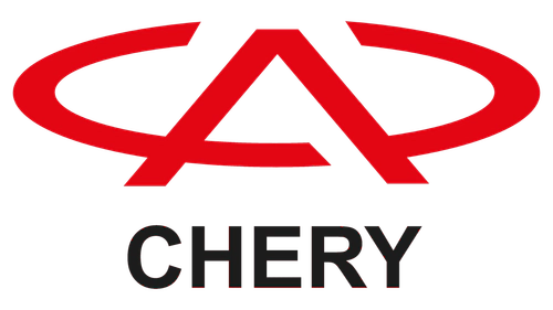
The first Chery logo was created specifically for the launch of the new government-backed automaker. This prelaunch version established the core oval and stylized letter concept that would remain consistent through all future redesigns.
- Design: Bold graphical emblem featuring A-like element inside oval frame with straight lines crossing the bottom
- Colors: Black and white
- Changes: Initial design created for company founding
- Context: Used during prelaunch activities in 1997 before official operations began
1997–2001: First Official Logo
This version served as the first official Chery logo after the prelaunch design. It introduced color and typography while maintaining the foundational emblem structure established at founding.
- Design: Thinner lines with cut-outs on sides of A element for airiness, oval frame, company name in uppercase sans-serif below emblem
- Colors: Red and white
- Changes: Modernization of prelaunch version with refined lines and added wordmark
- Context: Used during initial production and early growth years
2001–2013: 3D Silver Era
During this period the Chery car logo gained a three-dimensional metallic appearance that aligned with the company’s expansion phase. The emblem symbolized the brand’s focus on progress during significant growth and export activities.
- Design: Three-dimensional silver oval containing stylized letter A without horizontal bar, positioned above wordmark
- Colors: Dark red wordmark with silver emblem
- Changes: Added 3D effect and removed horizontal bar from A
- Context: Coincided with major growth, export expansion, and achievement of millionth vehicle milestone, with A standing for Auto
2013–2023: Refined Classic

The 2013 redesign of the Chery emblem updated the previous design to reflect the brand’s maturation and focus on quality. This version maintained the core elements while simplifying the overall execution.
- Design: Smoother and sleeker lines with open oval and thinner straighter A symbol
- Colors: Consistent with previous wordmark but refined
- Changes: Smoother open oval replacing the bolder 3D version
- Context: Update to reflect brand maturation and emphasis on progress and quality
2023 – Present: Modern Minimal
The current Chery symbol represents the latest evolution toward minimalism while preserving the brand’s core visual identity. This redesign continues the long-term shift toward simpler and more contemporary forms.
- Design: Flat execution of A in oval concept with diagonally cut bar ends, modified sans-serif typography with vertical cut-out in top of R
- Colors: Flat black
- Changes: Transition from detailed forms to progressive minimalistic style
- Context: Latest update to appear more progressive while retaining core brand symbols of oval and A representing Auto
Chery Logo Meaning and Design Continuity
The Chery logo meaning centers on the stylized letter A which represents Auto across all eras. Every version has maintained an oval frame in varying forms from closed to open, 3D, and flat. Color evolution has progressed from black and white through red and silver combinations to the current flat black approach. This consistent design philosophy links each Chery logo evolution directly to stages of corporate development from founding through growth, innovation, and current global focus.
The brand’s visual identity provides a clear timeline of its maturation as a Chinese state-owned automaker. From the 1997 prelaunch design to the present minimalist version, each update has balanced continuity with contemporary styling appropriate to the company’s development phase.