Key facts
- Founded
- 1911
- Country
-
 Sweden
- Headquarters
- Södertälje, Sweden
- Parent company
- Traton
- Legal name
- Scania CV AB (publ)
- Famous models
- R-series, S-series, P-series, G-series, Citywide
- Website
- www.scania.com
What the Scania Logo Means
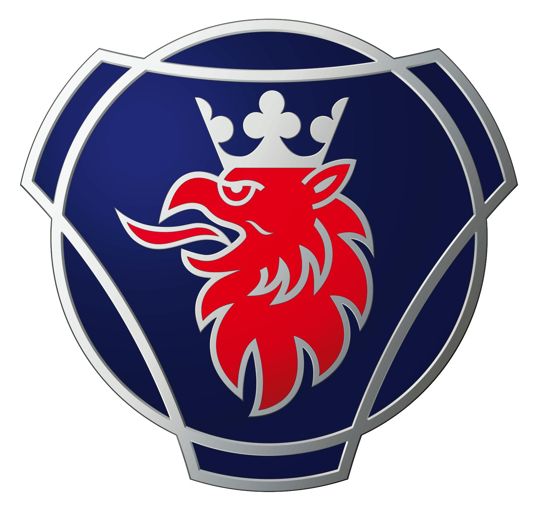
The crowned red griffin comes from the 17th-century coat of arms of Skåne, the southern Swedish province that gave the company its name. The dark blue badge around it is shaped like a bicycle pedal crank, which points back to the bicycles the original Scania company built before it made trucks.
In short, the logo is a regional emblem plus a nod to the company’s first product. Scania publishes no deeper symbolism, so meanings found on logo sites are interpretations.
The Griffin: The Animal in the Scania Logo
The animal is a griffin, a creature from heraldry. In Scania’s own description, it has the hind legs and tail of a lion and the forelegs, head and wings of an eagle. That mix puts Scania among animal logos, and it appears next to the car logos with lions as a griffin. It is not one of the car logos with wings, because the badge shows only the head.
It comes from the arms of Skåne, the province around Malmö where the first Scania company started. Logo sites often say it stands for grandeur, vigilance and strength. That reading comes from those sites, not from Scania.
The Crown and the Colors
Every version of the emblem that shows the griffin also shows its crown, from the small crown of 1901 to today’s badge; only the 1969–1984 wordmark had no griffin at all. That makes Scania one of the car logos with crowns. The crown was gold until the 2016–17 update, when a silver crown replaced it. The head itself is red, and a blue ring or disc has been part of the badge since 1911, so it also belongs with blue car logos.
Scania gives no official meaning for the crown colors. Logo sites commonly read gold as royalty and courage and silver as strength, speed and reliability, but that is commentary.
The Pedal Crank: Scania’s Bicycle Roots
The three-pronged outline around the griffin is a stylized bicycle pedal crank, and Scania itself uses that term. Maskinfabriks-aktiebolaget Scania was founded in Malmö in 1900 as a bicycle maker, after it took over the local branch of the English firm Humber & Co. Its first logotype put the animal at the center of the crank. The crank disappeared at the end of the 1960s and came back in 1995.
Scania Logo History and Evolution
The Scania logo history runs through seven versions, starting with the first logotype registered in 1901. The griffin appears in all of them except the 1969–1984 wordmark. The frame around it changed with the company, which went from a Malmö bicycle maker to Scania-Vabis, then Saab-Scania, then Scania AB, today a Swedish maker of heavy trucks, buses and engines.
| Period | Company | What changed |
|---|---|---|
| 1901–1911 | Maskinfabriks-aktiebolaget Scania | Griffin inside a pedal crank, MALMÖ above it |
| 1911–1954 | AB Scania-Vabis | Ring reads AKTIEBOLAGET SCANIA-VABIS |
| 1954–1968/69 | AB Scania-Vabis (Scania from 1968) | Standardized proportions and colors |
| 1969–1984 | Saab-Scania AB | SCANIA wordmark only, no griffin |
| 1984–1995 | Saab-Scania AB | Griffin returns inside globe-like rings |
| 1995–2016/17 | Scania AB | Pedal crank returns, gold crown |
| 2016/17–today | Scania, Volkswagen Group | 3D finish, silver crown, new wordmark |
1901–1911: The First Scania Logo
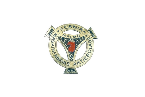
The first Scania logo was registered in 1901 by Maskinfabriks-aktiebolaget Scania, the Malmö bicycle maker set up a year earlier. The company dates from 1900, so 1901 is the year of the logo, not of the founding.
The logotype placed a red griffin head with a small crown at the center of a stylized pedal crank. The ring around it carried the words SCANIA and MASKINFABRIKS AKTIEBOLAGET, and MALMÖ sat above the head. A fine dotted pattern filled the background.
Sources describe the colors differently. The safest description is gold lettering and a red griffin on a dark enamel ground; some aggregators call that ground black, others blue.
1911–1954: The Scania-Vabis Emblem
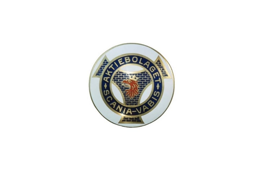
In 1911 the Malmö company merged with Vabis, a railway-wagon maker founded in Södertälje on 11 December 1891. The merger, led by Scania’s managing director Per Alfred Nordeman, created AB Scania-Vabis, and the head office moved from Malmö to Södertälje in 1912.
The new trademark kept the crank and the griffin and added both company names, so the ring now read AKTIEBOLAGET SCANIA-VABIS. The ring turned dark blue with gold lettering and gold outlines on a light disc. A brickwork pattern replaced the dots in the background, and the head stayed red under a gold crown. Scania’s own caption dates this symbol to 1911–1954.
1954–1968/69: The Modernized Scania-Vabis Logo
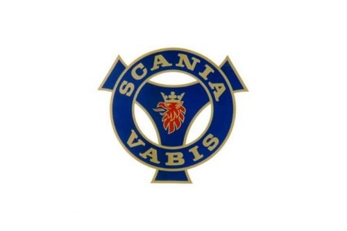
In 1954 Scania-Vabis introduced a modernized logo with standardized proportions and colors, as Scania’s site summarizes it, without listing the changes in detail.
It has a thick blue ring with a gold outline, SCANIA in gold at the top and VABIS at the bottom, and the crowned red griffin at the center of the crank shape. The word AKTIEBOLAGET and the brickwork are gone. This emblem lasted until the company dropped both the Scania-Vabis name and the pedal crank at the end of the 1960s.
1969–1984: The Old Scania Logo Without a Griffin
From 1969 to 1984, Scania trucks and buses carried only the Scania wordmark, set in bold sans-serif capitals. Neither the griffin nor the crank was part of it, which makes this the one old Scania logo without the animal.
Two events led there. Wikipedia reports that Daimler-Benz argued the pedal-crank emblem could be confused with the Mercedes-Benz three-pointed star, a dispute it describes as decided in 1968. Separately, in February 1968 the company launched a new truck range and shortened its name from Scania-Vabis to Scania. On 1 September 1969 it merged with Saab AB to form Saab-Scania AB, and from then on vehicles showed the wordmark alone.
Sources disagree on whether the letters were blue or silver. The image above follows one logo archive, which shows silver letters joined by short bars; neither detail is confirmed by Scania.
1984–1995: Reuterswärd’s Griffin Returns
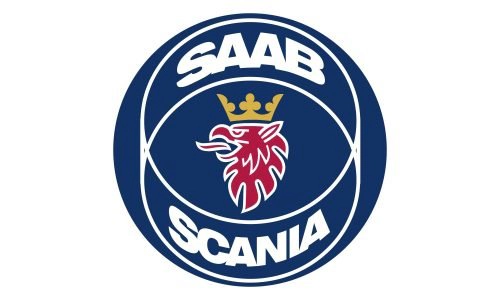
In 1984 the griffin returned after 15 years away, in a Saab-Scania emblem designed by the Swedish artist Carl Fredrik Reuterswärd. Scania called the return long-anticipated. Reuterswärd is best known for Non-Violence, his knotted-barrel revolver sculpture at the UN headquarters in New York.
His design left out the pedal crank. Instead, spherical rings surround the head: two thin white lines cross around it like the outline of a globe. The red griffin with a gold crown sits on a blue circle, with SAAB in white letters above and SCANIA below. This Scania emblem served as the symbol of the whole Saab-Scania group, including Saab.
1995–2016/17: The Pedal Crank Comes Back
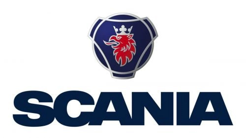
Scania split from Saab in 1995, when the truck and bus business became Scania AB, and the new company listed on the stock exchange in 1996. In 1995 Scania also restored the pedal crank and griffin trademark in a modernized form.
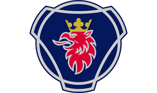
The badge is a rounded three-pronged crank around a dark blue disc, with a silver outline, a crimson griffin head and a gold crown. It has no lettering inside; the SCANIA wordmark is set apart from it. Today’s badge descends from this shape, not from the 1984 rings.
2016–17 to Today: The New Scania Logo
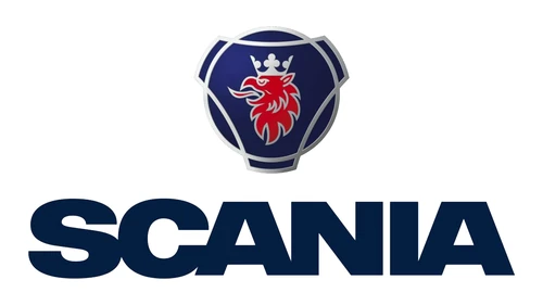
The new Scania logo comes from an identity update by the agency Brand Union. Scania dates the update to 2016, while trade press covered the rollout in February 2017, so the fairest date is 2016–17. Scania called it the first major update in two decades.
The badge kept the 1995 shape but gained a three-dimensional finish, a silver-gray metallic ring and brighter blue and red. A silver crown replaced the gold one, and that silver crown is on every current Scania logo. The wordmark became more distinct and is set in the custom Scania Sans typeface. In the full logo, the bold SCANIA wordmark sits below or beside the symbol.
Other Scania Emblems and Badges
Besides the main logo, Scania’s official accessories range uses several other marks:
- Scania symbol: the current crank-shaped griffin badge. Scania sells it as a chrome Scania badge.
- Wordmark: the SCANIA lettering, which Scania publishes as a separate file from the symbol.
- Super emblem: a heritage badge that Scania makes according to the original drawing. The catalog does not say which era it comes from.
- Scania-Vabis symbol: used on Scania’s heritage hubcaps, a reminder of the company’s name until 1968.
- V8 symbol: also offered on heritage hubcaps. It refers to Scania’s V8 engines; the company launched a 350 hp V8 turbo-diesel in 1969, at the time the most powerful truck engine in Europe.
Scania Logo PNG: Download and Use
The Scania logo PNG on this page is the current Scania symbol: the three-dimensional badge with the silver crown, without the wordmark. It has a transparent background and measures 1728 × 1641 pixels, so it works on light and dark layouts.
For brand work, use Scania’s own files. Scania publishes its current symbol and wordmark as SVG on scania.com, and its brand history and media files are on the Scania Media Portal. If you need the Scania logo in black and white, start from those vector files rather than converting a PNG with gradients.
The symbol and the wordmark are Scania trademarks. Use them to refer to the company, not to suggest a partnership.
Frequently asked questions
Why does Scania have the same logo as Saab?
Because the two companies were one group for 26 years. Scania merged with Saab on 1 September 1969 to form Saab-Scania AB, and the griffin emblem of 1984 became the symbol of that group, so Saab cars carried the griffin too. The partnership ended in 1995, when Scania split from Saab.
What is the animal in the Scania logo?
A griffin, a creature from heraldry with the hind legs and tail of a lion and the forelegs, head and wings of an eagle. Scania took it from the coat of arms of Skåne, its home province. The badge shows only the griffin's red head, topped by a crown.
What does Scania mean in Swedish?
Scania is the Latin name of Skåne, the southernmost province of Sweden, where the original company was founded in Malmö in 1900. The same region supplied the griffin in the logo. The name is not an acronym, so Scania does not stand for a longer phrase; it simply means the Skåne region.