Key facts
- Founded
- 1916
- Founded by
- Tokyo Ishikawajima Shipbuilding and Engineering Co., Ltd.
- Country
- Japan
- Headquarters
- Yokohama, Japan
- Legal name
- Isuzu Motors Limited
- Famous models
- Elf, D-Max, Giga, Trooper
- Website
- www.isuzu.co.jp/world
Isuzu Logo Evolution
1949 – 1974: First Logo Era
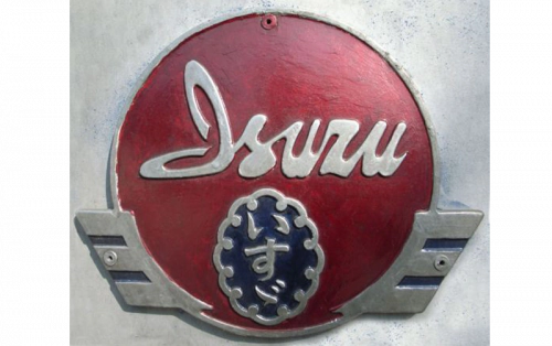
The first Isuzu logo was introduced immediately after the company officially changed its name to Isuzu in 1949. This design marked the formal beginning of the Isuzu brand identity following its time as Ishikawajima.
- Design: Blue shield containing an oval ornate medallion with Japanese wordmark
- Colors: Blue shield, red rectangle, white lettering
- Changes: Created directly due to the 1949 company renaming after the Isuzu River
- Context: Traditional formal heraldic style that reflected the brand’s new name meaning fifty bells
1974 – 1991: Second Logo Era
The second Isuzu logo appeared in 1974 following the company’s partnership with General Motors. This redesign symbolized a new beginning after GM acquired a 34 percent stake in 1972.
- Design: Two vertical pillars with diagonally cut tops above the white ISUZU wordmark
- Colors: Bright red background with white elements
- Changes: Replaced the previous shield and medallion design with pillar symbolism representing the Japanese character for the first syllable of Isuzu
- Context: Pillars also represented a traditional stamp of excellence used by craftsmen and corporate growth against a sunburst red background
1991 – Present: Third Logo Era
The third and current Isuzu logo was introduced in 1991 as part of a strategic shift toward simplification. This version removed the emblem entirely to create a cleaner, more modern brand appearance.
- Design: Text-based logo only using smooth bold sans-serif typeface with mirrored S and Z for symmetry
- Colors: White lettering on red background or red lettering on white background
- Changes: Eliminated the pictorial emblem while retaining the red-and-white palette established in 1974
- Context: Reflects values of progress and high quality through minimalist yet powerful simplicity
The Isuzu logo evolution demonstrates how each redesign was directly tied to major corporate events. The red and white color scheme introduced in 1974 has remained consistent through both the partnership era and the current minimalist period.
Isuzu logo history shows a clear progression from formal heraldic styling to symbolic representation and finally to modern simplicity. The brand continues to use its current wordmark across applications, providing Isuzu car logo recognition worldwide. The mirrored S and Z in the present design create visual balance that strengthens Isuzu symbol impact in both digital and physical formats.