Key facts
- Founded
- 1923
- Founded by
- Harry Kent, Edgar K. Worthington
- Country
- United States
- Headquarters
- Kirkland, Washington, United States
- Parent company
- PACCAR
- Legal name
- Kenworth Truck Company
- Famous models
- W900, T680, T880, T800, K100
- Slogan
- “The World's Best”
- Website
- www.kenworth.com
Kenworth Brand History
Kenworth traces its roots to 1912 when the Gerlinger brothers established Gerlinger Motors in Portland, Oregon as a car and truck dealership. The company produced its first truck in 1914 equipped with an inline six-cylinder engine. In 1923 the business was acquired by new owners whose names were combined to create the Kenworth brand name.
The company has experienced multiple ownership changes since the 1923 renaming. It currently operates as a wholly owned subsidiary of Paccar and is recognized for manufacturing medium and heavy-duty Class 8 trucks. Its headquarters remain in the Seattle area at Kirkland, Washington.
Kenworth Logo Evolution
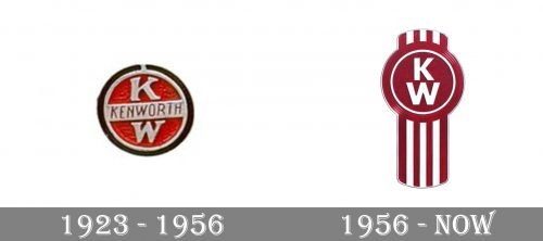
1923 – Original Kenworth Badge
The 1923 logo marked the official transition from Gerlinger Motors to the new Kenworth name. This Kenworth emblem featured a central KW monogram with the letters placed one above the other in serif typography. A silver plate displayed the full Kenworth name in smaller, thinner letters below the monogram. The design was enclosed in a silver circle with red filling and featured black trim encircling the entire badge. This early Kenworth symbol reflected the decorative style typical of its era.
- Design: Central K and W letters stacked vertically with serif strokes
- Colors: Red, silver, and black
- Changes: First documented logo after the 1923 name change
- Context: Represented the shift from Gerlinger family ownership to new owners
1956 – Minimalist Redesign
The 1956 redesign introduced a cleaner and more minimalistic approach to the Kenworth logo. This Kenworth badge retained the KW monogram as its centerpiece but modernized the letter strokes to equal width without serifs. Designers removed the name plate and black trim while adding vertical silver and red stripes. An optional Kenworth wordmark could appear below in bolder, heavier, and simpler typography than before. This Kenworth logo evolution aligned with mid-20th century design trends favoring simplicity and stronger visual impact.
- Design: Modernized KW letters with equal-width strokes
- Colors: Red and silver as primary elements
- Changes: Simplified from the cluttered 1923 version
- Context: Reflected broader industry movement toward minimalism
Current Primary Logo
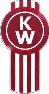
The current primary logo builds directly on the 1956 design while incorporating modern refinements. This Kenworth symbol maintains the KW badge with its distinctive vertical red and silver stripes. The design features a noticeable three-dimensional effect that adds depth to the emblem. Adjacent to the badge appears the text Kenworth, The World’s Best in black lettering. This version of the Kenworth car logo preserves the brand’s heritage while updating it for contemporary use.
- Design: Similar structure to 1956 version with added depth
- Colors: Silver, red, and black
- Changes: Added slogan and 3D effect to the established design
- Context: Deliberately reflects the 1956 logo to honor brand history while maintaining the enduring KW monogram
Current Corporate Logo
The current corporate logo serves a distinct purpose from the primary brand mark. This version places the familiar roundel with stripes inside a white square outlined in red. Next to it sits a red square containing KENWORTH in large white letters. Below appears the phrase A Paccar company in black text. This flatter, more corporate style explicitly links the Kenworth brand to its parent company.
- Design: Square format with integrated roundel and text blocks
- Colors: Red, white, and black
- Changes: More structured layout than the primary logo
- Context: Used for corporate communications to highlight Paccar ownership
Kenworth Logo Design Consistency
The KW monogram has remained the core symbol of the Kenworth logo since 1923. This enduring element provides visual continuity across more than a century of brand history. Red and silver have served as the primary colors consistently throughout all eras of the Kenworth logo evolution. Black has been used variably as a supporting color while white appears mainly in modern backgrounds and corporate applications.
The brand has followed a philosophy of gradual simplification while preserving its fundamental visual identity. Each redesign has maintained the red and silver color scheme and the central KW symbol that originated with the 1923 badge. This approach demonstrates how Kenworth balances respect for its heritage with adaptation to changing design trends. The current primary logo specifically echoes the 1956 version to reinforce the company’s historical roots.
The Kenworth logo meaning centers on the combination of founder names and the enduring KW monogram that has defined the brand for over one hundred years. From its origins in Seattle to its present status as part of Paccar, the visual identity has evolved thoughtfully while staying true to its core elements.