Key facts
- Founded
- 2002
- Founded by
- Navistar International
- Country
- United States
- Headquarters
- Lisle, Illinois, United States
- Parent company
- Traton
- Famous models
- CE Series, RE Series, TC Series
- Website
- www.icbus.com
Brand History and Corporate Evolution
IC Bus represents the modern continuation of a school bus manufacturing lineage that began with Ward Body Works in 1933. The company underwent multiple ownership and naming changes, including the transition to AmTran in 1992 and acquisition by Navistar International in 1995. In 2002 Navistar renamed the subsidiary IC Corporation, emphasizing the Integrated Coach concept, before changing the name to IC Bus in 2009.
Current headquarters are located in Lisle, Illinois, with production eventually moving to Tulsa, Oklahoma after the 2002 reorganization. The former Ward and AmTran manufacturing facility in Conway, Arkansas remained in use until 2010.
IC Bus Logo Evolution
1933–1992: Ward Era
- Design: Simplified side-profile illustration of a yellow school bus with stark black windows and simplistic black structural lines
- Colors: Classic yellow, deep grey for text, black structural elements
- Changes: Established the first visual identity for the company founded in Conway, Arkansas
- Context: Used throughout the Ward Body Works period and directly tied to the 1933 founding
1992–2002: AmTran Era

- Design: Monochromatic design centered on the word AmTran with stylized integration of initial A with m
- Colors: Single color throughout, relying on bold typeface
- Changes: Replaced the pictorial bus image with a wordmark featuring a slanting line on the right side of A
- Context: Introduced with the 1992 transition to AmTran and reflected the new corporate identity
1996–Today: IC Bus Shield Logo
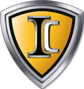
- Design: Shield-shaped heraldic emblem featuring large stylized interlocking I and C letters in sleek metallic font
- Colors: Vibrant yellow background with thick silver-grey border transitioning to narrower darker outline
- Changes: Minor revision in 2013 with added Navistar script creating the IC wing logo variation
- Context: Adopted through the 2002 IC Corporation transition and 2009 name change to IC Bus while conveying strength and reliability
IC Bus Logo Meaning and Symbolism
The letters IC stand for Integrated Coach, a name that highlights the single-corporate-structure assembly approach developed in the early 2000s. This concept directly influenced the branding emphasis on strength and reliability expressed in the shield emblem. The current ic emblem maintains the heraldic shield shape that has served as the core visual symbol since 1996.
Many resources provide ic logo png, ic logo transparent, and ic logo hd versions for reference. The ic symbol continues to represent the brand’s evolution from its Ward roots through multiple corporate reorganizations.
Legacy of Visual Identity Changes
The ic logo history shows a clear progression from pictorial representation to modern typography and finally to a strong heraldic emblem. Each ic logo evolution coincided with significant corporate milestones, from the 1992 AmTran transition to the 2002 IC Corporation renaming and the 2009 change to IC Bus. The enduring use of the shield design demonstrates the strength of the visual identity created in 1996.
For those seeking ic logo images, ic badge details, or ic logo download options, the shield emblem with its interlocking letters remains the definitive current mark. This evolution from the ward bus logo through the AmTran typography logo to the present ic car logo reflects the company’s journey while preserving continuity through the ic symbol that has defined it for nearly three decades.