Key facts
- Founded
- 1986
- Founded by
- Li Shufu
- Country
- China
- Headquarters
- Hangzhou, China
- Legal name
- Zhejiang Geely Holding Group Co., Ltd.
- Famous models
- Emgrand, Coolray, Atlas, Boyue, Preface
- Website
- www.geely-motors.com
Geely Brand History
Geely was founded in 1986 by Li Shufu. The name Geely translates to “lucky” or “auspicious” in Chinese. Headquartered in Hangzhou, the brand has grown into a progressive Chinese automaker known for adopting new technologies and regularly updating its visual identity to match its development stages.
The company’s trajectory shows a clear movement toward greater luxury and modernity. This evolution is most visible in its logo history, which has become progressively simpler and more stylish over time.
Geely Logo Evolution
1986–1998: First Logo

The first Geely logo captured the energy of a new startup. It featured an abstract red shape on a black background with a stylized “G” resembling a wing or dynamic swoosh.
- Design: Abstract red shape with stylized “G” laid on its side, ascending bars creating perspective of acceleration, thick bold lines
- Colors: Predominantly red and black
- Changes: First visual identity used during the founding period
- Context: Conveyed energy, passion, power, movement, speed, strength, and confidence while remaining simple and memorable
1998–2008: Second Logo
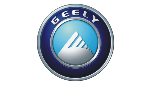
The second Geely logo introduced a more structured and global appearance. A circular band surrounded the central emblem while “GEELY” appeared in capital letters above.
- Design: Circular band surrounding lettering, central stylized shield or wing emblem, symmetrical layout
- Colors: Blue with light to dark gradient, silver tones
- Changes: Shift from abstract red and black to blue metallic circular design
- Context: Represented global reach, wholeness, protection, freedom, reliability, depth, modern technology, balance, precision, unity, and quality
2008–2014: Third Logo
The third Geely logo continued the blue theme while introducing a symbol tied to the brand’s origins. A circular emblem in two tones of blue featured a triangular element in the center.
- Design: Circular emblem, silver-white wordmark around upper perimeter, triangular symbol on light-blue background
- Colors: Blue palette in two tones, silver-white
- Changes: Replaced previous wing element with triangular symbol
- Context: Triangle symbolized the mountains of China, the brand’s birthplace, and represented company growth, professionalism, and stability
2014–2019: Fourth Logo
A major redesign occurred in 2014 as part of Geely’s luxury repositioning. The new Geely emblem took the form of a flattened shield made from six precious stones.
- Design: Flattened shield composed of six diamonds divided by golden frames, bright blue wordmark in all caps
- Colors: Bright blue, black, blue, gold
- Changes: Complete redesign introducing diamond and shield motif while retaining some previous color elements
- Context: Communicated quality, design excellence, and market influence through luxurious symbolism following the Volvo acquisition and higher-end market positioning
2019–2023: Fifth Logo

The fifth Geely logo refined the previous design with more contemporary details. The crest was stretched horizontally while materials received a more matte appearance.
- Design: Horizontally extended crest with elongated diamonds, updated Chinese logotype above smaller “Geely Auto” lettering
- Colors: Dark gray lettering, matte blue and black elements, silver frame
- Changes: Framing changed from gold to silver, elements given matte shades
- Context: Continued luxury positioning after Volvo acquisition with incremental modernization of the 2014 design
2023–Present: Sixth Logo
The current Geely logo represents the latest stage in the brand’s visual simplification. Six flat black fragments form a horizontally-stretched crest set against a gradient background.
- Design: Flat, simplified horizontally-stretched crest formed by six separate black fragments, uppercase medium-weight sans-serif lettering below
- Colors: Black fragments, bright blue gradient, dark lettering
- Changes: Further simplification of the crest while maintaining its recognizable shape
- Context: Continues the long-term trend toward modern, stylish, and luxurious identity suitable for global premium market presence
Logo Change Drivers and Brand Legacy
Several key milestones drove changes to the Geely logo meaning and design. The early abstract phase reflected startup energy and ambition. The circular and blue metallic designs that followed emphasized technological reliability and professionalism.
The Volvo acquisition marked a significant turning point. It prompted a shift from functional to luxurious positioning that influenced all subsequent designs. The 2014 redesign introduced the diamond and shield motif to signal premium quality and market power.
Later refinements in 2019 and 2023 continued this evolution toward clean contemporary luxury. The consistent focus on progressive simplification has created a distinctive Geely car logo recognized across global markets today.
The complete Geely logo history demonstrates how visual identity supported the brand’s growth from local manufacturer to international player. Each version of the Geely symbol, Geely emblem, and Geely badge has reflected the company’s expanding ambitions and elevated market positioning.