
Key facts
- Founded
- 2014
- Founded by
- William Li
- Country
- China
- Headquarters
- Shanghai, China
- Legal name
- NIO Inc.
- Famous models
- ES8, ES6, ET7, ET5, EC6
- Website
- www.nio.com
Nio Logo Evolution
2014 – 2016: NextEV Logo
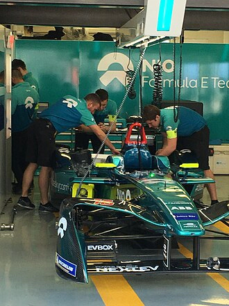
- Design: Crisp contemporary bold capital letters with sharp angles
- Colors: Grayscale for NEXT combined with turquoise contrast for EV
- Changes: Stylized E incorporates a forward-facing arrow symbol
- Context: Used during the company’s original NextEV identity phase after founding by William Li in 2014
2016 – Present: NIO Logo
- Design: Abstract symmetrical shape resembling a simplified Greek letter Omega
- Colors: Monochrome design dominated by bold black color on clean white background
- Changes: Upper portion forms a half-moon while bottom splits into two tapering sections
- Context: Introduced alongside the transition from NextEV to NIO on 21 November 2016 at the official brand launch in London
Nio logo meaning connects directly to the brand’s core philosophy of Blue Sky Coming. The top half of the Nio symbol represents sky, openness, vision and the future while the bottom half symbolizes earth, direction, action and forward momentum.
The Nio car logo was redesigned to create a minimalist and elegant aesthetic that aligns with the company’s belief in a brighter sustainable future. This visual identity replaced the earlier NextEV logo during the major rebranding that occurred two years after the company’s founding.
Nio emblem maintains its abstract form as a constant element of the brand since the 2016 global launch. The design intentionally encodes the literal translation of Weilai through its sky and earth representations.
Nio logo history spans two distinct eras beginning with the 2014 founding under the NextEV identity. The shift in 2016 marked both a name change and the adoption of a completely new visual approach tied to the Blue Sky Coming philosophy.
Nio logo png versions and high-resolution assets often feature the current black symbol due to its clean minimalist lines. The abstract form works effectively across different applications while preserving its original meaning.
Nio car symbol continues to represent the transition that happened when the company moved away from the turquoise and grayscale NextEV design. This change coincided with the first vehicle unveiling at the London launch event.
The Nio badge reflects the company’s Chinese roots through its visual interpretation of the name meaning Blue Sky Coming. Since its introduction in 2016 the symbol has remained unchanged.
Nio logo images typically highlight the contrast between the upper sky element and lower earth sections of the mark. This deliberate split creates the sense of momentum described in the brand’s foundational philosophy.
Nio logo download options commonly include the monochrome version that has been in use since the official brand launch. The design’s simplicity makes it versatile for various media while staying true to its original intent.
Nio logo transparent background files showcase the abstract Omega-like shape without any surrounding elements. This format emphasizes the pure form that connects the top sky representation with the bottom momentum sections.
Nio logo hd renderings preserve the precise curves and angles that distinguish the current symbol from the sharper typography of the earlier NextEV period. The evolution reflects the company’s growth from its 2014 founding to its 2016 rebranding.