Key facts
- Years active
- 1954–1988
- Founded by
- Nash-Kelvinator, Hudson Motor Car Company
- Country
- United States
- Headquarters
- Southfield, Michigan, United States
- Parent company
- Chrysler Corporation
- Legal name
- American Motors Corporation
- Famous models
- Rambler, Javelin, AMX, Gremlin, Pacer
Brand Overview
American Motors Corporation was founded on May 1 1954 through the merger of Nash-Kelvinator Corporation and Hudson Motor Car Company. The company focused on affordable compact vehicles and developed a patriotic visual identity based on the red white and blue tricolor of the United States flag. It remained in operation until June 20 1988.
The American Motors logo meaning centered on moderate patriotism expressed in a modern and stylish manner. This approach reflected the companys value of its roots and national identity. The patriotic theme remained consistent even as the visual design changed once during the brands lifetime.
American Motors Logo Evolution
1954 – 1967: First Logo Era
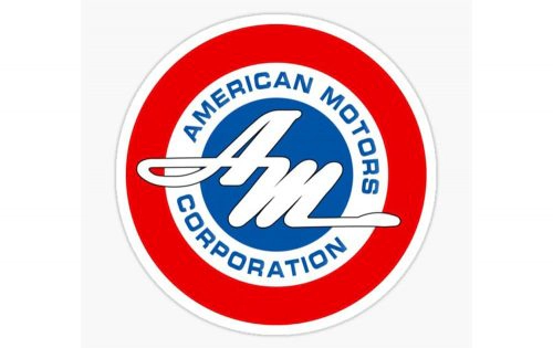
The first American Motors car logo appeared at the time of the companys founding in 1954 and remained in use through 1967. This design took the form of a circular badge composed of three concentric parts with a thick red outer circle. A white middle ring displayed the full name while the center featured a stylized monogram.
- Design: Circular badge with three concentric sections and elongated monogram letters that visually close the outlines
- Colors: Red white and blue
- Changes: None during this period as it served as the original emblem
- Context: Introduced alongside the 1954 company formation via the largest corporate merger in US history at the time
The American Motors emblem from this era established the patriotic color foundation that would persist throughout the brands history. Its classic style emphasized national identity in an emblematic form suitable for an emerging independent automaker.
1966 – 1969: Transitional Logo Era
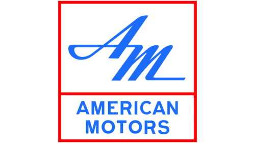
A transitional American Motors symbol appeared between 1966 and 1969 overlapping with the first design. This version adopted a rectangular shape with a thin red border and white background. The upper section presented stylized blue initials while the lower section carried the full company name.
- Design: Two-tiered rectangular emblem featuring bold initials joined by a flowing horizontal stroke
- Colors: Blue red and white
- Changes: Shifted from circular badge to rectangular format while keeping patriotic colors
- Context: Served as a bridge between the original circular design and the major 1970 redesign
This American Motors badge offered a dynamic yet classic appearance that continued to emphasize national identity. The flowing stroke in the initials suggested motion appropriate for an automotive brand.
1970 – 1988: Final Logo Era
The final American Motors car symbol was introduced in 1970 and remained in use until the company closed in 1988. This redesign replaced the circular format with a square badge featuring a white background. A geometric abstract structure appeared above the company name with a solid red triangle and vertical blue rectangle separated by white negative space.
- Design: Square badge with abstract geometric shapes and sans-serif typography
- Colors: Brighter and darker red blue white with black lettering
- Changes: Complete shift to geometric forms while preserving the core red white and blue palette
- Context: Coincided with a new corporate direction and brighter color treatment
The American Motors logo hd version from this period used bold slightly narrowed sans-serif lettering in title case. The red triangle symbolized growth and success while the blue rectangle represented stability and solidity. This remained the final design used during the brands lifetime.
Logo Design Meaning and Symbolism
Red in the American Motors logo represented passion and strength. White conveyed tenderness loyalty and care. Blue stood for reliability protectiveness and trustworthiness. Black was added in the 1970 version to express professionalism and authority.
The overall identity used the patriotic tricolor in a modern stylish manner. This approach demonstrated the companys commitment to its roots and motherland. Only one major redesign occurred in 1970 when the geometry changed completely but the iconic colors and patriotic mood were carefully preserved.
The 1970 redesign brightened the colors while maintaining the core American Motors logo philosophy. The abstract geometric elements reinforced messages of growth stability and professionalism.
Key Brand Milestones Related to Visual Identity
- 1954: Company formation and introduction of first circular patriotic logo
- 1970: Major logo redesign with brightened colors and abstract geometric design
- 1979: Renault acquires significant interest in AMC with logo style later visible in some Renault models of the 1980s
- 1988: AMC discontinued with trademark later held by FCA US LLC
The American Motors logo evolution shows remarkable consistency in its patriotic color choices despite significant changes in shape and style. The 1954 founding logo set the foundation with its circular badge while the 1970 version modernized the presentation without abandoning the brands core visual values. This visual continuity reflected the companys enduring emphasis on American Motors identity throughout its history.
The final American Motors logo transparent background versions preserve the clean square design with its distinctive red triangle and blue rectangle. These elements continue to represent the brands legacy of combining patriotism with modern design thinking.