Key facts
- Years active
- 1938–2011
- Founded by
- Edsel Ford
- Country
- United States
- Headquarters
- Dearborn, Michigan, United States
- Parent company
- Ford Motor Company
- Famous models
- Cougar, Grand Marquis, Sable, Marauder, Mountaineer
Mercury Brand Overview
Mercury was founded in 1938 by Edsel Ford and officially introduced on November 4, 1938, with its first vehicles released as 1939 models. The brand served as an entry-level premium offering positioned between Ford and Lincoln in the Ford Motor Company portfolio. Named after the Greek and Roman god Mercury, the brand emphasized themes of mobility, commerce, and travel while operating primarily in North and South American markets.
The core identity of Mercury remained connected to its mythological name throughout its existence. This connection directly shaped the initial logo design chosen by its founder. The brand maintained this foundational link even as its visual representation evolved over decades.
Mercury Logo Evolution
1938–1950s: Mythological God Profile

The first Mercury logo directly reflected the brand’s mythological name chosen by Edsel Ford. This design featured a detailed side profile of the god Mercury wearing his iconic winged hat. The wings were occasionally stylized to suggest an M shape, and the emblem was frequently used as a hood ornament.
- Design: Detailed side profile of the god Mercury in winged hat
- Colors: Monochrome in early applications
- Changes: Wings sometimes stylized as M shape
- Context: Most literal representation of the brand name Mercury logo meaning
1950s–1960s: Cougar Symbol
Success of the Mercury Cougar model prompted a significant shift in the brand’s visual identity during this period. The new design moved away from mythological imagery toward a representation of power and strength. This emblem featured a cougar profile with an open mouth, appearing ready to attack.
- Design: Profile contour of cougar with open mouth enclosed in circle
- Colors: Monochrome palette changed to metallic when placed on vehicles
- Changes: Dramatic departure from original god profile
- Context: Cougar model success drove adoption of this Mercury car symbol
1980s–2003: Stylized M with Wings

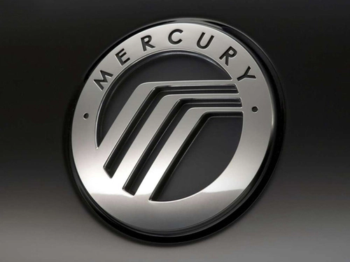
The Mercury emblem underwent modernization with an abstract design that still maintained subtle connections to earlier motifs. This version presented a stylized letter M created through three parallel lines running diagonally from an inner circle before angling right. The design was enclosed within a double circle frame.
- Design: Abstract M created by three parallel diagonal lines in double circle
- Colors: Transitioned from monochrome to metallic finishes
- Changes: Introduced nameplate Mercury around upper part of emblem
- Context: Represented push toward contemporary design while echoing original winged elements
2003–2011: Abstract M Winding Road

The final evolution of the Mercury logo refined the abstract M design for the brand’s last years. This version continued using three parallel lines to form the M shape within a double circle frame. The color scheme shifted to silver-gray tones that referenced the metallic element mercury.
- Design: Abstract letter M with lines suggesting winding road or winged helmet
- Colors: Consistent silver-gray tones representing metallic element
- Changes: Refined version of previous abstract design with enhanced elegance
- Context: Final Mercury badge used until brand discontinuation in 2011, considered synthesis of mythological origins and modern values
Key Relationships in Mercury Logo History
The Mercury logo evolution followed clear connections between brand events and design changes. The 1938 founding directly led to the initial mythological god logo that celebrated the name personally selected by Edsel Ford from over 100 options.
Later success of the Cougar model in the 1960s triggered the shift to the animal emblem representing power and authority. The modernization efforts in subsequent decades produced the abstract M designs that retained echoes of the original winged helmet concept.
These designs maintained themes of mobility, strength, and sophistication across all phases. The final winding road interpretation of the abstract M brought together the brand’s mythological beginnings with contemporary design principles.
The silver-gray metallic treatment in later years reinforced connections to both the element mercury and the brand’s sophisticated positioning. This visual identity was retired along with the brand on January 4, 2011.
Visual Identity Summary
Mercury car logo designs consistently maintained a connection to the brand name while progressing from literal to abstract representations. Early monochrome applications gave way to metallic finishes that enhanced the premium positioning. The final silver-gray palette directly represented the metallic element associated with the brand name.
All phases of the Mercury symbol emphasized mobility and strength appropriate to a brand named after the swift messenger god. The progression from god profile to cougar to abstract M reflected changing market strategies while preserving core brand DNA. The final Mercury logo transparent background versions continue to serve as references for automotive design history.
This Mercury logo history documents how a brand created to fill a pricing gap developed a distinctive visual language that evolved with automotive trends over more than seven decades. The designs remain studied examples of how logos can honor origins while adapting to new eras.