Key facts
- Years active
- 1945–2014
- Founded by
- Saab AB
- Country
- Sweden
- Headquarters
- Trollhättan, Sweden
- Parent company
- NEVS
- Legal name
- Saab Automobile AB
- Famous models
- 900, 99, 9-3, 9-5, 96
- Slogan
- “Born from Jets”
Saab Brand History
Saab originated in 1937 as an aerospace company known as Saab AB. Automotive production started in the years 1945–1947 in Trollhättan, Sweden. The brand became closely associated with Swedish innovation, safety engineering, and distinctive design.
Ownership changed several times across decades. Saab AB controlled the company from 1945 to 1968. The 1968 merger with Scania-Vabis created Saab-Scania, which owned the automotive division until 1990. General Motors held the brand from 1990 to 2010, followed by Spyker from 2010 until the company’s 2012 bankruptcy; new owner NEVS then built the last Saab-badged cars before production ended in 2014.
Saab Logo Evolution
1947–1984: Pre-Griffin Period
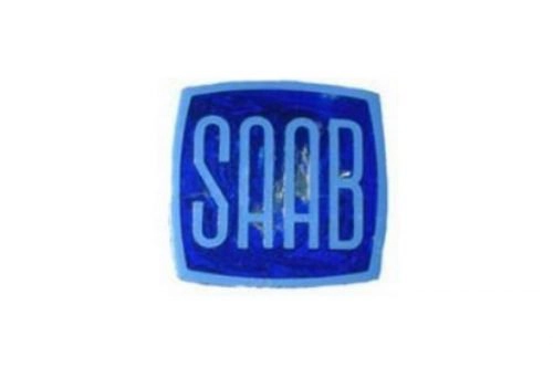
The early Saab logo focused entirely on the company’s aircraft heritage. Designers used airplane motifs paired with the SAAB name in various sans-serif styles. These logos appeared in blue, silver, and monochrome versions across different decades.
- Design: Simple aircraft symbol or stylized plane inside square frames with rounded corners
- Colors: Blue backgrounds, silver frames, black or silver lettering
- Changes: Multiple refinements between 1947 and 1984 including bolder lettering and layout adjustments
- Context: Direct visual reference to aerospace roots before the griffin was introduced
1984–1995: Saab-Scania Griffin Introduction
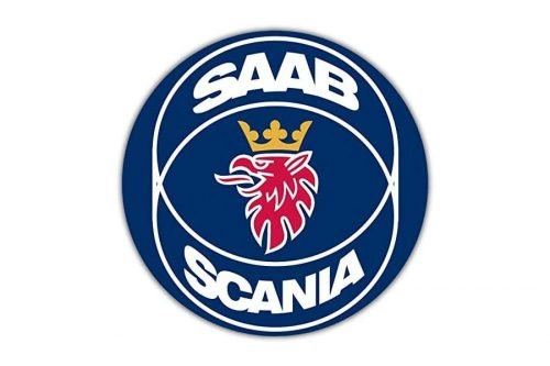
The Saab-Scania merger eventually led to the adoption of the griffin symbol in 1984. This joint logo featured a red griffin head inside a dark blue roundel. Carl Frederik Reuterswärd designed the emblem using elements from regional coats of arms.
- Design: Red griffin head inside concentric circles with SAAB above and SCANIA below
- Colors: Red griffin, dark blue roundel, silver rings and lettering
- Changes: First appearance of the griffin symbol previously used by Scania-Vabis
- Context: Marked the formal integration of heraldic heritage into the automotive Saab emblem
1995–2000: Post-Scania Separation
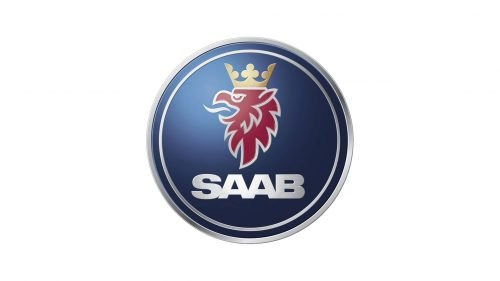
After Scania operations separated in 1995 the Saab logo was simplified. The Scania name was removed and the griffin head was enlarged within a single circle. This version strengthened focus on the standalone Saab brand.
- Design: Single blue roundel containing enlarged griffin head with SAAB positioned above
- Colors: Red griffin, dark blue background, silver elements
- Changes: Removal of SCANIA text and adjustment of proportions
- Context: Created after the 1995 corporate separation from Scania
2000–2012: Three-Dimensional Griffin Era
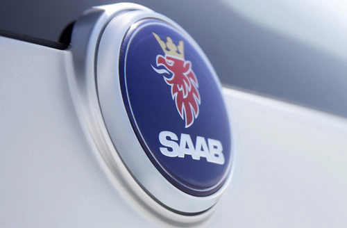
General Motors full influence after 2000 brought a refined three-dimensional version of the Saab logo. This emblem featured glossy gradients and a more prominent crown on the griffin. It remained in use until Saab Automobile’s 2012 bankruptcy ended the GM/Spyker-era ownership.
- Design: Glossy three-dimensional red griffin with gold crown inside blue roundel
- Colors: Red griffin, gold crown, dark blue roundel, silver SAAB lettering
- Changes: Added depth, gradients, and crown emphasis to modernize the symbol
- Context: Introduced to reinforce brand identity during the GM ownership period
2013–Present: Post-Griffin Wordmark
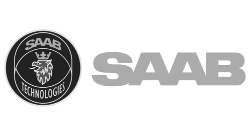
The 2012 ownership change to NEVS resulted in permanent loss of griffin usage rights. Since 2013 the Saab logo consists only of a clean uppercase wordmark. This minimalist approach replaced all previous symbolic elements.
- Design: Bold uppercase sans-serif SAAB lettering without any pictorial symbol
- Colors: Light gray or monochrome typography
- Changes: Complete removal of the griffin and roundel
- Context: Required after NEVS acquired assets but could not use the griffin
Saab Symbol Meaning and Visual Attributes
The core Saab symbol is the red griffin, a mythical creature combining an eagle’s head and wings with a lion’s body. This figure represents vigilance and draws directly from the coats of arms of Skåne and Östergötland counties in Sweden. The griffin had previously appeared in Scania-Vabis heraldry from 1911 onward.
Colors used across eras include red for the griffin, dark blue for the roundel, and silver or gold for outlines and lettering. The circular shape with concentric rings suggests movement and unity. Typography remained consistently uppercase sans-serif with adjustments in weight and spacing.
Saab Logo History Summary
The Saab logo history closely follows corporate milestones. The 1968 merger eventually produced the 1984 griffin logo. The 1995 separation from Scania triggered further simplification. GM’s 2000 influence introduced the three-dimensional version that defined the brand until 2012. Loss of the griffin after 2012 returned the identity to a simple wordmark.
This evolution reflects the brand’s journey from aerospace origins through multiple ownership changes while maintaining ties to Swedish regional symbolism. The various Saab car logo designs remain of strong interest to enthusiasts and design historians.