Key facts
- Founded
- 1930
- Founded by
- Battista Farina
- Country
- Italy
- Headquarters
- Cambiano, Italy
- Parent company
- Mahindra & Mahindra
- Legal name
- Pininfarina S.p.A.
- Famous models
- Battista
- Website
- pininfarina.it
Pininfarina Brand History
Battista “Pinin” Farina founded the company on 23 May 1930 in Turin under the original legal name Società Anonima Carrozzeria Pinin Farina. In 1928 he had left his brother’s firm Stabilimenti Farina to establish his own coachbuilding operation. A new factory was completed in 1958 and management passed to his son Sergio Pininfarina and son-in-law Renzo Carli.
The corporate name officially changed to Pininfarina in 1961 after the Italian President authorized the family surname change. This created the current legal name Pininfarina S.p.A. that remains in use today.
Family Succession and Ownership
Sergio Pininfarina led the company from 1958 until 2001. His son Andrea Pininfarina became head of the company in 2001 and served until his death in 2008. Paolo Pininfarina was then appointed successor and led until his death in 2024.
In 2015 the Mahindra Group acquired a 76.06 percent majority stake in the company. Headquarters are located in Cambiano, Italy.
Pininfarina Logo Evolution
1906–1930: Pre-Founding Crest
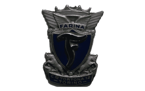
- Design: Elegant crest featuring elongated, slightly curved letter “F” with “Farina” wordmark in simple sans-serif uppercase
- Colors: Appears monochrome in historical descriptions
- Changes: Served as the visual foundation that later evolved into the rectangular emblem
- Context: Used during the pre-founding period from 1906 until the establishment of Carrozzeria Pinin Farina in 1930
1930–Today: Core Rectangular Emblem
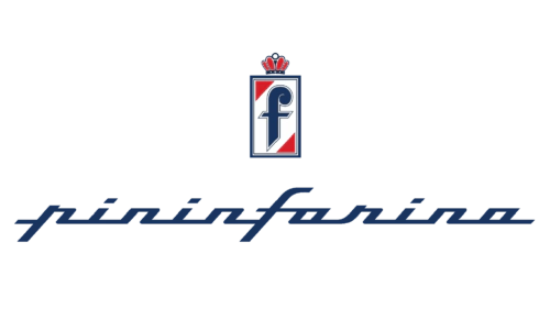
- Design: Italicized cursive wordmark paired with a vertically oriented rectangle containing a bold lowercase “F”, two red triangles, and an elegant red crown
- Colors: Traditional tricolor of red, blue and white
- Changes: Minor refinements while preserving core structure across nearly a century
- Context: This Pininfarina symbol reflects luxury, heritage and balance between modernity and classicism
2018–2020: Modern Metallic Variant
- Design: Calligraphic italicized interconnected font with “Automobili” in widely spaced sans-serif above and metallic silver gradient
- Colors: Light sky blue for “Automobili” and the “F” emblem
- Changes: Introduced metallic finishes and the new descriptor while keeping the classic lowercase “F” with its curved top detail
- Context: Created a more contemporary luxury appearance during this brief period
2020–Present: Current Monochrome Logo
- Design: Simplified black adaptation of the 2018–2020 layout with the same calligraphic lettering
- Colors: Monochrome black only
- Changes: Removed metallic gradients and color accents in favor of clean black presentation
- Context: The present Pininfarina logo maintains strong visual continuity while delivering sophisticated simplicity
Pininfarina Logo Design Elements and Meaning
The custom geometric cursive typeface features straight lines and square shapes. The closest commercial font is a modified version of Cabriolet. The letter “F” has remained the core symbol representing Farina across every era.
A crown element crowns the rectangular frame and symbolizes luxury and rich heritage. The Pininfarina logo meaning draws on color psychology where red conveys passion and power while blue suggests confidence and safety. White represents loyalty and reliability.
The overall impression balances modernity with classic elegance. This combination conveys authority, expertise and immaculate style that has defined the brand since 1930. Many enthusiasts seek the Pininfarina car logo in high-resolution formats for reference and study.
The enduring Pininfarina emblem continues to appear on official materials and design projects worldwide. Its consistent visual language across more than ninety years makes it one of the most recognizable symbols in automotive history.