Key facts
- Years active
- 1980–2025
- Founded by
- Jeanneau
- Country
- France
- Headquarters
- Les Herbiers, France
- Parent company
- Ligier
- Famous models
- M.Go, MC1, MC2, Virgo, M.GO-3
Microcar Brand History
Microcar was founded in 1980 in France as a division of Jeanneau, a major sailboat manufacturer, with some sources citing 1984 as the starting point. The company also operated under the Bénéteau group of yacht and boat builders. Production of its super-compact cars moved to a new custom-built factory in September 2000.
In September 2008 Microcar was acquired by Ligier Automobiles, which was backed by the Italian private equity firm 21 Investimenti Partners. The merger created Europe’s second-largest microcar manufacturer and the largest manufacturer of quadricycles. Philippe Ligier, son of Guy Ligier, became CEO of the expanded group. The brands kept their separate identities after the acquisition.
The company announced plans in 2024 to discontinue the Microcar brand because of increased competition. In 2025 the brand was discontinued and its factory in Montaigu was closed. Microcar is now defunct after operating as part of Ligier since 2014.
Microcar Logo Evolution
The visual identity of the brand remained centered on a red oval with white lettering throughout its history. Changes were evolutionary rather than revolutionary, preserving core recognition while updating for a more modern position.
1984 – 2011: Founding Era Logo
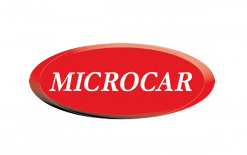
- Design: Horizontally stretched oval in scarlet-red with voluminous thick appearance
- Colors: Scarlet-red with gradient shades and white lettering
- Changes: None during this long period
- Context: Used from founding in 1984 until the 2008 acquisition by Ligier
A Microcar logo history shows this first version stayed in place through the 2000 factory move and remained the primary mark for more than twenty-five years.
2011 – 2025: Post-Acquisition Logo
- Design: Red oval background with delicate silver outline and two curved silver lines along the perimeter
- Colors: Glossy red with gradients and silver elements creating contrast for confidence, strength, comfort and safety
- Changes: Modernized custom geometric sans-serif typeface with clean lines and rounded angles
- Context: Symbolized a forward-looking approach to design and ecology after integration into the larger microcar group
This version served as the Microcar emblem until the brand ended in 2025.
The Microcar symbol always kept its red oval foundation across both eras. The Microcar car logo evolved from a simple naive shape into a slightly more technical and futuristic mark while retaining the same core visual DNA.
Designers chose fonts closest to Gia Black or Charles Wright 1935 for the later version, giving the Microcar badge a cleaner, more contemporary mood. The silver orbit elements in the updated logo reinforced the brand’s focus on progressive and ecological transportation solutions.
Microcar logo images from both periods clearly show the consistent use of a red oval field with white or light lettering. The Microcar logo evolution demonstrates how a brand can modernize its appearance without abandoning its original identity. Even after the company closed, these visual marks remain part of the documented history of French microcar manufacturing.