Key facts
- Founded
- 1968
- Founded by
- Guy Ligier
- Country
- France
- Headquarters
- Abrest, France
- Parent company
- 21 Investimenti Partners
- Legal name
- Ligier Automobiles
- Famous models
- JS2, JS4, JS50, EZ10, Myli
- Website
- www.ligier.fr
Brand Overview
Ligier was founded in 1968 in France by Guy Ligier. The company has evolved from building sports cars to competing in Formula 1 and now concentrates on microcars as part of Drive Planet Group.
Its headquarters are located in Abrest, France. The brand represents French motorsport heritage transitioning to compact and sustainable urban transportation.
Brand Timeline
The company started in 1968 with a focus on high-performance sports cars. In 1976 it entered the Formula 1 World Championship and remained active until 1996, securing nine Grand Prix wins and participating in endurance racing at Le Mans.
Ligier exited Formula 1 in 1996. In the early 2000s the company made a strategic shift from sports cars to microcars. It now specializes in fuel-efficient compact vehicles sold primarily across Europe.
Ligier Logo Evolution
1968–1976: First Logo
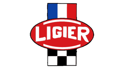
The first Ligier logo was created when the company was founded. It reflected the brand’s initial focus on sports cars and motorsport.
- Design: Oval shape with bold white sans-serif lettering of varying sizes to create a curved effect
- Colors: Red background, French national colors blue white and red at top of vertical strip, checkered flag pattern at bottom
- Changes: None, this was the original design
- Context: Directly tied to founder Guy Ligier and the launch of the sports car era
This version of the Ligier car logo established the French racing identity that would appear in every subsequent emblem.
1976–1998: Second Logo

Ligier introduced this logo in the same year it entered Formula 1. The design updated the motorsport elements while keeping strong ties to French national colors.
- Design: Two-line layout with wavy horizontal flag element on top and brand name below
- Colors: Dark blue for the main text, black for the secondary line, French flag and checkered flag colors
- Changes: Replaced oval shape with wavy flag motif, added “Automobiles” text
- Context: Created to mark the brand’s debut in the Formula 1 World Championship
The 1976 redesign coincided with the start of Ligier’s most successful racing period.
1998–2017: Third Logo
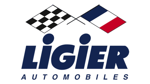
After leaving Formula 1 this updated Ligier emblem kept the crossed flags but rearranged the layout. The design maintained visual continuity during the transition period.
- Design: Crossed flags positioned above the brand name in italic style
- Colors: Blue and black text with traditional French and racing flag colors
- Changes: Changed to crossed flags format and italic lettering while keeping core color palette
- Context: Introduced following the 1996 Formula 1 exit and during the move toward microcars
This version of the Ligier symbol helped bridge the brand’s racing past with its emerging focus on compact vehicles.
2017–Present: Fourth Logo
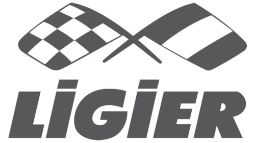
The current Ligier logo reflects the company’s complete shift to microcars and sustainable urban mobility. It adopts a cleaner, more modern appearance while preserving key heritage elements.
- Design: Wordmark only without the secondary “Automobiles” line and rounded crossed flags
- Colors: Grey and white palette
- Changes: Simplified to minimalist style, removed secondary text line, rounded flag corners
- Context: Updated to match the brand’s current emphasis on fuel-efficient compact cars
This latest Ligier logo evolution presents a friendlier and more accessible image for today’s market.
Ligier Logo Meaning and Symbolism
The Ligier emblem has always featured the French national flag combined with a checkered racing flag. This consistent use across all four versions demonstrates the brand’s strong connection to both France and motorsport.
Guy Ligier created the original design to express his personal racing background. The crossed flags and national colors continue to represent the company’s French motorsport heritage even as it now produces microcars.
The progression from the bold red oval of 1968 to the minimalist grey and white version of today mirrors the company’s journey from high-performance sports cars through Formula 1 to its current role in urban mobility. Each change in the Ligier logo history was timed with major shifts in business direction.