Key facts
- Founded
- 2005
- Founded by
- Masanori Yoshida
- Country
- Japan
- Headquarters
- Osaka, Japan
- Legal name
- Aspark Co., Ltd.
- Famous models
- Owl
- Website
- aspark.co.jp
Aspark Brand Overview and History
Aspark was founded in October 2005 by Masanori Yoshida in Osaka, Japan. Initially the company operated as an engineering services provider, offering human resources and technical support for the automotive and industrial sectors. Aspark remains active as of 2024 with its main theme centered on pioneering high-performance all-electric hypercars.
The brand timeline shows a clear evolution. From 2005 to 2013 Aspark focused primarily on engineering services. In 2013 the company entered electric vehicle development and adopted its current corporate logo. The year 2017 marked the unveiling of its flagship product, the Aspark Owl electric hypercar. After 2017 Aspark concentrated on refining electric powertrain and battery technologies for high-performance applications.
Aspark Logo Evolution
2013 – Present: Modern Aspark Corporate Logo
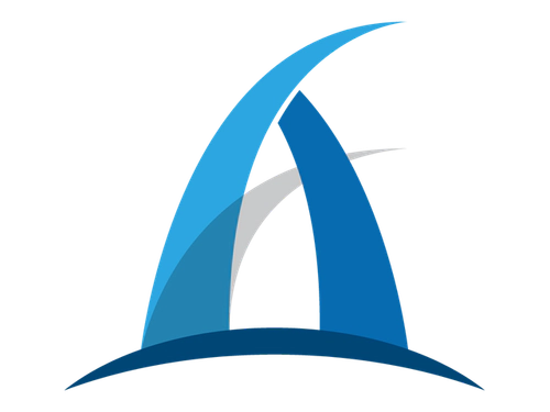
The current Aspark logo was introduced in 2013 as the company transitioned toward electric vehicle development. This Aspark car logo features a distinctive design that emphasizes speed and advanced technology.
- Design: Three arched and pointed elements resembling shark fins with a delicate gray base
- Colors: Multiple shades of blue and gray
- Changes: Replaced any earlier marks when the company shifted to EV hypercar focus
- Context: Adopted during the strategic move into full-electric hypercar development and reflects the aggressive performance focus later demonstrated by the Aspark Owl
2017 – Present: Aspark Owl Logo

A separate logo was created specifically for the Aspark Owl hypercar when it was unveiled in 2017. This Aspark symbol variant is tied directly to the brand’s high-performance electric vehicle.
- Design: Distinct mark created for the Owl hypercar
- Colors: Consistent with overall brand palette
- Changes: Introduced as a secondary logo alongside the main corporate mark
- Context: Launched together with the flagship electric hypercar to reinforce the brand’s focus on extreme performance electric vehicles
The Aspark logo evolution shows a clear link between visual identity changes and strategic business shifts. The 2013 adoption of the current Aspark emblem coincided with the move into electric vehicle development while the 2017 Aspark Owl logo reinforced the brand’s emphasis on record-breaking electric hypercars.
The sharp fin-like shapes and dynamic blue and gray colors of the main Aspark logo meaning reflect the brand’s focus on speed and cutting-edge electric performance. These visual elements remain central to how the company presents itself in relation to its world-record acceleration achievements.