Key facts
- Founded
- 1942
- Founded by
- Diesel Motor Industry Co., Ltd.
- Country
- Japan
- Headquarters
- Hino, Tokyo, Japan
- Parent company
- Archion
- Legal name
- Hino Motors, Ltd.
- Famous models
- Ranger, Profia, Dutro, Blue Ribbon, S'elega
- Website
- www.hino-global.com
Hino Brand History
Hino Motors, Ltd. officially began operations in 1942 and is headquartered in Hino-shi, Tokyo, Japan. The company traces its origins to 1910 and became a subsidiary of Toyota Motor Corporation in 2001, taking its place among the 16 major companies of the Toyota Group, before merging with Mitsubishi Fuso in 2026 under the new Archion holding company. Hino focuses on commercial vehicles and diesel engines, establishing itself as a leading producer of medium and heavy-duty diesel trucks in Asia.
Key Milestones
- 1910: Early company origins
- 1917: First known use of branding
- 1942: Official founding of Hino Motors, Ltd.
- Post-1942: Became a subsidiary of Toyota Motor Corporation
- 1994: Major logo redesign
- Present: Operates under the Archion holding company following its 2026 merger with Mitsubishi Fuso, after more than 100 years of history
Hino Logo Evolution
The Hino logo history reflects the manufacturer’s development from its early days to its current position within the Toyota Group. Two distinct eras define the visual identity of the Japanese truck maker.
1917–1994: Wordmark Era
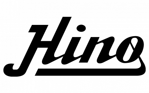
The first Hino logo was introduced in 1917 during the company’s early manufacturing period. This design served as the primary brand identifier for decades.
- Design: Wordmark only using fancy and bold script inscription
- Colors: Black
- Changes: Thick lines with rounded corners, curved tails, and an underline extending from the letter O
- Context: Early brand identity for the Japanese truck manufacturer
The Hino symbol from this period presented the name in a style that echoed traditional Japanese writing.
1994–Present: Emblem and Wordmark Era
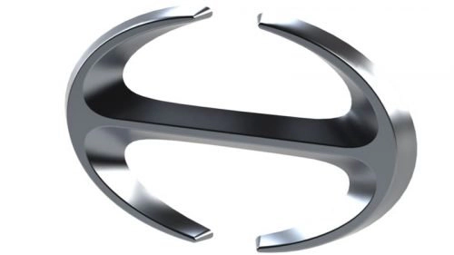
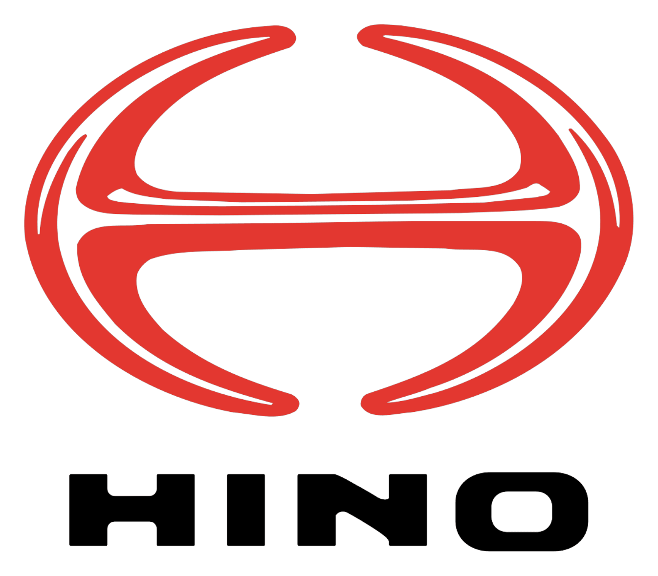
A significant update occurred in 1994 when Hino introduced its current combination mark. This redesign aligned the visual identity with the company’s status as a modern Toyota subsidiary.
- Design: Emblem plus wordmark combination featuring a stylized letter H
- Colors: Silver-gray gradient on emblem with glossy finish and matte silver wordmark
- Changes: Arched vertical bars forming an open oval with a horizontal bar, creating a three-dimensional effect
- Context: Updated to convey quality, stability, strength, and progressive values while celebrating Asian heritage
The Hino emblem resembles a shuriken, a Japanese throwing star, symbolizing the brand’s cultural roots and power. The accompanying wordmark uses all capital letters in a custom modern typeface with smooth bold lines and no serifs.
This Hino logo meaning reflects reliability and innovation suitable for a global commercial vehicle manufacturer. The current design continues to represent the company’s focus on trucks, buses, and diesel engines.
The evolution from the early script Hino car logo to the contemporary Hino badge demonstrates the brand’s progression over more than a century. Many users seek Hino logo images and high-resolution versions for reference, while the clean design also works well when a Hino logo transparent background is needed. The distinct Hino car symbol remains recognizable across various applications and markets.