Key facts
- Founded
- 1952
- Founded by
- Colin Chapman
- Country
- United Kingdom
- Headquarters
- Hethel, United Kingdom
- Parent company
- Geely Holding Group
- Legal name
- Lotus Cars Limited
- Famous models
- Elise, Esprit, Evora, Elan, Emira
- Slogan
- “For the Drivers”
- Website
- lotuscars.com
Brand Foundation
Lotus was established in Great Britain in 1952 by Anthony Colin Bruce Chapman, whose initials formed the ACBC monogram that would appear in most versions of the Lotus logo. The company has always centered on luxury sports cars and racing vehicles with a clear emphasis on heritage. Its current owner is Zhenjiang Geely Holding Group.
The Lotus symbol takes the form of an abstract lotus flower represented by a triangular contour with rounded angles. This core element, together with the founder’s monogram, has provided visual continuity across more than 75 years of brand history.
Lotus Logo Evolution
1948–1984: Original Logo
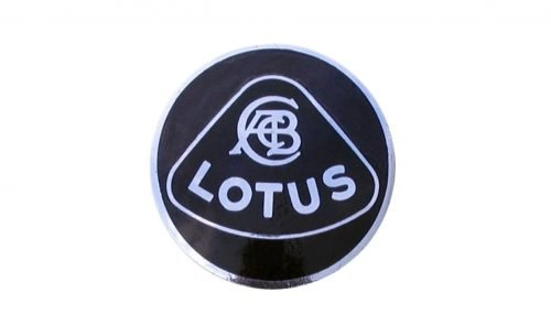
- Design: Circular frame containing triangular lotus shape with softened angles and an arched base
- Colors: Black, silver
- Changes: None during this long initial period
- Context: Created alongside Chapman’s first trials car in 1948, predating the company’s formal founding in 1952
1984–1986: First Major Redesign
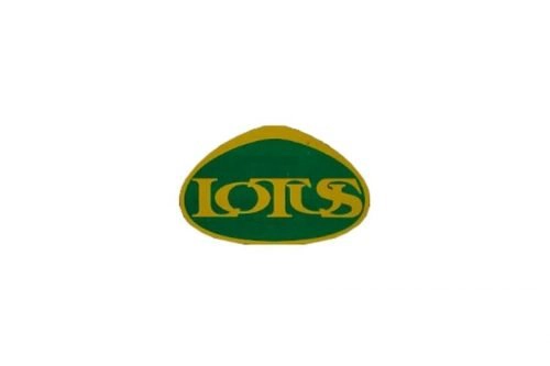
- Design: Removed circular frame, extended oval lotus shape
- Colors: Dark green background with golden frame and lettering
- Changes: Switch from sans-serif to bold serif typeface
- Context: Short-lived transitional design during a period of brand evolution
1986–1989: Refined Transitional Version

- Design: Oval lotus shape with monogram positioned above the lettering
- Colors: Dark green background, gold elements
- Changes: Reintroduction of the ACBC monogram
- Context: Brief evolution that added sophistication while maintaining recognizability
1989–2010: Return to Classic Design
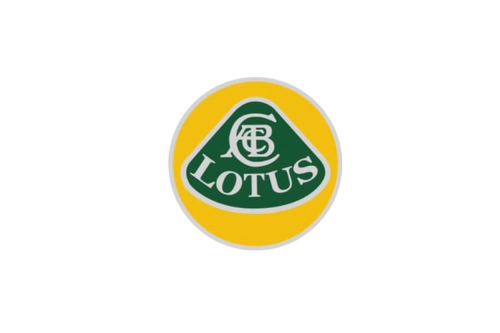
- Design: Enlarged monogram placed above serif “LOTUS” inscription
- Colors: Green lotus symbol, yellow circle, silver lettering and monogram
- Changes: Restoration of the 1948 visual approach with updated color palette
- Context: 21-year period reflecting renewed commitment to brand heritage
2010–2019: Glossy Refinement
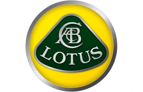
- Design: Same composition as the previous era with enhanced volume effects
- Colors: Green, yellow, and silver; yellow became slightly lighter
- Changes: Addition of gradients, gloss, and shadows
- Context: Digital-era polish coinciding with growing global visibility
2019–Present: Modern Minimalist Version
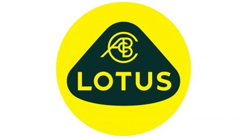
- Design: Flat minimalist style with simplified contours and straight-line “LOTUS” text
- Colors: Green and yellow remain dominant
- Changes: Removal of all silver details, switch to sans-serif typography, monogram redesigned to resemble a steering wheel
- Context: Modernization that occurred after the Geely acquisition
Visual Identity Elements
The Lotus car symbol has consistently used an abstract lotus flower represented by a triangular rounded shape. The ACBC monogram linking the brand to its founder appears in most eras of the Lotus logo history.
Green and yellow have served as the primary colors throughout the brand’s evolution, representing success, happiness, and growth. Silver and gold function as accent colors depending on the specific era. The design philosophy has always emphasized strong heritage preservation with only minor updates to remain contemporary.
A colorful primary version is used for marketing, while a monochrome variant supports official documents. This consistent symbolic and color language has maintained visual recognition across more than 75 years.
Direct Links Between Brand Events and Logo Changes
The Lotus logo evolution shows a clear pattern of returning to core elements after brief departures. The original design dates to Chapman’s first trials car in 1948, ahead of the company’s formal founding in 1952.
The first major change arrived in 1984 during a period of brand evolution and ownership shifts. The 1989 return to classic styling reflected a deliberate commitment to heritage. The 2010 refinement coincided with increased global visibility, while the 2019 modernization followed the ownership change to Geely around 2017.
Throughout its history the brand has maintained the lotus triangle and monogram as central components, demonstrating a consistent approach to identity management.