Key facts
- Founded
- 1983
- Founded by
- Mahathir Mohamad
- Country
- Malaysia
- Headquarters
- Shah Alam, Malaysia
- Parent company
- DRB-HICOM
- Legal name
- Proton Holdings Berhad
- Famous models
- Saga, Persona, X70, Iriz
- Slogan
- “It's in the Drive!”
- Website
- www.proton.com
Proton Brand Overview
Proton was established in 1983 as Perusahaan Otomobil Nasional by Mahathir Mohamad. The company began as Malaysia’s national automobile manufacturer with a primary focus on the domestic market. Its slogan “It’s in the Drive!” reflects the brand’s emphasis on driving experience and customer focus.
Headquartered in Shah Alam, Selangor, Proton also operates facilities in Proton City, Perak. The ownership structure today consists of DRB-HICOM holding 50.1 percent and Geely holding 49.9 percent. This partnership marks the brand’s shift toward a modern, globally oriented premium automotive identity.
Proton Logo Evolution
The Proton logo has undergone several changes since the company’s founding. Each update reflects the brand’s development from a national symbol-focused company to a contemporary manufacturer. The visual identity has consistently aimed to communicate strength, professionalism, and trustworthiness.
1985–1992: National Symbol Era
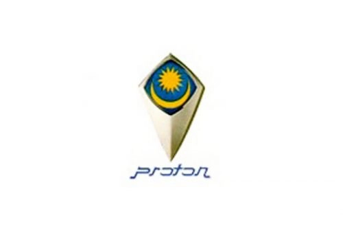
The first Proton logo was introduced in 1985 and remained in use until 1992. It drew directly from elements of the Malaysian flag and coat of arms.
- Design: Dark blue rhombus with bottom elongated shape featuring a yellow 14-pointed star and crescent moon
- Colors: Blue, yellow, and silver
- Changes: Used lowercase custom font resembling Arabic lettering
- Context: Primarily employed for the domestic market as the new national car company
This early Proton emblem established the brand’s initial identity as a symbol of Malaysian automotive ambition.
1992–2000: Transitional Export Era
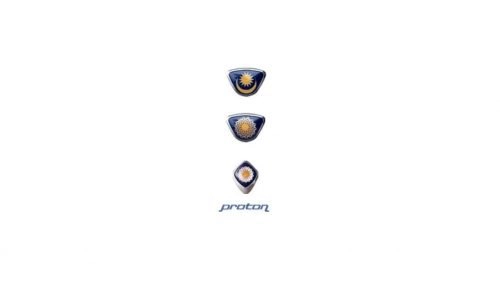
During this period Proton introduced multiple logo variants to support its expanding presence. The company created a dual system for different markets.
- Design: Original star and moon badge for local use alongside mandala-style designs
- Colors: Deep blue backgrounds with white and yellow elements
- Changes: Bolder and darker blue wordmark introduced
- Context: Company began expanding beyond Malaysia to export markets
The Proton car logo during these years balanced national heritage with growing international ambitions.
2000–2008: Tiger Shield Era
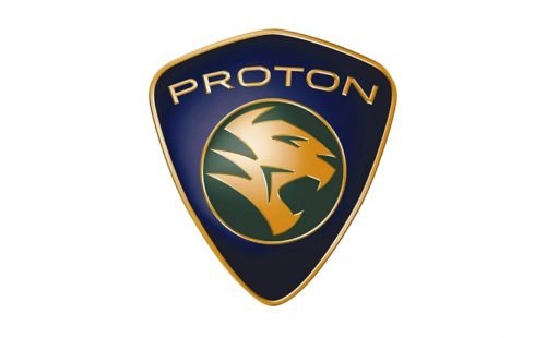
A major rebranding occurred in 2000 with the launch of the Proton Waja. This marked the introduction of the tiger shield as the unified symbol for both domestic and export markets.
- Design: Dark purple shield with thin gold outline and green circle containing a right-turned tiger head with open mouth
- Colors: Purple, gold, and green
- Changes: Text changed from lowercase italic to uppercase PROTON in lightweight sans-serif
- Context: Symbolized shift from religious and national symbols to dynamic animal motif representing strength
The Proton symbol now emphasized courage and power through the tiger emblem.
2008–2016: Two-Tone Metallic Era
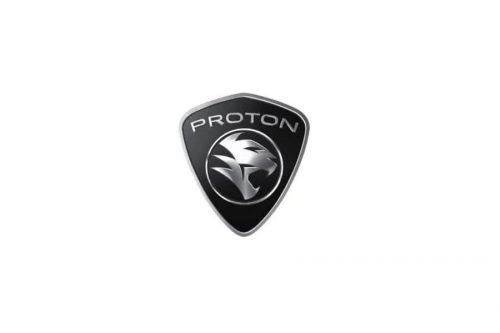
The Proton logo received a color update coinciding with the second-generation Proton Saga. This version adopted a more contemporary metallic finish.
- Design: Retained tiger shield structure but rendered in metallic black and silver
- Colors: Black and silver
- Changes: Larger and thickened lettering with three-dimensional effect
- Context: Updated to appear more brutal and solid while remaining compatible with any car color
This era refined the Proton badge for broader visual appeal across different vehicle designs.
2016–2019: Separated Wordmark Era
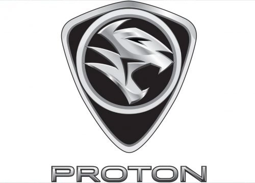
Further modernization of the Proton car symbol occurred during this period. The design focused on sharper details and improved contemporary aesthetics.
- Design: Increased thickness on badge contours with wordmark separated and placed below the crest
- Colors: Metallic silver with gradient effects and thin black outlines
- Changes: Bolder sans-serif wordmark and enhanced gloss on silver elements
- Context: Refinement of the tiger shield for a cleaner and more modern appearance
The Proton emblem gained increased visual impact through these precise adjustments.
2019–Present: Simplified Circular Era
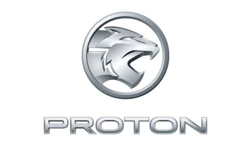
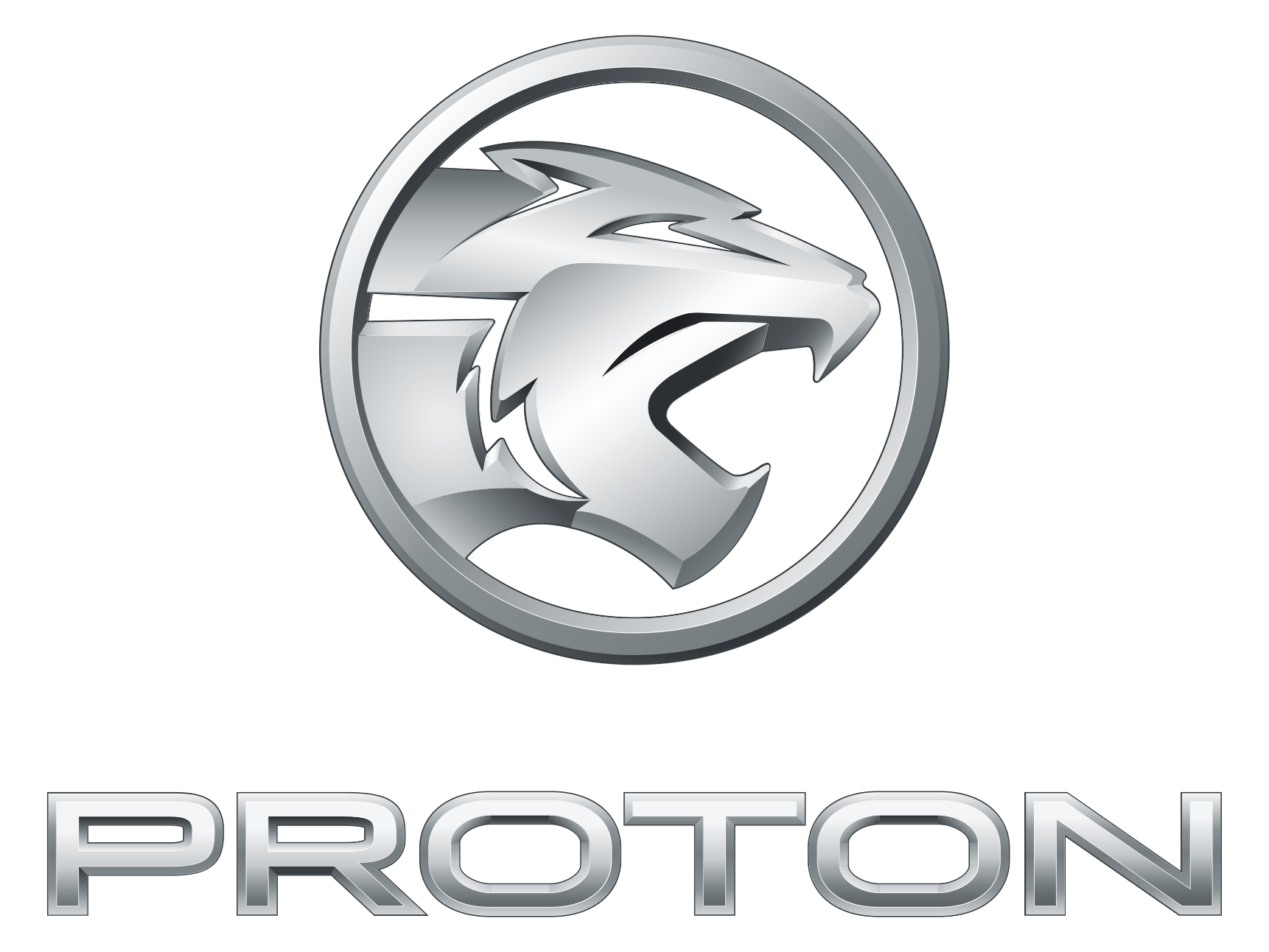
The current Proton logo represents the brand’s latest evolution toward minimalism. This version emphasizes stability and trustworthiness through simplified forms.
- Design: Circular emblem containing redrawn tiger head with open mouth and thin silver frame, wordmark placed below
- Colors: Minimalist metallic silver palette
- Changes: Shield completely removed in favor of circular format
- Context: Final evolution influenced by current ownership structure with Geely, focusing on cleaner professional identity
The Proton logo history shows a clear progression from ornate national symbols to confident, modern design language.
Design Philosophy and Color Progression
Proton logo evolution demonstrates a deliberate shift in visual strategy. Typography moved from ornate Arabic-inspired lowercase lettering in 1985 to bold uppercase sans-serif in 2000 and finally to clean, stable modern sans-serif from 2019 onward.
Color choices have also evolved significantly. Early logos featured blue and yellow elements connected to national symbolism. The tiger shield era introduced purple, gold and green before transitioning to black and silver metallic finishes from 2008. The current minimalist approach relies primarily on metallic silver tones that convey professionalism and strict attention to quality.
These changes in the Proton symbol reflect the company’s development from a national manufacturer to a forward-looking automotive brand focused on customer values including comfort and safety.
Brand Legacy
Since its founding in 1983, Proton has played a central role in Malaysia’s automotive industry. The company began as a national symbol and has grown through multiple ownership and design transformations. Today it maintains facilities in Shah Alam and Proton City while operating under joint ownership that supports its global ambitions.
The Proton logo meaning has transformed alongside the company itself. What began as direct representation of Malaysian identity through flag and coat of arms elements has developed into a symbol of strength, courage and modern professionalism through the tiger motif.
This Proton logo history provides clear evidence of the brand’s commitment to evolution while maintaining core values of quality and customer focus. The current simplified circular emblem represents a mature identity ready for continued international presence.