Key facts
- Founded
- 1937
- Founded by
- Kiichiro Toyoda
- Country
- Japan
- Headquarters
- Toyota City, Aichi, Japan
- Legal name
- Toyota Motor Corporation
- Famous models
- Corolla, Camry, RAV4, Hilux, Land Cruiser
- Slogan
- “Let's Go Places (US)”
- Website
- global.toyota/en
Toyota Logo Meaning: What the Three Ovals Stand For
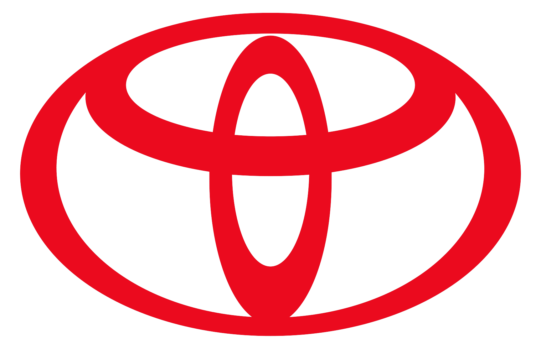
The Toyota symbol is three ovals. The two inner ovals, set at right angles, stand for the heart of the customer and Toyota’s own heart, and where they overlap they form a T. The outer oval is the world embracing Toyota. That is the official meaning of the Toyota emblem, in use since 1989.
Toyota sets out the Toyota logo meaning on its own brand pages, part by part:
- The inner ovals. One sits horizontally, one vertically. They represent the customer’s heart and the company’s heart, and their overlap stands for mutual benefit and trust. Toyota’s English-language history, describing 1989, words it a little differently: customers’ expectations and the car maker’s ideal.
- The T. Together the inner ovals draw a T for Toyota, and Toyota adds that the shape suggests a steering wheel.
- The outer oval. It stands for the world embracing Toyota, or, in Toyota’s other wording, the global reach of its technology and its unlimited potential.
- The space. The background carries the values Toyota wants to offer: quality, value beyond what buyers expect, the joy of driving, innovation, and integrity on safety, the environment and social responsibility.
Toyota’s Japanese history adds a point about geometry: an ellipse has two centers, which Toyota reads as the customer’s heart and its own car-making heart joined in trust. The stroke of each oval also thickens and thins, like Japanese brush lettering.
The design took about five years, prompted by Toyota’s growing profile abroad. The brief asked for a mark people could recognize from a distance, one that stood out from other badges and looked right from the front as well as in a rear-view mirror. The finished ellipses are symmetrical left to right. Nippon Design Center won the job in an international competition in which 10 design firms submitted 240 proposals. Yusuke Kaji was creative director and Masashi Uehara art director, with Kazumasa Nagai supervising.
Does the Toyota Logo Spell TOYOTA? Hidden Letters and Other Myths
No. The official Toyota symbol meaning never says the emblem spells TOYOTA. You can trace every letter of the name in the ovals, but that is a fan reading. The same goes for the bull’s head and the needle and thread.
| Claim | Where it comes from | Verdict |
|---|---|---|
| The inner ovals are the hearts of the customer and the company | Toyota’s emblem page | Official |
| The inner ovals form a T and suggest a steering wheel | Toyota’s emblem page | Official |
| Every letter of TOYOTA is hidden in the emblem | Design blogs and social media | Popular reading; Toyota doesn’t mention it |
| The emblem is a bull’s head | A resemblance people point out online | No basis in Toyota’s explanation |
| The ovals show thread passing through the eye of a needle, a nod to the loom business | Logo-history aggregator sites | No basis in Toyota’s explanation |
| The T stands for “trust” | Dealer blogs | Half right: the T is for Toyota, and the overlap stands for trust |
| The logo is made of circles | Common shorthand | Wrong: the shapes are ovals (ellipses) |
| Toyota keeps the meaning secret | Some logo sites | Wrong: Toyota publishes the meaning |
The needle-and-thread story is tempting because Toyota did start inside a loom company, but Toyota’s description of the emblem says nothing about sewing, and it mentions no animal either.
Toyota Logo History: From TOYODA to the Three Ovals
 1935–1936
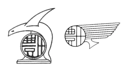 1935–1936
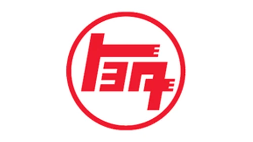 1936–Present
 1967–1978
 1978–Present
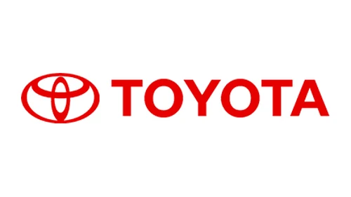 1989–Present
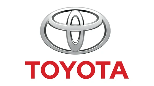 2000s
2000s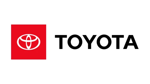 2019–Present
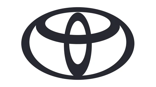 2020–Present
 2021–Present
The old Toyota logo was not an oval at all: Toyota’s car business started in 1933 inside Toyoda Automatic Loom Works, and its first badges carried the family name, Toyoda. Toyota logos over the years changed in three big steps: the katakana mark of 1936, the TOYOTA wordmark of 1978 and the three ovals of 1989. Since 1989 the ovals have been re-drawn, but never replaced.
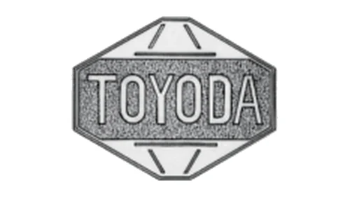
1935: The TOYODA Trademark
The first trademark of the car business read TOYODA in thin Latin capitals, on a textured metal-look panel inside a faceted, jewel-like frame. Toyota’s archive caption dates its registration to 27 July 1935. That archive image is monochrome, so the red-and-white version on some logo sites has no support in Toyota’s records.
1935–1936: The G1 and Model AA Mascots
The vehicles wore kanji instead. The G1 truck of August 1935 carried a round badge with stylized kanji for Toyoda (豊田), topped by a golden shachihoko, the mythical fish-tiger that symbolizes Nagoya. The Model AA passenger car of 1936, and the AB, paired the same kanji roundel with wings for speed. They were sold under the Toyoda name, as Kokusan Toyoda-go. Some sites put the shachihoko on the sedan; Toyota’s captions place it on the truck.
1936–Present: The Katakana Toyota Mark
The first logo to say Toyota was written in katakana. In July 1936, after finishing its first passenger car, the automobile department held a public contest for a new mark to help advertising and sales. About 27,000 entries came in from all over Japan.
On 25 September 1936 it chose the three characters トヨタ inside a plain ring, with short speed lines trailing from the strokes, and the company took the name the mark spelled. From October 1936 the cars were sold as Kokusan Toyota-go, and the mark was registered in April 1937, shortly before Toyota Motor Co. was founded on 28 August 1937.
It never went away. In Japan it is still Toyota’s corporate emblem, on the headquarters building and on employee badges, usually in red. Japanese sources credit the design to Nakajima Taneo. Sites that date it to 1949 are wrong.
Late 1950s–1978: The First English Wordmarks
Toyota Motor Sales, U.S.A. was set up in 1957, when the Crown became the first Japanese car shipped to America. From the late 1950s the katakana mark was joined by various all-capital TOYOTA wordmarks. Logo archives show a bold serif version dated 1958, but no Toyota source confirms the artwork or the year.
From the late 1960s until March 1978, Toyota’s Japanese advertising used a thin sans-serif TOYOTA logotype next to the katakana circle. In the US and Canada it stayed until March 1986.
1978–Present: The TOYOTA Wordmark
Today’s TOYOTA logotype was first shown at the 1977 Tokyo Motor Show. It went into use in Japan in April 1978 and in the US and Canada in April 1986. Its heavier capitals have near-round Os and wide, even spacing. The design is credited to Los Angeles designer Robert Overby. It is still the wordmark in the Toyota logo, set to the right of or below the ovals.
1989–Present: The Three-Oval Emblem
The logo of Toyota as most people know it was introduced on 2 October 1989. It debuted that month on the Celsior, the Japanese version of the Lexus LS 400. Lexus, launched in the US earlier that year, kept its own L emblem, so Toyota now ran two sets of marks.
Before 1989 each Toyota model wore its own emblem, and the new Toyota emblem was meant to unify the brand’s image in Japan and abroad. It went on new models rather than being fitted to old ones, and by 1990 it was on most Toyota vehicles, print ads and dealer signs. Toyota’s launch artwork shows the red ovals to the left of the red TOYOTA wordmark.
Toyota ties the emblem to its 50th anniversary, although the company was founded in 1937 and Toyota’s own advertising history marks the 50th in 1987.
2000s: The 3D Silver Emblem
In the 2000s the Toyota logo in marketing took on a 3D silver look, with a shaded, beveled emblem that matched the chrome badge on the cars. Logo archives disagree on the start: one dates it to 2004 on the Crown Majesta, another to 2005. We found no Toyota source for the exact year.
2019: The Flat Emblem on a Red Square
The US Toyota logo puts a flat white emblem inside a solid red square, which the brand guidelines call the staging platform, with the TOYOTA wordmark beside it in black or white. Logo archives date its arrival in North American advertising to 2019; the guidelines give no start date.
2020: The Symbol-Only Flat Logo in Europe
On 20 July 2020 Toyota Motor Europe switched all its communications to a flat 2D Toyota symbol with no wordmark, starting with the new Yaris. A bespoke typeface, Toyota Type, came with it, and Toyota framed the change as a step from car company to mobility company. The agency The&Partnership reportedly worked on it.
This Toyota logo is for communications only: the cars kept their badge, and Toyota USA still pairs the emblem with the wordmark.
2021: The Revised Emblem
In March 2021 Toyota’s US brand materials switched to a revised emblem supplied by Toyota Motor Corporation in Japan. It keeps the three ovals but leaves a small gap between the top ellipses and uses a thinner stroke. That is the most recent change to the Toyota symbol itself.
Is There a New Toyota Logo? The Current Logo in 2026
Not a new design. The three ovals introduced in 1989 are still the logo Toyota puts on its cars today; what has changed is how they are drawn and framed. The latest Toyota logo update is the revised Toyota emblem of March 2021, with a small gap at the top and thinner strokes.
Which Toyota logo you see depends on where you look:
| Where | Logo used | Since |
|---|---|---|
| On Toyota cars | Chrome three-oval badge; black or flat 2D badges on some models | 1989–1990 |
| US advertising and dealers | White emblem on a red staging platform, TOYOTA wordmark in black or white | About 2019 |
| US brand materials | Revised emblem with a gap at the top and a thinner stroke | March 2021 |
| European communications | Flat emblem alone, no wordmark, Toyota Type lettering | 20 July 2020 |
| Toyota corporate in Japan | Katakana トヨタ circle mark (headquarters, staff badges) | 1936 |
| Century | Phoenix emblem, no ovals | Brand since October 2025 |
| GR | Its own GR badge | Switch expected to finish January 2027 |
The new Toyota logo story for 2025 and 2026 is about where the ovals appear: Century and GR are moving out from under the Toyota badge.
Why Some Toyotas Wear a Different Badge
The Toyota car logo on most models is the chrome three-oval badge. Some Toyotas wear something else: a black or flat Toyota emblem, TOYOTA lettering on the grille, a model’s own emblem, or the badge of a separate brand.
- Chrome ovals. The standard Toyota badge, on most new models since 1989–1990.
- Black or flat badges. Black and flat 2D versions of the emblem appear on some cars. A flat badge reportedly first went on the bZ4X in 2022.
- TOYOTA across the grille. Some heritage and special models, such as the Land Cruiser 70 and the Hilux GR Sport, wear the wordmark instead of the emblem.
- Model emblems in Japan. Some Japanese-market models still carry a model-specific grille emblem instead of the ovals. We cover the Toyota Crown logo on our Toyota Crown page and the Alphard’s badge on Toyota Alphard.
- The Century phoenix. Century cars wear neither the ovals nor the TOYOTA wordmark, but a hand-made phoenix ornament on the grille, wheels, steering wheel and key. Akio Toyoda announced Century as a standalone brand, positioned above Lexus, on 16 October 2025.
- The GR badge. GR (Gazoo Racing) began as Toyota’s sports-car label in 2017. When it showed the GR GT on 5 December 2025, Toyota said GR would become a standalone brand selling cars under its own badge. The switch is gradual and expected to be complete in January 2027.
- The Lexus L. Lexus, Toyota’s luxury brand, launched in the US in 1989 with its own L emblem, months before the ovals appeared.
In 2026 Toyota’s brands are Toyota, Lexus, Daihatsu and Century, with GR on its way to becoming the fifth.
What Does Toyota Mean? Why the Name Changed From Toyoda
Toyota has no dictionary meaning. It is a coined variant of the founding family’s name, Toyoda (豊田), whose kanji mean “abundant rice field”. The design Toyota chose in September 1936 spelled トヨタ, Toyota, and the company took that name. Toyota gave three reasons:
- A cleaner look and sound. Toyoda in katakana (トヨダ) needs a voicing mark for the “da”. Without it, トヨタ looks simpler, and the voiceless “ta” sounds clearer.
- Eight strokes. トヨタ takes eight strokes to write, a number linked with wealth and good fortune.
- More than a family firm. Dropping the family name marked the move from a family business to a company with a role in society.
So the Japanese symbol for Toyota is the katakana トヨタ, the word the corporate mark spells. In Chinese-speaking markets the brand is still written 豐田 (traditional) or 丰田 (simplified), the same characters as the family name.
The new name raised a small worry in America: in 1959 James F. McGraw, Toyota’s first US sales administrator, warned that “Toy” sounds like a toy.
Toyota Logo Colors and Font
The Toyota logo is red in Toyota’s own artwork, chrome on the cars, and black or white in much of today’s advertising. It is a combination mark, pairing the three-oval emblem with the TOYOTA wordmark, although European communications use the emblem alone.
- Red. The katakana mark appears red on white or white on a red field. The 1989 launch artwork was red, and the US staging platform is a red square.
- Chrome. Most car badges are chrome, which is why some sites wrongly call the brand color “silver metallic”.
- Black and white. You’ll find the Toyota logo in black and white in both regions: US lock-ups print the wordmark in black on light backgrounds and white on dark ones, and the European flat emblem is shown in black or white. It is on our list of black car logos.
The wordmark is custom lettering credited to Robert Overby, not a typeface you can install. Toyota’s own typeface, Toyota Type, arrived with the 2020 European identity and also appears in Toyota’s US brand guidelines, where the logo system has three parts: emblem, staging platform and typography.
Toyota Logo PNG and Usage Rules
The Download button at the top of this page gives you a Toyota logo PNG. For official artwork, Toyota’s US brand guidelines at brand.toyota.com set out the full Toyota logo system, including these versions:
- Full color: white ovals on the red square, with the wordmark in black for light backgrounds or white for dark ones.
- Black: a single-color logo on white.
- White: a single-color logo on black or red.
Toyota’s marks are registered trademarks, going back to the TOYODA mark of 1935 and the katakana mark of 1937. Editorial reference is the usual use. Anything commercial, including a Toyota sign or merchandise, needs permission from Toyota first. See also our list of Japanese car brands.
Frequently asked questions
Who founded Toyota?
Kiichiro Toyoda founded Toyota. He was the son of loom inventor Sakichi Toyoda, and on 1 September 1933 he set up an automobile department inside his father's company, Toyoda Automatic Loom Works. When Toyota Motor Co. became an independent company on 28 August 1937, Rizaburo Toyoda was its first president and Kiichiro its vice-president.
What was Toyota's first car?
Toyota's first car was the Model A1 prototype of May 1935, built a year after the department's first engine, the Type A of 1934. The G1 truck followed in August 1935, and the Model AA of 1936 was the first production passenger car. The G1 and the AA were sold under the family name, as Toyodas.
What is the story behind Toyota?
Toyota grew out of Toyoda Automatic Loom Works, now Toyota Industries. Its car department opened in 1933 and became Toyota Motor Co. in 1937. A separate sales company, set up in 1950, merged back in 1982. Toyota launched the Prius hybrid in 1997, and the group now builds around 10 million vehicles a year, more than any other carmaker.
What is Toyota's full name?
Toyota's full name is Toyota Motor Corporation. The name dates from 1 July 1982, when Toyota Motor Co., the manufacturer founded in 1937, merged with Toyota Motor Sales Co., the sales company set up in 1950. The corporation is headquartered in Toyota City, Aichi Prefecture, Japan.
Who is the current CEO of Toyota?
Kenta Kon has been President and CEO of Toyota Motor Corporation since 1 April 2026. He was previously chief financial officer, and the appointment was announced on 6 February 2026. Koji Sato became Vice Chairman, while Akio Toyoda, the grandson of founder Kiichiro Toyoda, has been chairman since April 2023.
What is Toyota's slogan?
Toyota has no single global slogan. In the US it uses "Let's Go Places", which still appears as a tagline logo in Toyota's US brand guidelines, so the answer to whether Toyota still uses it is yes. In Japan, Toyota has used the line "TO YOU (mark) TOYOTA", with the Toyota mark between the words, since October 2025.