Key facts
- Founded
- 1983
- Founded by
- Jean-Charles Giraud
- Country
- France
- Headquarters
- Aix-les-Bains, France
- Parent company
- Polaris Industries
- Legal name
- AIXAM-MEGA S.A.S.
- Famous models
- City, Crossline, Coupe, GTO
- Website
- www.aixam.com
Aixam Brand Overview
Aixam was founded in 1983 in France and has focused on the production of microcars and quadricycles since its establishment. The company operates today as part of the Aixam-Mega group and is headquartered in Aix-les-Bains, Savoie. Its visual identity has always emphasized a bold and authoritative presence that communicates quality and comfort for compact vehicles.
The brand maintains a strong connection between its corporate image and the evolution of its visual marks. This consistency appears across three distinct periods that reflect the company’s maturation from a young manufacturer to an established name in its segment.
Aixam Logo Evolution
1983–1996: Plain Text Logotype
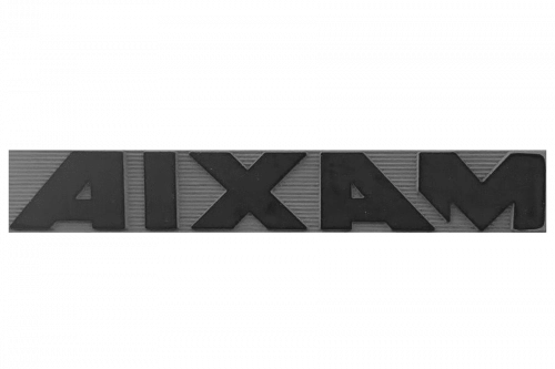
The first Aixam logo served the company throughout its initial decade and established the core typographic approach still visible in later versions. This design relied entirely on the brand name rendered in a strong, geometric style that conveyed solidity and clarity.
- Design: All-capital AIXAM lettering in a bold square sans-serif typeface with extra-thick lines and straight edge cuts
- Colors: Primarily black or dark blue
- Changes: Simple close letter spacing with minimal decoration
- Context: Introduced at founding in 1983 and used for the first thirteen years of the brand’s existence
1996–2007: Circular Medallion with Integrated A
In 1996 Aixam introduced its first major visual update by adopting a circular medallion that created a more emblematic identity for the brand. This design marked the transition from purely typographic representation to a structured badge that combined symbol and text.
- Design: Matte-blue circular field with large gradient white letter A whose horizontal bar is replaced by the word AIXAM in all capitals crossing through it
- Colors: Matte blue background, double red and white outline, white gradient lettering
- Changes: Replaced the plain text mark with an integrated emblem that served as the primary symbol for eleven years
- Context: Represented the first attempt to develop a distinctive badge that could function independently of the full brand name
2007–Today: Separated Emblem and Logotype
The current Aixam logo was introduced in 2007 to simplify the previous complicated design while preserving its essential character. This version separates the circular emblem from the wordmark, allowing both elements to function independently or together depending on application needs.
- Design: Sleek circular blue medallion positioned above the logotype, simplified letter A with 3D volume and softened contours, bold rounded sans-serif typeface where letters slightly touch
- Colors: Royal blue medallion and deep blue lettering, white and silver gradients on the A, refined thicker white-silver and red outlines
- Changes: Removed complexity from the 1996 version, added subtle three-dimensional qualities while maintaining the blue circle and red accent
- Context: Created to produce a cleaner, more modern appearance that remains the official mark used by the company today
Aixam Logo Design Elements
The brand has maintained remarkable consistency in its typography and color choices across more than forty years. Its custom bold rounded sans-serif lettering features uppercase characters with massive presence and softened angles throughout all eras.
Royal blue serves as the primary corporate color, appearing in both medallions and lettering. White and silver provide highlights while a thin red accent outlines the circular elements. Black was used only in the earliest period before the brand adopted its characteristic blue palette.
These choices communicate stability, professionalism, high value and trustworthiness while the red accent adds a note of passion and energy.
Aixam-Mega Visual Relationship
From approximately 1993 onward Aixam developed the related Mega sub-brand that shared core design principles with the main mark. The Mega emblem used a similar dark blue circular field with red and white borders, creating a unified family appearance across both brands.
The 2007 redesign applied comparable simplification to the Mega mark, placing its name outside the circle while retaining the blue circular foundation. This shared design language strengthened the visual connection between the two ranges during their period of parallel use.
Aixam Logo History Summary
The evolution of the Aixam logo demonstrates a clear progression from basic text identification in 1983 toward a more sophisticated yet cleaner emblematic system. Each change aligned with the company’s growth and desire to present a more mature and modern image to its customers.
The current design successfully balances the bold presence established in the first era with the symbolic strength introduced in 1996 while achieving greater clarity and versatility. This visual heritage continues to support the brand’s reputation for quality microcars and quadricycles in the European market.