Key facts
- Founded
- 1955
- Founded by
- Shanghai Municipal Government
- Country
- China
- Headquarters
- Shanghai, China
- Legal name
- SAIC Motor Corporation Limited
Brand History
SAIC Motor traces its origins to 1955 when it was established in Shanghai as the Shanghai Internal Combustion Engine Components Company. The company went through several name changes that reflected its growing role in the Chinese automotive sector. It is currently known as SAIC Motor Corporation Limited and remains a state-owned enterprise under the Shanghai State-owned Assets Supervision and Administration Commission.
SAIC Motor Logo Evolution
1955–1979: First Logo
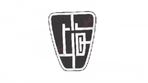
- Design: Black badge with white outline, top wider than bottom, Chinese characters integrated into the shape
- Colors: Black and white only
- Changes: None during this period
- Context: Used while the company operated as a local Shanghai parts and tractor manufacturer
1979–1995: Second Logo
- Design: Blue circle with blue tick or check mark and white outline placed on triangular shape with rounded corners
- Colors: Blue and white
- Changes: Shift from purely textual Chinese characters to graphic symbol
- Context: Coincides with increasing cooperation in the automotive sector during the 1980s
1995–2011: Third Logo
- Design: Blue ring with horizontal bar in the middle featuring the SAIC acronym
- Colors: Blue and white
- Changes: First logo to prominently feature the SAIC acronym, extended versions included Chinese name above English name
- Context: Introduced alongside major corporate restructuring and significant production growth
2011–2021: Fourth Logo
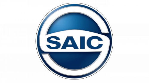
- Design: Prominent stylized S sign with wide horizontal bar containing SAIC in capital letters placed over a blue circle with highlight at top
- Colors: Blue and white
- Changes: Introduction of stylized letter S as central element, semi-bold sans-serif typography with elongated upper tail of C
- Context: Aligned with opening of international offices and peak period of domestic leadership
2021–Present: Fifth Logo
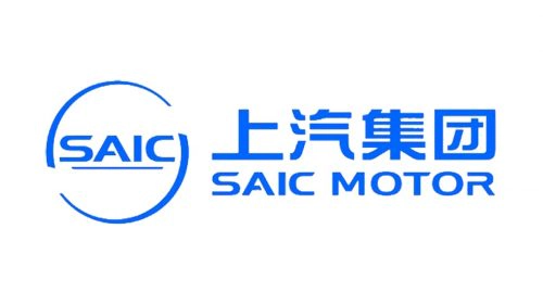
- Design: Two semicircles enclosing the nameplate from above and below with no background elements and SAIC name underscored
- Colors: Blue and white
- Changes: Small cut in A horizontal bar, both tails of C straightened, letters positioned even closer together
- Context: Represents the company’s move into a more digital era with minimalist design trends
Logo Design Language Continuity
Blue and white have remained the primary color palette across all logos since 1979. This combination conveys calming qualities and stylish clarity. Typography has consistently used sans-serif semi-bold capitalized letters with gradual adjustments in letter spacing and specific character details over time.
The symbol evolution shows a clear redesign pattern where each change corresponds to major corporate name adjustments or strategic expansion milestones. From the tick inside a circle in the 1979-1995 era to the ring with horizontal bar, then the stylized S, and finally the enclosing semicircles, each SAIC Motor symbol has marked a significant point in the company’s development.
Historical Milestones Tied to Logo Changes
Several key events directly connect to the visual identity updates of SAIC Motor. In 1984-1985 the company reached agreements with Volkswagen during the second logo era. The 1995 name standardization and associated growth triggered the third logo featuring the ring and bar design.
The 2011 shortening of the company name to SAIC Motor along with international expansion steps coincided with the introduction of the stylized S logo. Finally the 2021 shift toward minimalist identities led to the current semicircle design that remains in use today. These moments illustrate how SAIC Motor logo history closely tracks the company’s strategic evolution.
The complete SAIC Motor logo evolution demonstrates a consistent approach to visual identity that has adapted to each phase of corporate development while maintaining core design principles. For those interested in high quality assets, SAIC Motor logo png and SAIC Motor logo transparent background versions are often sought for reference and design purposes alongside SAIC Motor logo hd images.