Key facts
- Years active
- 1887–1967
- Founded by
- René Panhard, Émile Levassor
- Country
- France
- Headquarters
- Paris, France
- Parent company
- Citroën
- Legal name
- Panhard et Levassor
- Famous models
- Dyna, PL17, 24
Brand Overview and Founding
Panhard was established in 1887 by René Panhard and Émile Levassor under the original full name Panhard & Levassor. The French company initially focused on civilian car manufacturing and ranks among the world’s oldest automotive brands. Over time its identity shifted from pioneering automobiles to specialized vehicle production while retaining strong recognition.
Key milestones include the 1887 founding, early logo updates in 1891 and 1907, the 1945 introduction of the Panhard wordmark, and the 1953 metallic shield design. Corporate changes continued with PSA ownership after 1974 and the 2005 acquisition by Auverland, which retained the Panhard name due to its superior worldwide brand recognition. The company later became a subsidiary of Renault Trucks Defense.
Panhard Logo Evolution
1887–1891: Early Monogram Period
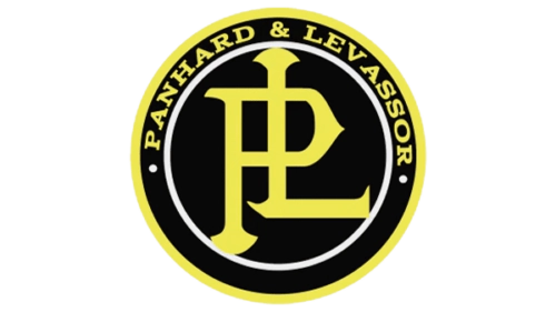
- Design: Round form with central monogram and bordering text
- Colors: Yellow, black, white
- Changes: Original logo directly tied to the 1887 founding
- Context: Used during the brand’s earliest civilian car manufacturing years
1891–1907: Bold Red Monogram Period
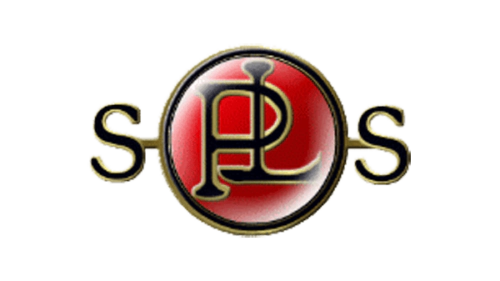
- Design: Round base with modified PL monogram and flanking S letters
- Colors: Red, black, golden
- Changes: Updated from the 1887–1891 version with new color and S elements
- Context: Second early variant during the brand’s growth phase
1907–1953: Minimalist Monogram Period
- Design: Simplified monogram without S letters
- Colors: Off-white, black, golden
- Changes: Major simplification in 1907 coinciding with maturing brand identity
- Context: Longest-used logo era spanning much of the company’s history
1945–1967: Italic Wordmark Period

- Design: Wordmark only with italicized sans-serif lettering
- Colors: Black
- Changes: Complete move away from monogram style
- Context: Introduced as the brand entered its later manufacturing phase
1953–1967: Metallic Shield Period
- Design: Shield-shaped emblem with indented metallic effect
- Colors: Metallic silver, red, golden
- Changes: New sophisticated form introduced in 1953
- Context: Represented the brand during mid-20th century production
2005–2012: Modern Revival Period
- Design: Updated wordmark combined with deer symbol
- Colors: Not specified in revival
- Changes: 2005 modernization of the 1945 design with added symbolic element
- Context: Final documented logo period following the Auverland acquisition
Brand Legacy
The Panhard logo evolution demonstrates the company’s ability to balance tradition with modernization across more than 120 years. From the original 1887 PL monogram through multiple redesigns, each era of the Panhard emblem reflects specific moments in corporate development. The decision to retain the Panhard name in 2005 due to its worldwide recognition underscores the enduring value of its visual identity.
The complete Panhard logo history serves as a timeline of French automotive heritage. Each Panhard symbol and badge captures the brand’s transition from pioneering car manufacturer to its later specialized role. These designs continue to provide reference value for those studying automotive branding and visual identity development.