Key facts
- Years active
- 1899–1958
- Founded by
- James Ward Packard, William Doud Packard, George Lewis Weiss
- Country
- United States
- Headquarters
- Warren, Ohio, United States
- Parent company
- Studebaker-Packard Corporation
- Legal name
- Packard Motor Car Company
- Famous models
- Twelve, Clipper, Caribbean, One-Twenty, Patrician
- Slogan
- “Ask the Man Who Owns One”
Packard Brand History
Packard was founded in 1899 in Warren, Ohio by James Ward Packard, William Doud Packard, and George Lewis Weiss. The company produced its first automobile that same year. In 1902 it was refinanced and renamed Packard Motor Car Company, with Henry B. Joy becoming a key leader who oversaw the relocation to Detroit, Michigan between 1902 and 1903.
The Detroit headquarters served as the primary production base from 1903 until 1956. Packard earned a reputation for high-end luxury automobiles and was known as part of the “Three Ps” of American luxury alongside Pierce-Arrow and Peerless. The company reached its peak luxury positioning during the 1930s, marked by continuous engineering innovation.
A major milestone occurred in 1954 when Packard merged with Studebaker to form the Studebaker-Packard Corporation. The last Detroit-built Packard rolled off the line in 1956, with final cars produced in South Bend, Indiana in 1958. The Packard brand name was discontinued in 1962.
Packard Logo Evolution
1899–1950s: Early Crest Era
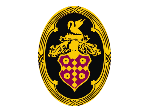
The early crest served as the primary corporate and vehicle branding for decades after the company’s founding. This Packard logo emphasized heritage and prestige through its traditional design elements.
- Design: Ornate royal crest often presented on vertically oval medallion or circular badge featuring bird from the Packard family crest
- Colors: Burgundy, gold, black, silver with occasional sky-blue background versions
- Changes: Incorporated script wordmark in title-case with thick arrow-like underline formed by elongated D tail alongside uppercase serif and sans-serif variants
- Context: Used on front and rear of vehicles to convey luxury positioning throughout the company’s most successful decades
1911–1950: Mascot Development Period
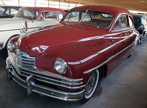
Packard introduced several distinctive mascots and hood ornaments that complemented its main emblem over the years. These elements helped differentiate engine lines and models while adding decorative prestige to the vehicles.
- Design: Hood ornaments ranging from symbolic figures to detailed statuettes including the Goddess of Speed based on Nike
- Colors: Varied metallic finishes consistent with luxury automotive detailing of each era
- Changes: Figure Six introduced in 1911, Goddess of Speed first appearing in 1925, Pelican mascot introduced in 1932 on senior models and officially renamed back to Pelican in 1949
- Context: Mascots served both decorative and model-differentiating purposes such as distinguishing six-cylinder from other engine variants
1950s: Final Geometric Era
The company adopted a more modernist approach to its visual identity during its final years as it faced increasing competitive pressure. This Packard emblem represented a significant departure from the ornate crest that had defined the brand for decades.
- Design: Minimalist geometric emblem consisting of a dark red hexagon with plain solid texture and right side shadowed to suggest motion
- Colors: Dark red dominant combined with silver wordmark applications on vehicles
- Changes: Replaced earlier ornate crest with simplified geometric form while retaining uppercase serif lettering now featuring slightly narrowed elegant lines
- Context: Used in the years surrounding the 1954 merger with Studebaker and through the final vehicles produced in 1958
Packard Symbol Meaning and Legacy
The core Packard symbol drew from the Packard family heraldry with a prominent bird element that appeared across crest and mascot designs. This consistent use of the pelican or cormorant reinforced brand heritage throughout the company’s history. The color palette of burgundy, gold, black, and silver remained remarkably stable, always conveying luxury and trustworthiness.
Packard logo history reflects the broader trajectory of American luxury automaking from ornate early designs to streamlined modernist expressions in the 1950s. The evolution from elaborate royal crest to simplified geometric form mirrors the brand’s journey through its peak years into its final chapter after the Studebaker merger.
Enthusiasts often seek Packard logo png, Packard logo transparent, and Packard logo hd versions to study these historical designs in detail. The various iterations of the Packard car symbol continue to represent American automotive excellence and engineering innovation from the early 20th century through the late 1950s.