Key facts
- Years active
- 1852–1966
- Founded by
- Henry Studebaker, Clement Studebaker, John Studebaker, Peter Studebaker
- Country
- United States
- Headquarters
- South Bend, Indiana, United States
- Legal name
- Studebaker Corporation
- Famous models
- Champion, Avanti, Lark, Commander
Studebaker Brand History
Studebaker was founded in February 1852 and incorporated in 1868 as the Studebaker Brothers Manufacturing Company. The company established its headquarters in South Bend, Indiana, and initially specialized in building wagons and carriages. It entered the automotive sector in 1902 with electric vehicles and achieved full in-house gasoline automobile manufacturing by 1912.
The company experienced several key milestones that shaped its development. These included the start of gasoline vehicle production in 1904, a merger with Packard in 1954, the closure of its South Bend plant in 1963, the production of its final vehicle in Hamilton, Ontario in 1966, and the complete dissolution of the company in February 1968. Throughout its history, Studebaker earned a reputation for quality and durability as an American automotive pioneer.
Studebaker Logo Evolution
Studebaker logo history reflects four major updates that coincided with important stages in the company’s growth from wagon maker to automobile manufacturer.
1902 – 1917: Early Script Logo
This first Studebaker logo was introduced at the time the company entered the automotive industry. The design featured an elegant and simple inscription that helped signal the brand’s transition from wagons to cars.
- Design: Monochrome script with curved tails on letters
- Colors: Black and white
- Changes: Created specifically for the 1902 automotive launch
- Context: Used during initial years of car production and ownership changes
The Studebaker symbol from this era maintained a well-balanced appearance that emphasized the brand name through decorative lettering.
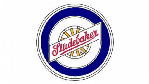
1912 – 1935: Circular Wheel Badge

Studebaker logo evolution continued in 1912 with the introduction of a circular wheel badge when the company began full gasoline automobile manufacturing. This design incorporated a wheel symbol that directly referenced the brand’s wagon-making heritage.
- Design: Blue circular badge with central white and yellow wheel plus diagonal banner
- Colors: Blue, white, black, red, and yellow
- Changes: Added symbolic wheel element for the first time
- Context: Marked the shift to complete in-house car production
The Studebaker car symbol in this period combined the earlier script style lettering within a memorable colorful badge.
1935 – 1963: Modern Circular S Badge

A significant modernization occurred in 1935 with the arrival of a new Studebaker emblem during the company’s mature automotive period. This version emphasized both passenger cars and commercial trucks through added tagline text.
- Design: Circular badge with bold vertical S on the left and uppercase brand name
- Colors: Scarlet red and white
- Changes: Replaced script with square sans-serif typeface and introduced prominent S
- Context: Reflected established reputation for quality vehicles
This Studebaker logo png style remained in use for nearly three decades and projected a sleek, professional image appropriate for its time.
1963 – 1968: Split-Color Minimalist Badge
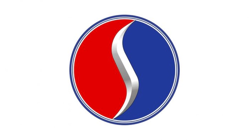
The final Studebaker logo evolution took place in 1963 following the merger with Packard as the company entered its last years of independent vehicle production. This design adopted a cleaner and more minimalist corporate appearance.
- Design: Split-color circle with bold three-dimensional S and connected sans-serif nameplate
- Colors: Red, blue, and silver
- Changes: Simplified previous badge while retaining the S element in sharper form
- Context: Coincided with plant closures and the end of automobile manufacturing
The Studebaker logo transparent background versions of this final design are often sought by collectors and historians documenting the brand’s conclusion.
Studebaker Logo Design Elements and Symbolism
Typography for the Studebaker logo changed across the four eras from decorative script with curved tails to square sans-serif thick lines and finally to connected sans-serif lettering. The stylized S became a dominant element from 1935 onward. The wheel symbol used between 1912 and 1935 provided a direct visual link to the company’s original wagon manufacturing roots.
Color choices in the later periods conveyed specific qualities. Blue represented professionalism while red suggested energy and passion. Silver added a sense of modernity and loyalty in the final logo era.
Studebaker Logo Meaning and Legacy
The various Studebaker logo images tell the story of an American company that began with horse-drawn vehicles and adapted its visual identity as it embraced automotive technology. Each change in the Studebaker logo hd reflected responses to major company events such as entering full gasoline production or navigating the challenges after the Packard merger.
Today enthusiasts search for Studebaker logo download options and Studebaker logo transparent files to study this evolution. The company’s legacy as a durable vehicle builder continues to interest those exploring automotive history through its distinctive badges and emblems. The progression from early script to the final split-color design captures more than a century of industrial development in a single visual timeline.