
Key facts
- Founded
- 1989
- Founded by
- Takashi Oka, Bill Bruce
- Country
-
 Japan
- Headquarters
- Yokohama, Japan
- Parent company
- Nissan
- Famous models
- Q50, QX55, QX60, QX80
- Website
- www.infiniti.com
What Does the Infiniti Logo Mean?
The two strokes of the inverted V are the edges of the road, narrowing as they run into the distance, and the brand calls the idea “The Infinite Road.” Mount Fuji and the infinity sign are popular readings of the same shape, not the stated design intent.
The Infinite Road to the Horizon
Infiniti’s brand page says the company wanted a logo for “the road ahead and our pioneering spirit.” Its 30th-anniversary timeline describes the 1987 design as a badge showing two central lines running into the horizon. When the symbol made its debut on the Q45 in 1989, Infiniti presented it as the limitless possibility of a road with no end.
Mount Fuji and the Infinity Sign Theories
Many people see Mount Fuji in the inverted V, and Wikipedia attributes both the road and the mountain to Nissan. Others see the mathematical infinity sign, the lemniscate, in the oval outline. Infiniti’s own page lists both as theories, then says the symbol represents what the brand stands for. In short: a road to the horizon by design, a mountain or an infinity sign by interpretation.
Why the Name Is Spelled With Four I’s
The name came from Nissan’s Horizon task force, which chose INFINITI in 1987. Its members felt the four I’s looked like lines on a road. Starting and ending the word with the same letter was meant to give it a never-ending quality. That is why the brand is Infiniti, with an “i” at the end rather than a “y.” The company styles the name in capitals: INFINITI.
Infiniti Logo History and Evolution
The Infiniti logo history is short. The name and badge were chosen in 1987, the logo appeared on cars in 1989, and an evolved version arrived in June 2023. The core symbol has stayed largely the same throughout. Infiniti’s own evolution graphic shows four logos in a row, but the company has not dated the two in the middle, so the versions below are the ones with confirmed artwork.
The fastest way to tell the old and new Infiniti logo apart is the top of the V: it ends in a sharp point before 2023 and opens into two separate strokes after.
1989: The Original Infiniti Logo
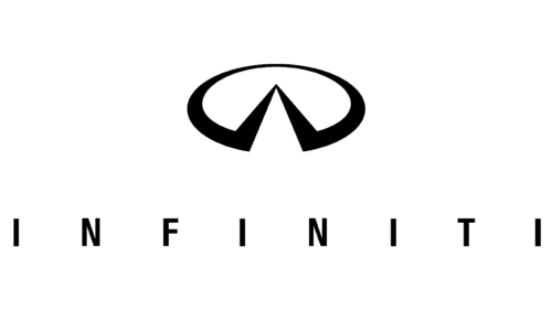
The first Infiniti logo was flat black artwork. Two angular strokes meet in a sharp point inside an oval, and a thin uppercase INFINITI wordmark sits below. The letters are narrow, but the spacing between them is very wide, so the wordmark runs far beyond the edges of the emblem.
This is the Infiniti logo car buyers first saw, on the Q45 sedan that opened the brand in 1989. On that car’s hood it took the form of a detailed cloisonné badge, covered in the badge section below.
2000s–2023: The Three-Dimensional Chrome Logo
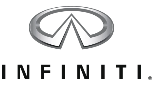
Through the 2000s and 2010s, Infiniti used a three-dimensional, chrome-style version of the logo. It kept the pointed inverted V but rendered the emblem in a silver metallic gradient, with a thicker bevelled oval. The emblem grew much larger next to the wordmark, and the letters became heavier, with tighter spacing.
The start year is uncertain. The logo site 1000logos.net dates this version to 2004, but no Infiniti source confirms that year.
2023: The New Infiniti Logo
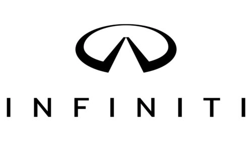
Infiniti released an evolved logo on June 22, 2023, together with a Horizon graphic and a new three-dimensional emblem for its cars. The biggest change is at the top: the two strokes no longer meet in a point. They end in flat tops with a gap between them, like a road running on to the horizon.
The rest of the update is subtler. The logo is flat black again, the oval is slightly wider and thinner, and the emblem is larger than in 1989. The wordmark is bolder, flatter and spaced wider. Several design outlets report that the agency Bruce Mau Design worked on the refresh.
The Infiniti Badge on the Car
The logo first appeared on cars as a detailed cloisonné badge on the hood of the Q45. Once the symbol was settled, Infiniti designed the vehicle badge around the Japanese concept of Ma, aiming for something elegant and simple, yet warm and human. The fine detailing of that first badge later disappeared, but its shape stayed largely the same.
Infiniti’s brand page highlights where the logo appears on its cars and concepts:
- Chrome badge: the classic version of the marque.
- FX: set into the grille.
- QX55: doubles as an opening button.
- QX60: sits in an origami-influenced grille.
- Q Inspiration concept: a three-dimensional marque.
- All-new QX80: an illuminated badge.
The 3D emblem released in 2023 is illuminated as well, and Infiniti announced it for future production vehicles. The company says the light lifts the bright road to the horizon.
Infiniti Logo Colors, Font and Variants
The Infiniti logo is monochrome. The 1989 and 2023 artworks are solid black, while the three-dimensional version used a metallic silver gradient. The newer logo also comes reversed, in white on a dark background.
Infiniti has not published the name of the typeface in its wordmark, so font names that circulate online are guesses. What is clear is the style: an uppercase sans-serif, which the 2023 update flattened and spread out to echo the horizon line.
Infiniti’s newsroom logo gallery, updated on June 20, 2024, offers the current logo in these official lockups:
| Lockup | Layout | Color versions |
|---|---|---|
| Primary | Symbol above the INFINITI wordmark | Black on white, white on black |
| Secondary | Symbol beside the wordmark | Black on white, white on black |
The 2024 date marks the gallery upload, not a new design. For a quick file, download the Infiniti logo PNG with the button above.
Where Infiniti Comes From
Infiniti is a Japanese car brand and the luxury division of Nissan, so its country of origin is Japan. Its headquarters are in Nishi-ku, Yokohama, although the brand launched first in the United States, on November 8, 1989.
The head office has not always been in Japan. Infiniti moved its headquarters to Hong Kong in 2012 and brought them back to Yokohama in 2020. In Europe, the brand announced its entry at the 2008 Geneva Motor Show and left Western Europe in 2019–2020.
See more Japanese car brands and other luxury car brands.
Frequently asked questions
Did Infiniti change its logo?
Yes, but only lightly. In June 2023 the brand released an evolved Infiniti logo, the fourth one in its own evolution graphic, along with an illuminated 3D emblem planned for future production cars. The basic idea, an oval holding a road that runs to the horizon, is the same one chosen in 1987.
Are Infiniti and Acura the same company?
No. Infiniti is Nissan's luxury brand, Acura is Honda's, and Lexus is Toyota's. The three Japanese premium brands were created around the same time, which is why people often mix them up. Watch the spelling too: the Nissan brand is Infiniti, not Infinity.
Which car logo looks like Infiniti's?
Search questions most often pair it with the Mazda and Acura badges. To spot the Infiniti logo, look for a horizontal oval with an inverted V inside and no letters in the symbol itself. In the 2023 version, the two strokes stop short of each other at the top instead of meeting in a point.