Key facts
- Founded
- 1948
- Founded by
- Maurice Wilks
- Country
- United Kingdom
- Headquarters
- Whitley, Coventry, United Kingdom
- Parent company
- Tata Motors
- Famous models
- Defender, Discovery, Range Rover, Freelander, Series I
- Slogan
- “Above and Beyond”
- Website
- landrover.com
Land Rover Brand History
Land Rover began in 1948 under the Rover Company. The brand later passed through several owners: Leyland Motor Corporation from 1967 to 1968, British Leyland Motor Corporation from 1968 to 1986, Rover Group from 1986 to 2000, Ford Motor Company from 2000 to 2008, and has been owned by Jaguar Land Rover under Tata Motors since 2008. Each corporate change influenced aspects of the brand presentation, including updates to the Land Rover logo.
The company has always focused on vehicles that deliver capability above and beyond expectations. Its British origin in Solihull remains an important part of the brand identity, especially in the earliest versions of the emblem.
Land Rover Logo Evolution
1948 – 19??: Original Oval Logo
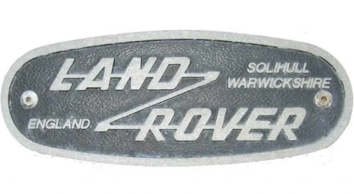
The first Land Rover logo was created at the time of founding in 1948. It featured a dark gray almost black oval with a silver outline and italicized lettering that included the full origin details.
- Design: Oval shape possibly inspired by a tin of fish, italic lettering with distinctive Z connection between Land and Rover
- Colors: Dark gray with silver outline
- Changes: Included additional text Solihull Warwickshire England
- Context: Celebrated British origin and reflected reliability and functionality of the vehicles
19?? – 1968: Simplified Rectangular Logo
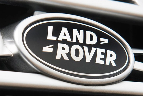
A simplified rectangular version of the Land Rover logo appeared in later years until 1968. This design placed a rectangular base on a slight diagonal to suggest motion.
- Design: Rectangular base with thin white framing on slight diagonal, retained Z connection
- Colors: White lettering on black background
- Changes: Removed origin text and adopted uppercase styling
- Context: Gave the logo a dynamic feel symbolizing capability on hills and challenging terrain
1968 – 1978: Black and Silver Round Logo
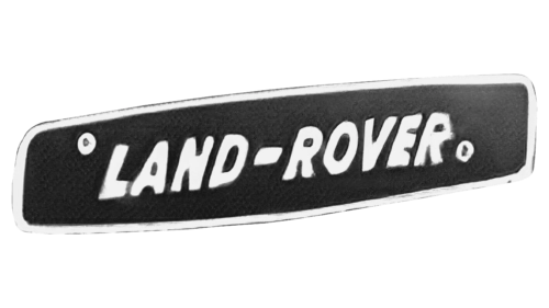
The Land Rover logo became rounder during the 1968 to 1978 period. This version used a black and silver color palette and presented the wordmark with greater confidence.
- Design: Rounder emblem, bold Land Rover wordmark, signature zigzag connection split into two parts
- Colors: Black and silver
- Changes: Shifted from rectangular to rounder form with separated zigzag element
- Context: Reflected power and capability during the British Leyland era
1978 – 1986: Green and Gold Logo
Green was introduced to the Land Rover logo between 1978 and 1986. This version kept the same style and spacing as the previous emblem while adopting an emerald green field and gold lettering.
- Design: Same overall layout as prior version with consistent spacing
- Colors: Emerald green with gold lettering
- Changes: First use of green that would become the brand signature
- Context: Marked the introduction of the color that represents nature and vitality for the brand
1986 – 2021: Iconic Emerald Green Oval Logo
The longest-lasting version of the Land Rover logo ran from 1986 until 2021. This emblem defined the modern era of the brand with an emerald green oval and white outline.
- Design: Emerald green oval with white outline, Gill Sans typeface, retained Z connection now split into two small signs
- Colors: Emerald green with white lettering and outline
- Changes: Adopted clean Gill Sans typography for simplicity and functionality
- Context: Became the defining logo of the brand for 35 years and aligned with Rover Group ownership
A brighter variant appeared alongside the main design from 1996 to 2021. This version featured a brighter green with gradient and light beige lettering that gave a more natural appearance.
2021 – Present: Modern Black and White Logo
A contemporary black and white version of the Land Rover logo was introduced in 2021. This update modernized the overall appearance while preserving core elements.
- Design: Thicker black outer border and thinner inner border separated by white line, slightly redrawn letters without black shadow
- Colors: Black and white
- Changes: Simplified color scheme and refined border structure
- Context: Updated the emblem to appear more modern and bold under current Jaguar Land Rover direction
2023 – Present: JLR Corporate Logo
In 2023 Jaguar Land Rover introduced a unified corporate logo. This minimalist design represents the first single emblem for both Jaguar and Land Rover brands.
- Design: Simple minimalist motif
- Colors: Black and white
- Changes: Replaced separate brand logos with one corporate symbol
- Context: Reflects elegance, modernity and cutting-edge essence for the parent company
Land Rover Logo Design Elements and Symbolism
The oval shape remains a constant feature across most versions of the Land Rover logo. One legend suggests the shape was inspired by a tin of fish seen by Maurice Wilks during lunch.
The distinctive Z-connection carries two main interpretations. It is often said to represent difficult roads that Land Rover vehicles can conquer and also serves as a graphical representation of the company motto Above and Beyond.
Color choices have carried clear meaning. Green symbolizes nature, energy, vitality, movement and eternal progress while white represents purity and dignity. The adoption of Gill Sans typography from 1986 onward was chosen for its simplicity and reflection of functionality and quality.
Land Rover Logo History Summary
The evolution of the Land Rover logo closely followed major corporate milestones. The 1948 founding produced the original oval with full origin text. Corporate changes in 1968 brought simplification and a black and silver palette. Green arrived in 1978 and the iconic emerald green oval was introduced in 1986 at the start of the Rover Group era. The 2008 acquisition by Tata Motors did not immediately alter the emblem. A modern black and white design appeared in 2021 and the unified JLR corporate logo followed in 2023.
This timeline shows how the Land Rover emblem has balanced heritage with contemporary needs while keeping the oval form, Z-connection and meaningful color symbolism intact across more than seven decades.