Key facts
- Founded
- 1985
- Founded by
- Ron Dennis
- Country
- United Kingdom
- Headquarters
- Woking, United Kingdom
- Parent company
- CYVN Holdings
- Legal name
- McLaren Automotive Limited
- Famous models
- 720S, F1, P1, Senna, Artura, 12C
- Website
- cars.mclaren.com
The New McLaren Logo (September 2026)
Yes, McLaren has a new logo. On September 22, 2026, the company announced an evolved brand identity for both McLaren Automotive and McLaren Racing, built around a new wordmark. The Speedmark, the Speedy Kiwi and papaya orange all stay, so what changed is the lettering, not the symbol.
What Changed in the New McLaren Wordmark
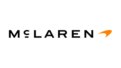
The new wordmark spells MCLAREN in wide, all-capital sans-serif letters, with one exception: a small lowercase c that rests on a short horizontal line. It is lighter and more open than the heavy lettering that dominated the brand for decades. This lettering is reported as the basis of a custom typeface called McLaren Sans.
Here is how the old McLaren logo compares with the new one:
| Old wordmark (to September 2026) | New wordmark (from September 22, 2026) | |
|---|---|---|
| Letters | Mixed case, “McLaren” | All capitals, lowercase c on a line |
| Weight | Heavy and bold | Lighter, wider, more open |
| Source | Earlier McLaren wordmarks | The sign on the McLaren family’s service station |
| Symbol | Speedmark | Speedmark, kept |
| Scope | Papaya for Racing, black for Automotive | One identity for both |
Creative Bloq compared the look to a luxury fashion brand, and Car and Driver described it as replacing the bolder wordmark first introduced in 1981.
Where the New Lettering Comes From
The letters are based on the sign above the service station owned by Bruce McLaren’s parents, Les and Ruth McLaren, in Remuera, Auckland. As a teenager, Bruce rebuilt a 1929 Austin 7 Ulster in that garage, and it became the car that gave him his first race win.
The announcement was fronted by one executive from each business: David Woodhouse, Chief Creative Officer of McLaren Automotive, and Lou McEwen, Chief Marketing Officer of McLaren Racing.
Is the McLaren Logo Still a Kiwi? What Stays
Yes, the kiwi stays. The Speedy Kiwi, introduced in 1971, is part of the new identity. So is the Speedmark, which the press release keeps at the center of the brand; one early report that it would be limited to sub-brands misread the release. Papaya orange also remains, joined by an expanded palette drawn from key moments in McLaren history.
First seen on: the McL 6GT, revealed at Monterey Car Week and inspired by Bruce McLaren’s M6GT. It is the first model to carry the new McLaren logo, spelled across its tail, and it is not expected before 2028.
McLaren Logo Meaning: The Kiwi, the Speedmark and Papaya
The McLaren symbol has two parts with separate meanings. The kiwi, used in the first logos and kept today as the Speedy Kiwi, stands for New Zealand, the home country of founder Bruce McLaren. The Speedmark, the curved swoosh on the McLaren car logo, represents the air vortices a racing car’s rear wing creates. Papaya is the brand color rather than a symbol, and its story is in the FAQ below.
Unlike the horse of Ferrari or the bull of Lamborghini, the Speedmark depicts no animal, and no McLaren logo has ever had wings.
Why the First McLaren Symbol Was a Kiwi
The kiwi is New Zealand’s national symbol, and Bruce McLaren was born in Auckland. When motorsport artist Michael Turner designed the team’s first crest in 1964, he put a black kiwi at its center as a tribute to that homeland. McLaren describes the result as closer to a coat of arms than a corporate identity.
The 1971 Speedy Kiwi kept the bird but redrew it leaning forward, to suggest the higher speeds Bruce’s cars raced at.
What the McLaren Speedmark Represents
The Speedmark is the abstract McLaren symbol: a tapered swoosh that first appeared in 1997, placed on top of the F1 cars’ side-pods. Officially, the shape resembles the vortices generated by the rear wing. McLaren also offers a second reading, the aggressive markings seen on predatory animals and insects.
Fans offer other readings: a stylized kiwi head, a softened version of the chevron it replaced, or a figure 1. None of them comes from McLaren.
When people mention the McLaren emblem on a modern car, they usually mean the Speedmark, not the lettering beside it.
McLaren Logo History: Every Version Since 1963
The McLaren logo has gone through 11 versions since the racing team began in 1963. Dates follow McLaren’s heritage page; sites that say the crest was created in 1963, the Speedy Kiwi arrived in 1967 or the Speedmark in 1998 disagree with it.
1963–1970: The Bruce McLaren Motor Racing Team Crest
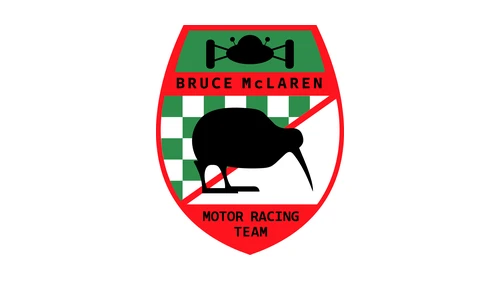
Used by: the racing team. The original McLaren symbol was a shield designed in 1964 by Michael Turner and used from the team’s early years until 1970. Under BRUCE McLAREN and a single-seater silhouette sit a green-and-white checkered field, a red diagonal stripe and a black kiwi, with MOTOR RACING TEAM along the bottom.
For its 60th anniversary in 2023, McLaren Racing put this crest back on its F1 car at the Italian Grand Prix.
A Later Crest Variant Reading McLAREN
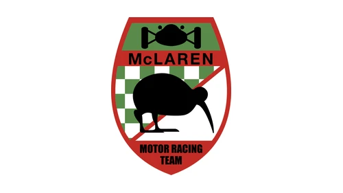
Used by: the racing team. A second version of the shield replaces BRUCE McLAREN with a single word, McLAREN, and has a heavier red outline. Logo archives date it to about 1965; McLaren’s heritage page does not list it separately.
1971–1980: The Speedy Kiwi
Used by: the racing team. In 1971, a year after Bruce McLaren’s death, the shield gave way to the Speedy Kiwi, designed by Doug Eyre: a sleeker, forward-leaning kiwi on its own, with new lettering.
McLaren’s papaya orange, known as McLaren Orange, is usually traced to this period, though its exact origin is debated. The file above shows the bird as a plain black silhouette.
1981–1990: The McLaren International Logo
Used by: the racing team. After Team McLaren merged with Ron Dennis’s Project 4 Racing around 1980–81, the team became McLaren International. The new logo came from Raymond Loewy, a present to the team from its main sponsor (Marlboro), and it evokes a checkered flag: rows of chevrons above a heavy italic McLaren wordmark, with INTERNATIONAL beneath.
Rocket red arrived at the same time, chosen after several shades were tested so the sponsor’s color would look right on television.
1991–1997: Three Chevrons Become One
Used by: the racing team, as road-car plans took shape. In 1991 the three rows of chevrons merged into a single red chevron at the top right of the wordmark, and the font became more modern. McLaren links the change to its track ambitions converging with a young road-car division.
1997–2006: The Speedmark Arrives
Used by: the racing team. In 1997 the chevron was replaced by a curved, tapered swoosh in shaded red, rising above the end of the heavy black wordmark. This was the first Speedmark, and it is still in use.
2007–2017: Refined for the Chrome Livery
Used by: the racing team. In 2007 McLaren refined the marque to suit the team’s new Chrome livery, giving it a more modern look. The lettering is lighter in this version, and the Speedmark was kept.
Around 2010–2017: The McLaren Automotive Logo
Used by: McLaren Automotive. After the road-car business relaunched as McLaren Automotive in 2010, it used the wordmark and a red Speedmark with AUTOMOTIVE spelled out in spaced capitals below. Logo archives date this file to about 2012; the company’s first model, the 12C, launched in 2011.
2017–2021: Mono Black Speedmark and One McLaren
Used by: all of McLaren. In 2017 the Speedmark lost its shaded red and turned solid black. McLaren says the change stood for “one” McLaren, with three businesses united as one group. That year Ron Dennis sold his shares, and McLaren Automotive was brought together with the group.
2021–2026: Papaya Speedmark for McLaren Racing
Used by: McLaren Racing only. In 2021 the team’s Speedmark turned flat papaya, and the wordmark got a slimmer, modernized font meant to express agility and speed and to work better on digital screens. The change set the racing team apart, while McLaren Automotive kept its black Speedmark.
2026: One Evolved Identity
Used by: McLaren Automotive and McLaren Racing. The September 2026 identity (see the top of this page) reunites both businesses under one wordmark.
McLaren Racing vs McLaren Automotive Logos
McLaren Racing and McLaren Automotive are separate companies, and for much of their history they used different versions of the logo. The McLaren Automotive logo on road cars dates from the 2010 relaunch.
| Period | McLaren Racing (F1 team) | Road-car business |
|---|---|---|
| 1963–1984 | Kiwi crest, Speedy Kiwi (1971), McLaren International (1981) | None yet |
| 1985–2009 | Single chevron (1991), Speedmark (1997), Chrome refinement (2007) | McLaren Cars, founded 1985; F1 road car unveiled 1992, 106 built |
| 2010–2016 | 2007 refined wordmark and Speedmark | McLaren Automotive from 2010: wordmark, red Speedmark, AUTOMOTIVE beneath |
| 2017–2020 | Mono black Speedmark, “One McLaren” | Same mono black Speedmark |
| 2021–Sept. 2026 | Papaya Speedmark, slimmer font | Black Speedmark |
| From Sept. 22, 2026 | New wordmark, Speedmark, Speedy Kiwi, papaya | The same shared identity, first on the McL 6GT |
They also have different majority owners; see the FAQ below.
McLaren Logo on the Car: Where the Badge Sits
Which McLaren logo on car bodywork you see depends on when the car was built. Every road car sold so far carries a pre-2026 version, because the McL 6GT will be the first to wear the new branding. Here is which McLaren badge appears where:
- Road cars from the 2010 relaunch: the wordmark with the red Speedmark of the McLaren Automotive logo.
- Road cars from 2017 on: the black Speedmark, which McLaren Automotive kept after Racing switched to papaya.
- F1 cars since 1997: the Speedmark on top of the side-pods, in papaya from 2021.
- McL 6GT (not before 2028): the new wordmark across the tail.
The September announcement says nothing about replacing the McLaren badge on cars already on the road. To date the McLaren logo on car badges, look at the Speedmark first: shaded red points to before 2017, solid black to 2017 or later, and flat papaya to the race team since 2021.
McLaren Logo Fonts, Colors and PNG
The McLaren logo PNG on this page is the current 2026 version: the new capital-letter wordmark in black with a papaya Speedmark, on a transparent background.
- Typeface: the 2026 lettering is reported as the basis of a custom typeface, McLaren Sans.
- Colors: black lettering and a papaya Speedmark. Papaya is now joined by an expanded palette; press reports name shades such as Ember, Midnight, Colnbrook, Mist and Muriwai.
- Black and white: the 2017 mono black version is the official precedent for a single-color McLaren logo.
- Rights: the logo is McLaren’s trademark. The transparent McLaren logo PNG is for reference, editorial and fan use, not for products.
McLaren Country of Origin: A British Brand With a New Zealand Founder
McLaren’s country of origin is the United Kingdom. Its headquarters, the McLaren Technology Centre, is in Woking, England. Its founder’s story starts in New Zealand: Bruce McLaren was born in Auckland and started his racing team in 1963.
The kiwi in the McLaren logo and the 2026 Remuera lettering point to New Zealand; the company is British. McLaren is not German, Japanese or American, even though Mercedes-Benz was an engine partner of the F1 team.
McLaren Cars was founded in 1985 by Ron Dennis, the road-car business relaunched as McLaren Automotive in 2010, and the racing team dates from 1963 and Bruce McLaren.
Similar brands include Aston Martin and Bugatti; see all supercar brands and hypercar brands.
Frequently asked questions
Does Elon Musk still own McLaren?
No, and he never did. Elon Musk owned a single McLaren F1 road car, which he bought in 1999, crashed in 2000 and sold around 2007. McLaren Automotive is owned by CYVN Holdings, an investment company owned by the government of Abu Dhabi.
Who owns McLaren now?
The road-car company belongs to CYVN Holdings of Abu Dhabi, which bought it from Bahrain's Mumtalakat in a deal announced in December 2024 and owned it outright by March 2025. In April 2025 it merged with Forseven to form McLaren Group Holdings. The F1 team is separate: Mumtalakat holds the majority and CYVN a minority stake.
Is McLaren owned by Mercedes or Audi?
No. Neither company owns McLaren. Mercedes-Benz was an engine partner of the McLaren F1 team and, for a time, a shareholder, which is where the connection comes from. Audi has never owned the brand. Its ultimate owner is CYVN Holdings of Abu Dhabi.
Is McLaren German or British?
British. McLaren is a private British company, McLaren Automotive Limited, headquartered in Woking, England, at the McLaren Technology Centre. It is not German, Japanese or American. The confusion comes from its New Zealand-born founder, its Abu Dhabi owner and its Formula 1 partnership with Mercedes-Benz.
Why did McLaren go papaya?
Papaya is McLaren's historic color, usually traced to the Speedy Kiwi years of the early 1970s. Its exact origin is debated: it may have come from a sponsor's livery or from New Zealand's national racing colors. The F1 team returned to a papaya livery in 2017, and its Speedmark turned papaya in 2021.
Who designed the McLaren logo?
There is no single designer. Motorsport artist Michael Turner drew the first kiwi crest in 1964, Doug Eyre created the Speedy Kiwi in 1971, and Raymond Loewy designed the 1981 McLaren International logo. McLaren's announcement credits no outside studio for the 2026 wordmark, which is based on a family garage sign.
What does McLaren mean?
McLaren is a surname. The company is named after its founder, New Zealand racing driver Bruce McLaren, who started his team in 1963. It is not an acronym or a model name: the team began as the Bruce McLaren Motor Racing Team, the name spelled out on its first crest.
Is McLaren a Ferrari?
No. McLaren and Ferrari are separate, rival companies. McLaren is British and based in Woking, England, while Ferrari is Italian and based in Maranello. They compete against each other in Formula 1 and in the supercar market, and neither one owns the other.