Key facts
- Founded
- 1945
- Founded by
- J. R. D. Tata
- Country
-
 India
- Headquarters
- Mumbai, India
- Parent company
- Tata Group
- Legal name
- Tata Motors Passenger Vehicles Limited
- Famous models
- Nexon, Punch, Curvv, Harrier, Safari
- Slogan
- “Connecting Aspirations”
- Website
- www.tatamotors.com
Tata Logo Meaning: What the Blue Oval and T Stand For
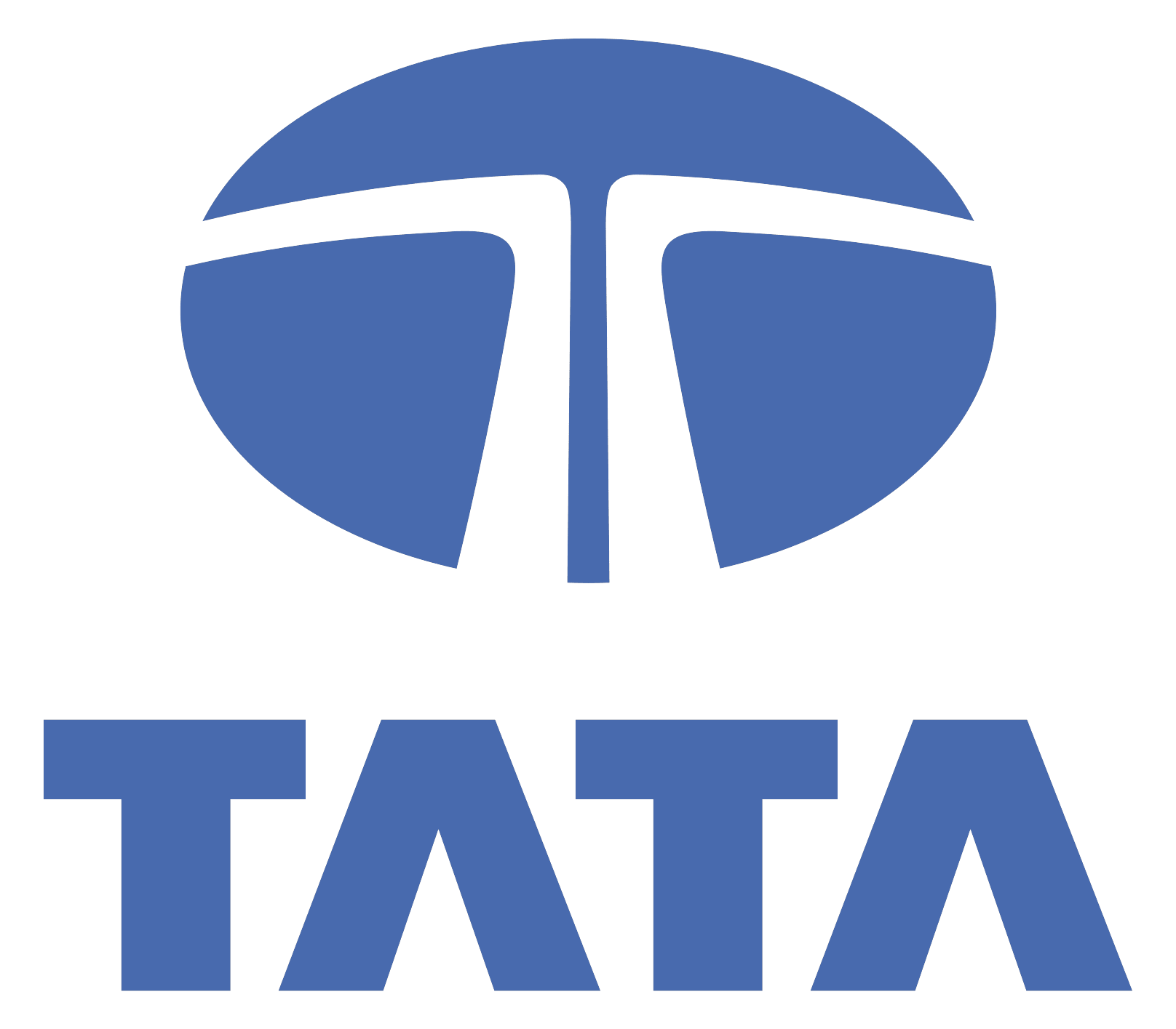
The Tata logo belongs to the group, not to the cars alone, which is why the cars and Tata Steel share one emblem. Tata Technologies and the other group companies use the same emblem.
The T is made of two white lines. One forms the top bar and the other the stem, and they start side by side at the bottom before turning outward at right angles. Commentators read the shape as fluidity and movement, a fountain of knowledge, or a tree offering shelter. These are interpretations of the design, not an official Tata logo meaning.
What the logo contains:
- Ellipse: a solid blue oval, wider than it is tall.
- T: the two white lines that form the bar and the stem.
- Wordmark: in the full lockup, TATA sits below the emblem, and its A has no crossbar.
New Tata Logo 2026: Is Tata Changing Its Logo?
Is the Tata logo new in 2026? Not the badge. What people search for as the “Tata new logo” is TATA.CARS, a consumer-facing identity that Tata Motors Passenger Vehicles unveiled in August 2026. The blue ellipse on the cars stays as it was.
TATA.CARS is a brand name, not a legal renaming, so the company is still Tata Motors Passenger Vehicles Ltd. Its brand promise is “Nothing’s Too Far.”
What changed and what didn’t:
- Changed: the customer-facing name, now TATA.CARS.
- Changed: the graphic language, built on a concept called Parallel Pathways, with a new shade called Ambition Blue, a bespoke typeface called Parallel Display and a sonic identity.
- Unchanged: the ellipse badge on the vehicles.
- Unchanged: the legal entity and the model names (Nexon, Punch, Curvv, Harrier, Safari).
Many Tata logo images shared as a “Tata new logo concept,” usually a black minimalist T, are concept art. No such logo was adopted, and the 2026 rebrand left the emblem alone.
Tata Logo History and Evolution
Tata logo history is short: one major redesign, the blue ellipse of 1998–99, with an older red roundel before it and the TATA.CARS identity added around it in 2026. Logo sites disagree on dates; we use the sourced ones.
Before 1999: The Tata Engineering Roundel
Before the late 1990s, the company used a red roundel. Its ring reads TATA across the top and ENGINEERING along the bottom, and a white disc in the middle holds a red T with a wheat sprig on each side. The words come from the founding name, Tata Engineering and Locomotive Company. Some logo sites add silver and date the roundel 1945–1988, but no primary source supports either detail.
What changed: nothing yet. This old Tata logo is the starting point, in red and white with no blue.
1998–99: The Blue Ellipse Redesign
The blue ellipse came out of a group-wide redesign in 1998–99, when the Tata companies moved to a single shared mark. The 1999 version, the original Tata logo in today’s form, pairs the ellipse and its two-line T with a bold TATA wordmark whose A has no crossbar. One source puts the public release in February 1999. The 1988 date on some logo sites appears to be a typo for 1998.
What changed: red became blue, the ring and wheat sprigs went, and the roundel became an ellipse.
2003: Tata Motors Name, Same Emblem
In 2003 the company, founded as TELCO, took the name Tata Motors, according to Indian business sources. The emblem stayed the same: the Tata Motors logo sets the blue ellipse above a smaller TATA MOTORS wordmark, with MOTORS in a lighter weight than TATA. Some logo databases call 2003 the year a wordmark was added, but the stacked TATA wordmark already sat under the ellipse in 1999.
What changed: the name under the emblem, not the emblem.
2026: TATA.CARS, Same Badge
In August 2026 the car business adopted TATA.CARS as its consumer brand, with Ambition Blue as its new color. The badge on the cars is still the blue ellipse.
What changed: the brand name and the communications around the logo, not the logo itself.
Tata Group Logo vs Tata Motors Logo vs TATA.CARS
The Tata Group logo and the Tata Motors logo use the same emblem. The Tata brand logo belongs to the group, and Tata Sons owns the brand, so a Tata Motors logo PNG and a group one show the same ellipse. Since October 1, 2025, there have also been two separate Tata Motors companies.
| Name | What it is | Logo you see | Since / note |
|---|---|---|---|
| Tata Group (Tata Sons) | Group founded by Jamsetji Tata; Tata Sons owns the brand | Tata Group logo: ellipse and T with the TATA wordmark | Founded 1868; headquarters Bombay House, Mumbai |
| Tata Motors Ltd. | The commercial-vehicle company, formerly TML Commercial Vehicles Ltd. | The same ellipse with the Tata Motors name | Separate since the October 1, 2025 demerger |
| Tata Motors Passenger Vehicles Ltd. | Tata cars and EVs, plus Jaguar and Land Rover | The same ellipse badge on the cars | The original company, renamed at the 2025 demerger |
| TATA.CARS | Consumer-facing brand of Tata Motors Passenger Vehicles, not a legal entity | TATA.CARS identity; the badge on the cars is unchanged | Unveiled August 2026 |
So the Tata Group logo, the Tata company logo on businesses such as Tata Steel and Tata Technologies, and the badge on Tata cars are one design, used under the same group rules.
Tata Logo Colors and Font
The Tata logo comes in three colors only. Group brand guidelines allow Tata Blue, solid black, or white reversed out of a blue or dark background. A black Tata logo is one of these permitted one-color versions, not a separate design. Tata Blue, about #1268B3 in the group guidelines, puts Tata among the blue car logos. Hex codes on logo-download sites are color picks, not official values.
- Wordmark: a custom bold sans-serif with a crossbar-less A. It is not Helvetica, and no official source names a typeface (some logo databases list Myriad).
- TATA MOTORS lockup: MOTORS is set lighter than TATA.
- TATA.CARS: a bespoke typeface called Parallel Display, used in brand communications rather than on the badge.
Tata Car Logo: The Badge on the Vehicle
The Tata car logo is the same ellipse and T made as a raised badge in metallic silver-grey chrome. It is what owners see on their vehicles, and it did not change with the TATA.CARS rebrand. If you are replacing a worn Tata badge or emblem, match the shape: a true ellipse with the two-line T inside.
Tata Logo PNG: Free Download and Usage Rules
Get the Tata logo PNG from the download button under the main logo above. The file is a Tata PNG of the emblem over the TATA wordmark, and it doubles as a Tata Motors logo download, because the emblem is identical. Only the full lockup differs, with TATA MOTORS as the wordmark, and we don’t host it as a separate Tata Motors PNG.
The logo is a trademark, so use it to identify the brand or in editorial work, not to suggest an endorsement. Group guidelines add three rules:
- Use one color only: Tata Blue on white, white on Tata Blue or a dark background, or solid black, never a tint.
- Don’t outline, skew, distort or redraw the mark.
- Leave clear space around it. The guidelines size that exclusion zone from the height of the T symbol.
Tata Motors Slogans and Taglines
The current Tata car slogan is “Nothing’s Too Far,” the TATA.CARS promise from August 2026. Each line belongs to a different layer of the brand:
- Connecting Aspirations (2017): the corporate brand promise Tata Motors announced on August 21, 2017. It is the line people mean when they search for the Tata Motors Connecting Aspirations logo.
- Nothing’s Too Far (2026): the brand promise of TATA.CARS.
- Leadership with Trust: the Tata Group tagline on tata.com, not a car slogan.
Frequently asked questions
Who designed the Tata logo?
The blue ellipse was designed by Wolff Olins, the London brand consultancy, during a group-wide Tata rebrand in 1998–99. Some logo sites credit the design to 1988, which appears to be a typo. The 2003 change that other sites describe was a new company name, Tata Motors, not a new design.
Why is Tata called Tata?
Tata is a family surname. The group is named after the Tata family and its founder, Jamsetji Nusserwanji Tata, who started the business in 1868. A popular claim that Tata means "father" in Parsi has no reliable source, and Parsi is the name of a community, not a language.
Is the Tata logo the same as Toyota's?
No. Tata is an Indian company and Toyota a Japanese one, and they are not related. Tata and Toyota logo mix-ups start with the ovals both emblems use. Tata's is a single solid blue ellipse with a white T, while Toyota's, introduced in 1989, is three ovals arranged symmetrically from left to right.