Key facts
- Founded
- 1944
- Founded by
- Kim Chul-ho
- Country
- South Korea
- Headquarters
- Seoul, South Korea
- Parent company
- Hyundai Motor Group
- Legal name
- Kia Corporation
- Famous models
- Sportage, Sorento, Telluride, Soul, Stinger
- Slogan
- “Movement that inspires”
- Website
- www.kia.com
Kia Logo Meaning: The 2021 Symbol Explained
The Kia logo today is a signature-style wordmark: the letters K, I and A drawn as one angular line, with no oval around them. Kia unveiled it on January 6, 2021, with a fireworks drone show over Incheon, and it replaced the red oval that had been the Kia symbol since 1994. Kia presented the change as part of its move from carmaker to provider of sustainable mobility solutions.
The design is monochrome. In print it is dark navy, close to black, and on dark backgrounds it turns white. As a Kia car logo it is usually chrome or a dark finish, and the Kia symbol on car grilles, tailgates and trunk lids is the same one-line signature. There is no red anywhere in the current mark.
Kia says the logo resembles a handwritten signature, and it can be drawn in a single stroke without lifting the pen. The A has no crossbar, a detail that explains most of the confusion covered in the next section.
What the three principles mean
Kia built the new Kia car symbol around three ideas:
- Symmetry stands for confidence and trust. The left and right halves of the mark are balanced.
- Rhythm is the continuous line itself. It runs through K, I and A without a break.
- Rising refers to the diagonal strokes that climb from left to right. They echo the first syllable of the name, ki (起), which means “to rise.”
That last point links the Kia logo to the name. The same “rise” idea appears in earlier Kia logos, starting in 1964, as the timeline below shows.
Why the Kia Logo Looks Like “KN”
The new Kia logo says Kia, not KN. The confusion comes from the A, which has no crossbar. Because the I and the A are joined, the upright of the I, the long rising diagonal and the last upright read together as a backwards N. The eye then sees “KN” instead of “KIA.”
The misreading spread once the new Kia logo appeared after the rebrand. Media reports in 2022, including Jalopnik and Autoblog, put searches for “KN car” at roughly 30,000 a month. Kia has not changed the design in response, and KN is not a separate car brand.
The missing crossbar is not new. The red oval Kia used from 1994 also drew its A without one, but there the letters stood apart inside the oval.
Here is how to read the Kia symbol letter by letter:
- The first upright and its two diagonals form the K. Its upper arm runs straight into the top of the I.
- The second upright is the I.
- The long diagonal rising from the foot of the I, together with the last upright, forms the A.
Traced that way, the whole mark is the one-stroke signature Kia describes, and “KN car” searches all lead back to Kia. The earlier versions below show where each part of the design came from.
Kia Logo History: Every Version Since 1953
Kia counts seven versions of its logo, from the 1953 industrial emblem to the 2021 signature. Wikipedia groups 1994 to 2012 as a single oval, so some lists show six. Where Kia’s own pages end a period a year earlier, the dates below follow the edges used on Wikipedia. The old Kia logo most drivers remember is the red oval, but it was the fourth design.
1953–1964: Triangle, gear and benzene ring
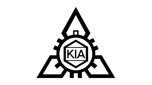
The first Kia logo appeared in 1953, a year after the company took the name Kia Industries. It placed small KIA letters inside a hexagon shaped like a benzene ring, circled by a gear and framed by a triangle. Kia explains the triangle as a drafting tool, a set square, while the gear and the benzene ring represented the mechanical and chemical industries. The black line mark was shown on the Samchully, the first Korean-made bicycle, which Kia built in the early 1950s.
1964–1986: Hangul ㄱ and ㅇ wheel monogram
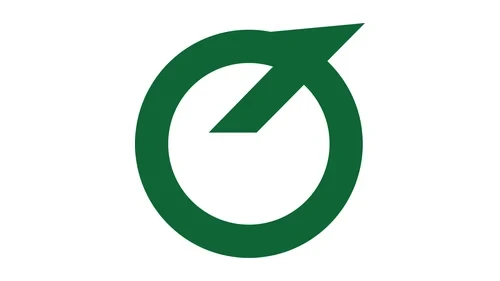
For its 20th anniversary in 1964, Kia held an internal competition for a new logo, because the first one was complex and said little about vehicles. The winner combined two Hangul letters. The ㄱ stands for 기 (起), “to rise,” Kia’s founding principle, and the ㅇ stands for 아 (亞), Asia, while doubling as a wheel. Kia connects that wheel to the K-360 three-wheeler, the C-100 motorcycle and the front wheel of a bicycle. This Kia symbol is a green ring cut by a diagonal stroke, with no Latin letters, and it stayed in use for 22 years.
1986–1994: “Chimney” three-wave flag over Kia wordmark
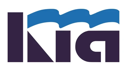
The 1986 logo brought Latin letters back: a heavy “Kia” wordmark in dark navy-purple with a blue flag of three curves above it. It arrived as Kia resumed building passenger cars, with Ford as its partner, after a 1981 government consolidation order had stopped car production. According to Kia, the three curves express three values: a pioneering spirit, effort and creativity, and trust and cooperation. The design picked up the nickname “chimney emblem.”
1994–2004: Flat red oval, KIA in capitals
The red oval Kia logo arrived in 1994 for Kia’s 50th anniversary, a year after the brand’s first sales in the United States. The oval represents the globe, and Kia tied it to a goal of becoming one of the world’s top 10 automakers. Moving from blue to red was deliberate, because Korean carmakers mostly used blue. This first oval was flat and brick red, with KIA in capitals and an A that has no crossbar, so it looks like a Greek lambda (Λ). It is one of many red car logos.
2004–2012: 3D oval with beveled rim
In 2004 the Kia logo gained depth. Kia says the update added dimensionality and adjusted the colors, which shows as a glossier, more saturated red ring with a beveled edge, a light inner highlight and shaded letters. The shape and the lettering stayed the same, which is why Wikipedia treats 1994 to 2012 as one logo.
2012–2021: Refined flat oval, brighter red
The 2012 revision refined the form and the gradients, according to Kia. The result is a flatter, brighter crimson ring, a little bolder and cleaner than the 1994 original, with the same crossbar-free A. Counting all three versions, the red oval stayed on Kia cars from 1994 into 2021, longer than any other Kia logo.
2021–present: Angular continuous-line signature wordmark
The current Kia logo drops both the oval and the red. K, I and A become one angular, continuous line in dark navy, white or chrome, with rising diagonals and, once again, no crossbar on the A. The meaning of its shapes is covered in the Kia logo meaning section at the top of this page.
Kia logo eras that never existed
Some versions of the Kia emblem that circulate online are not part of Kia’s own chronology:
- A “1944–1964” emblem. The triangle-and-gear badge is real, but Kia dates it to 1953, not to the company’s founding year.
- A 1981 rising-sun oval, 1994 red-and-blue two-tone ovals, a 1999 silver-and-black gradient oval and a 2006 angled ellipse with a K. None of these appears in Kia’s history.
- Mismatched captions. Some image labels on Kia’s global site give overlapping dates or mention a “KIA MOTORS” wordmark. The artwork shows only KIA, so the dates in Kia’s text (1953, 1964, 1986, 1994, 2004, 2012 and 2021) are the reliable ones.
What Does the Name Kia Mean?
The name Kia means roughly “rising from Asia.” It joins two Sino-Korean characters: 起 (ki), “to arise,” and 亞 (a), short for Asia. Kia’s heritage pages put it as “rising from Asia to the world,” so the name is a word, not an acronym. The company took it in 1952, when Kyungsung Precision Industry became Kia Industries. It became Kia Motors Corporation in 1990 and dropped “Motors” in 2021. The idea behind the name also runs through the Kia logos: the 1964 ㄱ stood for 起, and the 2021 diagonals are designed to rise.
Is Kia a Korean Brand?
Yes. Kia is a South Korean car brand headquartered in Seoul, and its country of origin is South Korea. It is the country’s second-largest automaker after Hyundai, with more than 3.1 million vehicles sold in 2025. It belongs on any list of Korean car brands, and it has never been Chinese, Japanese or American. Key milestones:
- 1944: Kim Chul-ho (Kim Cheol-ho in Kia’s spelling) founds Kyungsung Precision Industry in Seoul, making steel tubing and bicycle parts.
- 1952: the company is renamed Kia Industries. Honda-licensed motorcycles follow from 1957 and Mazda-licensed trucks from 1962.
- 1974: Kia builds its first car, the Mazda-based Brisa.
- 1998: after collapsing in the 1997 Asian financial crisis and entering court receivership, Kia is sold through international bidding. Hyundai Motor is chosen over Daewoo, Samsung and Ford and takes 51%.
- 2021: Kia Motors becomes Kia and adopts the current Kia logo.
Kia’s American story began in 1993, when four dealers in Portland, Oregon, started selling the Sephia. Since its plant in West Point, Georgia, opened in 2010, some of the Kias sold in the US have been built there, but the brand is still South Korean.
Kia Logo PNG Download: High-Resolution File and Usage
The Kia logo PNG on this page is the current 2021 signature in dark navy on a transparent background, 1,728 by 407 pixels. That is enough for a high-resolution Kia logo on screens, in slides and in most documents. Use the download button under the main logo at the top of the page.
- Colors: Kia uses the mark in dark navy or black on light backgrounds and in white or chrome on dark ones, so a black and white Kia logo is the normal form.
- Official artwork: for press or commercial work, take files from Kia’s own media sites, such as the Kia America newsroom.
- Use: the Kia logo is a trademark, and the file here is for editorial reference.
The Kia badge on a car is the same signature, usually in chrome or a dark finish. Cars built before the switch still carry the red oval emblem, so both badges are common on the road.
Frequently asked questions
Why did Kia change its logo?
Kia changed its logo in 2021 because it wanted to be seen as a provider of sustainable mobility, not only as a carmaker. The same rebrand shortened the company name from Kia Motors to Kia. The change was announced on January 15, 2021, and approved at the shareholders' meeting on March 22, 2021.
What is Kia's new logo?
Kia's new logo is the angular signature wordmark introduced on January 6, 2021. It spells KIA in one connected line, with no oval and no red. Its launch over Incheon set a Guinness World Record, with 303 pyrodrones setting off fireworks at the same moment, the most drones ever to do so.
Is the new Kia logo KN or Kia?
It is Kia. The letters are K, I and A, and the A has no crossbar, which makes the last two letters look like a backwards N. The name is pronounced "KEE-ah," from the Korean 기아, so there is no N sound in it, and KN is not a car brand.
Is Kia still owned by Hyundai?
Partly. Hyundai Motor Company is Kia's largest shareholder, with 35.17% as of 2025, down from the 51% it bought in 1998. Kia remains a separate company listed on the Korea Exchange under the ticker 000270, and the ties run both ways, because Kia holds stakes in about 22 Hyundai subsidiaries.
What does Kia actually stand for?
Nothing, because Kia is not an acronym. The name is built from the Sino-Korean characters 起 and 亞, meaning "rise" and "Asia." Backronyms such as "Korea In America" are jokes, and KIA as "killed in action" is an unrelated military abbreviation that happens to share the same three letters.
What is Kia's slogan?
Kia's slogan is "Movement that inspires." It arrived together with the new logo in 2021 and replaced "The Power to Surprise," the line Kia had used since 2005. The newer line matches the rebrand's focus on mobility, which Kia describes as more than building cars.
Is Kia Honda or Toyota?
Neither. Kia is a South Korean brand with no ownership link to Honda or Toyota. Its Japanese connections are historical and came through licensing. Kia built Honda-designed motorcycles and later Mazda-based cars, such as the Kia Pride, which Ford sold as the Festiva, and the Avella, sold as the Ford Aspire.
Are Kia and Hyundai both Korean?
Yes. Both are South Korean carmakers, and together they are the two largest in the country, with Hyundai first and Kia second. Kia keeps its own management and workforce. Chung Eui-sun is chairman, Song Ho-sung is chief executive, and the company had about 51,000 employees in 2025.