Key facts
- Years active
- 2005–2021
- Founded by
- Ying Jianren
- Country
- China
- Headquarters
- Yongkang, Zhejiang, China
- Parent company
- Zotye Holding Group
- Legal name
- Zotye Automobile Co., Ltd.
- Famous models
- T600, T300, Z100, E30 EV
- Website
- www.zotye.com
Zotye Brand History
Zotye was officially founded in January 2005 as an automobile manufacturer after starting in 2003 as a business focused on car parts assembly and sales. The company operated under Zotye Holding Group with headquarters in Yongkang, Zhejiang, China. Founded by Ying Jianren, Zotye maintained its primary focus on vehicle production until it declared bankruptcy and ceased all operations in 2021.
Zotye Logo Evolution
2005 – 2018: Original Zotye Logo
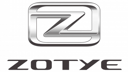
The original Zotye logo was used from the brand’s founding in 2005 throughout the majority of its active production years. This design featured a gradient three-dimensional silver badge placed above a modern uppercase inscription with a thick distinctive letter Z that had elongated horizontal bars.
- Design: Thick letter Z merges into a horizontally stretched rectangular silver frame with softened angles and clean lines balancing rounded corners
- Colors: Gradient silver providing a classic automotive metallic appearance
- Changes: Emblem positioned directly above the brand name in modern uppercase sans-serif typography
- Context: This logo served the company from its establishment in 2005 until the redesign in 2018 during its Zotye logo history
The Zotye symbol centered on a stylized letter Z representing the brand initials and conveyed strength through its balanced geometric construction. This design remained consistent with the brand’s identity for over thirteen years of vehicle manufacturing.
2018 – 2021: Redesigned Zotye Logo
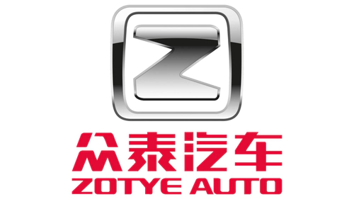
Zotye implemented a major logo redesign in 2018 as part of its efforts to update the visual identity near the end of its operational period. The new mark featured a bold rounded letter Z enclosed in a square frame with softened corners and introduced bilingual text elements.
- Design: Emblem set above two-level lettering with shorter and thicker Z bars that do not touch the frame edges on a transparent background
- Colors: Deep red for all lettering with silver elements completely removed
- Changes: Shifted to custom heavy uppercase sans-serif typography that appears slightly extended while adding Chinese name above smaller English ZOTYE inscription
- Context: This final logo was used until the company’s bankruptcy in 2021 and reflected broader industry trends toward simpler bolder marks in its Zotye logo evolution
The 2018 redesign aimed to strengthen the badge by adding brightness smoothness and professionalism to align with current logo design trends. Both Zotye logos maintained the central Z emblem demonstrating continuity in brand identity despite the visual updates.
The company transitioned from a metallic silver 3D design to a flat red bilingual approach as part of its Zotye emblem development. This change occurred during challenging market conditions leading to its eventual closure while still preserving the core symbol of the stylized letter Z.
Zotye maintained a modern trend-following design philosophy across both eras of its visual identity. The shift in color palette and typography reflected the company’s attempt to convey confidence and excellence through its updated Zotye car logo in the final years of operation.