Key facts
- Years active
- 2008–2014
- Founded by
- TagAZ (Taganrog Automobile Plant)
- Country
- Russia
- Headquarters
- Taganrog, Russia
- Famous models
- Estina, Corda, Tingo
Vortex Brand Overview
Vortex was launched in Russia in 2008 by TagAZ (Taganrog Automobile Plant) and quickly established itself as a producer of rebadged, Chery-based passenger cars. The brand identity centers on conveying power, authority, and expert craftsmanship. This masculine and high-style positioning is primarily communicated through its visual identity, particularly the Vortex logo.
The overall design approach emphasizes clarity and strength. Every element of the branding works to reinforce perceptions of quality and precision that customers associate with the Vortex name.
Vortex Logo Evolution
2008 – 2014: Modern Monogram Logo
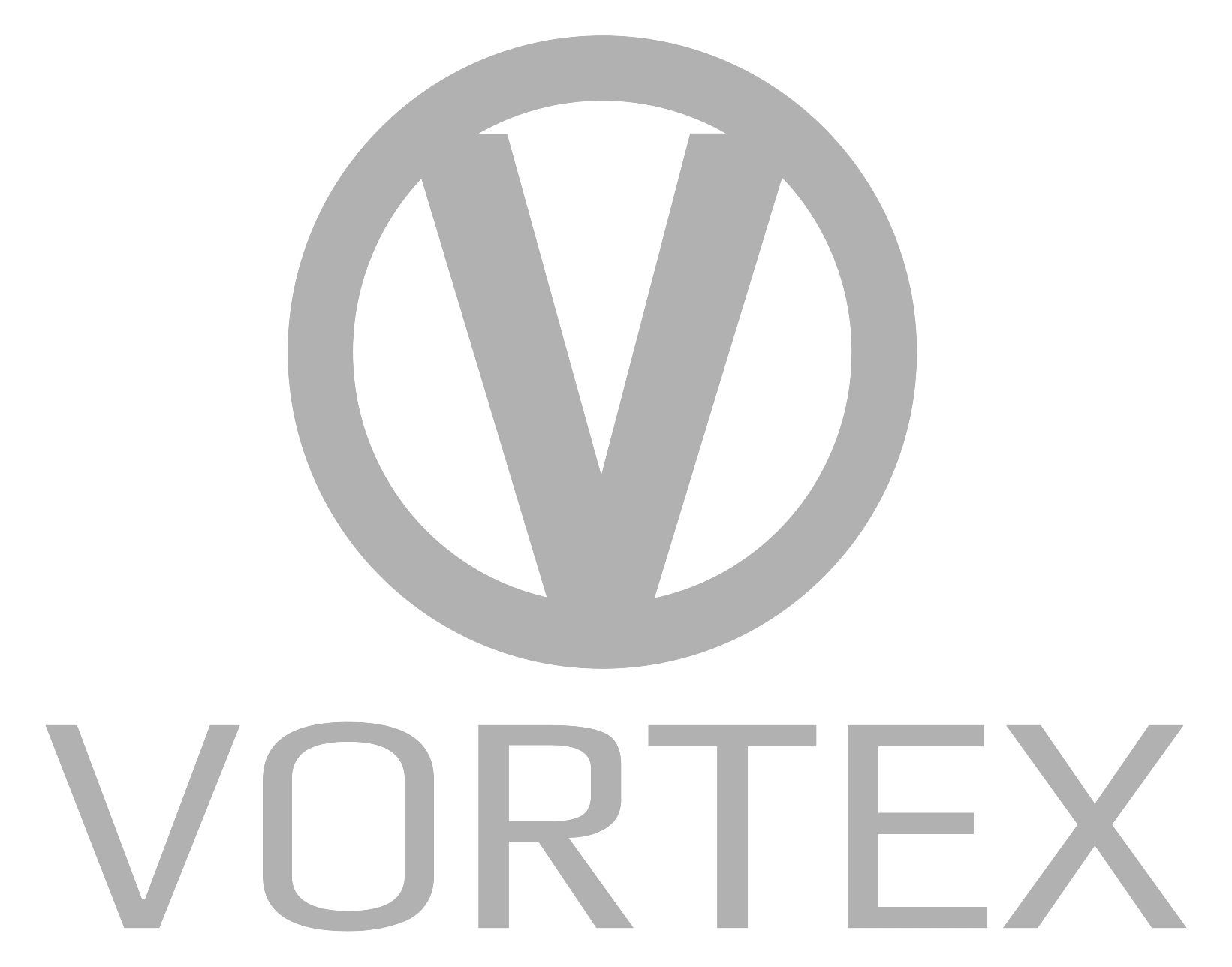
The Vortex logo was introduced in 2008 and was used until production ended in 2014. It consists of a combination mark featuring an emblem positioned above a wordmark. The design employs a monochrome color palette of black and white, with occasional use of gray and white for a more elegant appearance.
- Design: Combination of geometric emblem and serif wordmark
- Colors: Monochrome primarily black and white with gray variants
- Changes: No redesigns or prior versions documented
- Context: Original design created to reflect masculine, authoritative brand values
The emblem features a geometric pattern formed by three capital letters: V, T, and X overlapping. The letter T is smaller and positioned between the ticks of V and X. Sharp serifs are used throughout, creating a striking and eye-catching geometric monogram.
The wordmark displays all capital letters spelling VORTEX in a contemporary serif typeface. The letters are slightly stretched horizontally and incorporate sharp serifs that mirror the angular style of the emblem. This coordinated approach between emblem and wordmark strengthens the overall recognition of the Vortex symbol.
The Vortex emblem creates a unique and recognizable geometric pattern through the overlapping letter composition. This structure reinforces brand memorability while maintaining a laconic appearance. The sharp serifs and geometric letter arrangement convey a sense of progress and high style.
Vortex logo meaning connects directly to the brand’s desired image. The design evokes authority, power, and expertise in quality and design. By using shared sharp serifs between the emblem and wordmark, the logo achieves visual harmony that supports the brand’s masculine character.
The monochrome palette further enhances the authoritative presence of the Vortex badge. This restrained color approach allows the strong geometric forms to stand out clearly across different applications.
The Vortex logo history shows remarkable consistency, with the 2008 design remaining the sole version used by the company. This stability has helped establish strong visual recognition within its market segment.
The geometric monogram formed by the V + T + X overlap has become a distinctive element of the Vortex car logo references in various contexts. Its powerful appearance makes it suitable for applications requiring a strong visual presence.
For those seeking high-quality reference materials, Vortex logo images of this design showcase the precise alignment and sharp details that define the brand’s visual identity. The consistent use from 2008 to 2014 demonstrates the effectiveness of the original concept.
The contemporary serif choice in the Vortex logo transparent variants maintains legibility while projecting a sense of modern expertise. This attention to typographic detail contributes to the premium positioning of the brand.