Key facts
- Founded
- 1968
- Founded by
- Vehbi Koç
- Country
- Turkey
- Headquarters
- Bursa, Turkey
- Parent company
- Koç Holding; Stellantis
- Legal name
- Tofaş Türk Otomobil Fabrikası A.Ş.
- Famous models
- Doğan, Şahin, Kartal, Serçe
- Website
- tofas.com.tr
Brand Overview
Tofas was founded in 1968 through a partnership between Fiat and Koç Holding, initiated by Vehbi Koç. The company is headquartered in Bursa, where its primary manufacturing plant began operations the following year. This joint venture aimed to address rising demand for cars within Turkey while helping to build a local automotive sector.
Brand Timeline
Key milestones in the company’s development include its official establishment in 1968 and the opening of the Bursa plant in 1969. The first major operational period ran from 1969 through 2008. In 2008 the company introduced a significant update to its visual identity, marking the start of its current branding phase that continues today.
Tofas Logo Evolution
1969–2008: Original Tofas Logo

The first Tofas logo was used for nearly four decades following the company’s founding. It captured the spirit of the new Fiat-Koç Holding partnership through its unified design elements.
- Design: Bold stylized inscription of “TOFAŞ” with interconnected letters
- Colors: Deep blue
- Changes: Modern typography that conveyed strength and confidence
- Context: Represented the joint-venture origins and emphasis on unity between Turkish and Italian partners
This original Tofas car logo reflected the brand’s early focus on forward-thinking innovation and collaborative strength. The sleek appearance helped establish the company’s presence in the Turkish market.
2008–Present: Current Tofas Logo
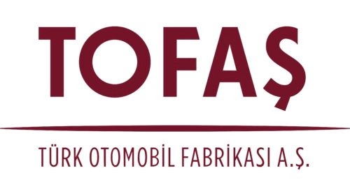
A major redesign took place in 2008, introducing a more sophisticated visual identity that remains in use. This update coincided with the company’s growth and adoption of advanced manufacturing approaches after four decades of operation.
- Design: Refined elegant typography with serifs and clean lines
- Colors: Maroon deep red-brown palette
- Changes: Addition of the full company name “TÜRK OTOMOBIL FABRIKASI A.Ş.” beneath the main mark
- Context: Highlights Turkish heritage while projecting tradition and corporate maturity
The current Tofas emblem maintains the distinctive ‘Ş’ character across both eras, preserving linguistic identity. This evolution from the interconnected blue design to the refined maroon version shows the brand’s development while keeping core elements intact.
The Tofas logo history demonstrates a clear progression from bold modernity to elegant sophistication. Both versions emphasize the company’s Turkish roots and enduring partnership values established at founding.
Users interested in high-quality assets can find the Tofas logo transparent background, Tofas logo hd, and Tofas logo png versions suitable for reference or design projects. These Tofas logo images capture the distinct characteristics of each era, from the original deep blue mark to the present-day maroon styling. The Tofas symbol continues to represent the brand’s commitment to automotive manufacturing in Turkey, with its badge reflecting both heritage and forward momentum.
For those exploring visual identity changes, the Tofas logo evolution offers insight into how the company has refined its presentation over time. The Tofas car symbol in its various forms maintains strong recognition while adapting to new corporate priorities. The Tofas badge from the current era particularly emphasizes cultural elements through its typography and inclusion of the full legal name.