Key facts
- Years active
- 1903–1994
- Founded by
- Charles Chetwynd-Talbot, Adolphe Clément
- Country
- United Kingdom
- Headquarters
- London, United Kingdom
- Parent company
- PSA Peugeot Citroën
- Legal name
- Clément-Talbot Ltd.
- Famous models
- Horizon, Alpine, Samba, Sunbeam Lotus, Tagora
Talbot Brand History
Talbot was founded in 1903 as Clément-Talbot by Charles Chetwynd-Talbot, the 20th Earl of Shrewsbury, and Adolphe Clément of Clément-Bayard. The company operated as an independent Anglo-French manufacturer until 1919, when it became part of STD Motors, also known as Sunbeam-Talbot-Darracq.
In 1935 the operations split into separate UK and French entities. The British side joined the Rootes Group in 1938 while the French side continued as Talbot-Lago under Antonio Lago. Chrysler acquired the Rootes Group in 1967, leading to further integration within Chrysler Europe. PSA Peugeot Citroën purchased Chrysler Europe in 1978 and revived the Talbot name from 1979 until 1994, when passenger car production had already ceased in 1986 and the final vans ended in 1994.
The brand’s story reflects repeated ownership transitions that consistently triggered redesigns of its visual identity. From ornate heraldic symbols to corporate geometric marks, each Talbot logo captured the design tastes and corporate priorities of its controlling company.
Talbot Logo Evolution
1903–1908: First Emblem
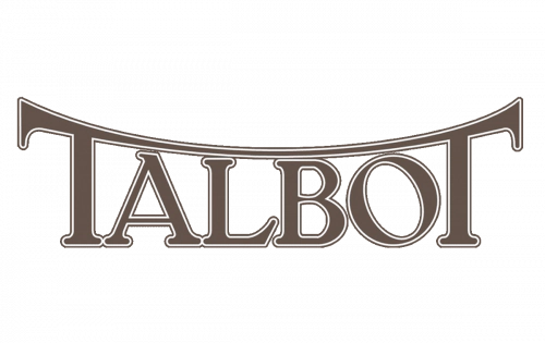
The very first Talbot logo was introduced at the company’s founding in 1903. This text-only design marked the beginning of the Anglo-French brand.
- Design: Fancy custom lettering with connected T letters creating a roof-like structure
- Colors: Brown with thin double outline in brown and white
- Changes: Pure typography without any symbolic elements
- Context: Used during the original Clément-Talbot founding period
1908–1919: Heraldic Lion and Crown
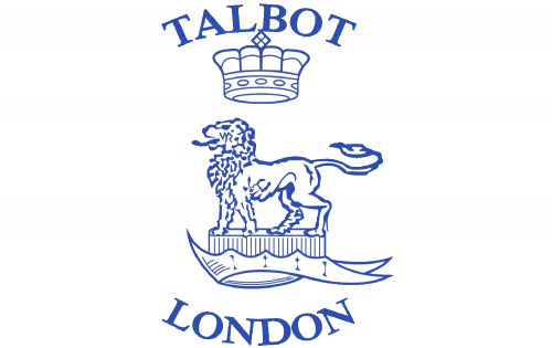
A major redesign occurred in 1908 that moved away from pure text. The new Talbot emblem adopted traditional heraldic styling.
- Design: Lion with crown inside contoured shield, Talbot arched above and London below
- Colors: Blue and white color palette with classy serif font
- Changes: Introduction of symbolic lion and crown elements
- Context: First use of heraldic imagery during the independent Clément-Talbot years
1919–1935: Blue Oval Lion
The formation of STD Motors in 1919 prompted another update to the Talbot car logo. This version placed the heraldic elements within a distinct oval shape.
- Design: Lion with crown in thick silver lines, black side fragments with silver outline
- Colors: Solid blue oval with silver outline, black background areas
- Changes: Shift to oval format and smoother rounded sans-serif lettering
- Context: Used throughout the STD Motors period
1935–1938: Silver Crest Refinement

Just before the ownership split, the Talbot symbol received a refined crest treatment in 1935. This design simplified the previous oval approach.
- Design: Blue circular medallion on silver crest with rounded bottom, no side banners
- Colors: Blue medallion on silver background
- Changes: Removal of side banners and direct placement of text on silver field
- Context: Final refinement before the 1935–1938 division into Rootes and Talbot-Lago operations
1938–1954: Winged Blue Medallion
The Rootes Group era brought a dramatic winged design to the Talbot badge in 1938. This version stretched horizontally to emphasize width and presence.
- Design: Intense blue medallion on wing-like silver emblem with thick black lettering
- Colors: Darker intense blue on silver with black text
- Changes: Addition of wing elements and shift to ExtraBold custom sans-serif
- Context: Used under Rootes Group during the Sunbeam-Talbot branding period
1954–1958: Simplified Crest
A final pre-dormant simplification occurred in 1954 as the British Talbot operations wound down. This Talbot car symbol returned to a cleaner crest format.
- Design: Blue crest with thick diagonal white banner and framed edges
- Colors: Blue crest, white banner, black lettering with gray outline
- Changes: Removal of wings and adoption of simpler crest structure
- Context: Final design before the brand became dormant in the UK
1962–1977: Pentastar Era

Chrysler ownership introduced a completely modern corporate identity. The famous Pentastar became central to the Talbot emblem during this period.
- Design: Sharp-lined Pentastar enclosed in square frame with wordmark below
- Colors: Light blue Pentastar and frame with white lines, blue serif lettering
- Changes: Complete departure from heraldic style to geometric corporate symbol
- Context: Used throughout Chrysler Europe ownership
1977–1995: Geometric T
The final Talbot logo was created in 1977 when PSA Peugeot Citroën prepared to revive the brand. This geometric design marked the end of the logo evolution.
- Design: Bold geometric T letter inside circular frame with custom sans-serif wordmark
- Colors: White, dark blue and red on light blue background, with silver versions for vehicles
- Changes: Modern minimalist approach with strong geometric forms and diagonal cuts
- Context: Used during the PSA revival period from 1979 to 1994
Talbot Logo History and Legacy
The Talbot logo history demonstrates how ownership changes directly shaped visual identity. From the ornate 1908 heraldic lion to the 1977 geometric T, each Talbot emblem reflected the priorities of its current owner.
Designs evolved from elaborate heraldic symbols in the early years to corporate geometric marks in the later decades. This progression mirrors broader trends in automotive branding throughout the twentieth century.
Enthusiasts often seek Talbot logo png, Talbot logo transparent, and Talbot logo hd versions for reference. The Talbot car logo and Talbot symbol continue to fascinate those studying automotive heritage and badge design.
The Talbot badge represents more than a century of Anglo-French automotive collaboration. Even though the marque disappeared in 1994, its logo evolution remains a clear visual record of the company’s turbulent history.