Key facts
MAZ Brand Overview
Minsk Automobile Plant was founded in Minsk, Belarus in 1944 to meet military vehicle requirements during World War II. The company remains a state-owned enterprise under the Belarusian government and has grown into one of the largest heavy vehicle manufacturers in Eastern Europe.
The brand first introduced its visual identity in 1951 with a symbol that would define its image for the next 25 years. Key product launches such as the MAZ-200 and MAZ-500 truck series in the late 1950s strengthened its role in Soviet logistics.
Maz Logo Evolution
The visual identity of MAZ has passed through three distinct phases, each reflecting the company’s development and changing design approaches.
1951 – 1963: First Bull Logo Era
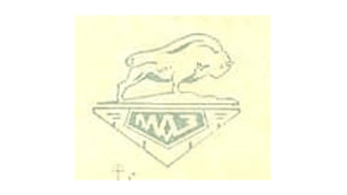
The first maz logo was introduced in 1951 and featured a powerful bull as its central symbol. This choice directly represented the heavy, large and strong vehicles produced by the company.
- Design: Inverted triangle emblem containing a symmetrical line pattern and inner dark pentagon
- Colors: Primarily dark tones emphasizing strength
- Changes: Establishment of the bull as the core maz symbol and maz car logo
- Context: Aligned with the brand’s focus on heavy-duty trucks
1963 – 1976: Enhanced Bull Logo Era
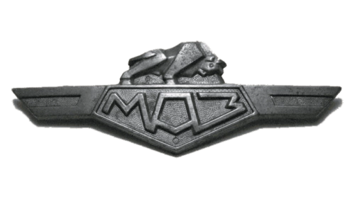
A major update to the maz emblem occurred in 1963, creating a more dynamic version of the original bull design. This redesign gave the symbol greater visual impact while keeping the established elements.
- Design: Three-dimensional metallic appearance with the bull in a fighting pose
- Colors: Dark gray shades with shadow effects
- Changes: Modified base from simple triangle to wing-like extensions while retaining the pentagon with Russian name
- Context: Aimed to convey a more professional and realistic appearance matching the strength of MAZ vehicles
1976 – Present: Minimalist Text Era
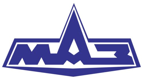
The most significant change in maz logo history took place in 1976 with the complete removal of the bull symbol. The company adopted a clean text-based design that continues to be used today.
- Design: Geometric bold strokes with straight cuts and thin border following letter shapes
- Colors: Dark blue on white base
- Changes: Shift to minimalist typography with the distinctive exaggerated middle letter A resembling a mountain
- Context: Move toward modern identity while preserving impressions of reliability and trustworthiness
This final evolution removed animal imagery entirely, focusing instead on a stylized Cyrillic representation of the brand name.
Maz Logo Meaning and Legacy
The bull in early maz car symbol versions embodied the power and durability required for heavy transport. Its replacement in 1976 reflected the company’s maturation and desire for a more contemporary appearance.
The current maz badge maintains strong ties to the brand’s origins through continued use of Russian Cyrillic lettering. Dark blue coloring communicates trust while the unique lettering style ensures strong visual recognition.
MAZ continues as a state-owned Belarusian manufacturer with the simplified text logo serving as its primary identifier. The brand’s logo evolution demonstrates a clear transition from symbolic representation of strength to minimalist modern design.