Key facts
Kamaz Brand Overview
Kamaz was founded in 1969 in Naberezhnye Chelny, Tatarstan, Russia. The name is a portmanteau for Kama Automobile Plant, referencing its location on the Kama River. The company was established to meet growing demand for heavy trucks in the USSR and now counts the state corporation Rostec as its largest shareholder, with a 49.9% stake.
Kamaz Logo Evolution
1969–1970: Offroad Tire Logo
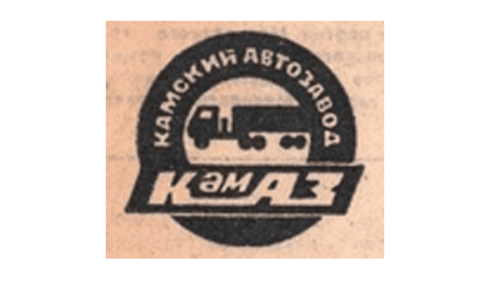
The first Kamaz logo was created immediately upon the company’s founding. It centered on an offroad tire to communicate the brand’s focus on heavy off-road vehicles.
- Design: Offroad tire as the base element with full company name in Russian
- Colors: Black tire on a beige square background
- Changes: Basic sans-serif uppercase typography with oversized “A” in central “KAZ”
- Context: This Kamaz logo directly reflected the new plant’s intended product line of rugged trucks
1970–1974: Refined Tire and Truck Logo
A smoother tire outline replaced the original aggressive tread design within just one year. A truck silhouette appeared in place of the central initials and a horizontal banner displayed the brand name in the lower half.
- Design: Simplified tire combined with vehicle imagery
- Colors: Maintained the earlier color approach while adding the truck element
- Changes: Introduction of pictorial truck representation
- Context: This update to the Kamaz emblem refined the original concept and strengthened product association
1974–1988: Bold Text Logo
The company removed all pictorial elements and adopted a text-only design during this period. Russian lettering appeared in a black bold sans-serif typeface with wide letter spacing.
- Design: Pure typographic solution without symbols
- Colors: Black text on light background
- Changes: Complete elimination of tire and truck imagery
- Context: The simplified Kamaz symbol reflected confidence and stability after the brand had become well established domestically within the USSR
1988–Present: Running Horse Logo
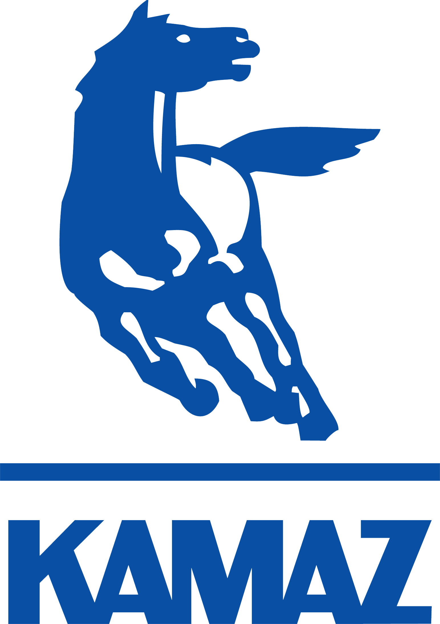
The most significant modernization of the visual identity occurred in 1988. A running horse symbol in a white and blue color palette became the central element, standing on a horizontal ground line. For the first time the brand name appeared in English as “KAMAZ” using bold sans-serif uppercase letters with slight overlapping and joined bases.
- Design: Dynamic horse combined with modern typography
- Colors: White and blue palette
- Changes: Shift from Russian-only text to English lettering and addition of the horse symbol
- Context: This Kamaz logo evolution coincided with perestroika and the beginning of international expansion, intended to convey power, dynamism, determination and speed
Connection Between Company Milestones and Visual Changes
The Kamaz logo history closely follows key moments in the company’s development. The 1969 founding led directly to the tire-based logo that emphasized off-road capability. By 1974, as the brand consolidated its position within the USSR, the identity simplified to a text-only mark. The 1988 introduction of the running horse and Latin alphabet lettering signaled modernization during the late Soviet period and early market reforms.
Legacy of the Kamaz Emblem
The current Kamaz car logo has remained unchanged for over three decades. Its horse symbol has become widely recognized as a representation of strength and forward motion in the heavy truck industry. The evolution from the early tire-focused designs to the modern running horse illustrates the brand’s journey from a new Soviet plant to a global manufacturer while maintaining core values of power and reliability.