Key facts
- Founded
- 1954
- Founded by
- Brian Lister
- Country
- United Kingdom
- Headquarters
- Cambridge, United Kingdom
- Parent company
- Warrantywise
- Legal name
- Lister Motor Company Ltd
- Famous models
- Knobbly, Storm, LFT-666, Stealth
- Website
- www.lister.com
Lister Motor Company, also referred to as Lister Cars, stands as a historic British manufacturer known for its high-performance vehicles and deep connection to Jaguar. Founded in 1954 in Cambridge by Brian Lister, the company first operated as George Lister Engineering Limited. Its legacy includes being the most successful British sports racing car of the 1950s, particularly through the famous Knobbly cars.
Brand History and Ownership Changes
The company began in 1954 when Brian Lister established George Lister Engineering Limited in Cambridge, United Kingdom. During the late 1950s it achieved peak motorsport success with Knobbly cars driven by Archie Scott Brown and Stirling Moss. These Lister-Jaguar models helped cement the brand’s reputation in racing.
Ownership transitioned in 1986 when Laurence Pearce acquired the company. Under his leadership from 1986 to 2013 the firm produced tuned Jaguar XJS variants and the Lister Storm. A major change occurred in 2013 when the Whittaker family through Warrantywise purchased the company. Lawrence Whittaker led the acquisition, and the business was rebranded as Lister Motor Company Ltd on 20 May 2013.
Since 2013 the focus shifted to modern limited-edition Jaguar variants and continuations of historic designs. In 2014 the company restarted production of original designs and built ten continuation Lister Jaguar Knobblys to mark its 60th anniversary. This was followed by a Lister Knobbly Stirling Moss limited edition in 2016.
Later releases included the Lister LFT-666 based on the Jaguar F-Type in 2018 and the Lister Stealth based on the Jaguar F-Pace in 2020. These models continue the tradition of creating high-performance vehicles tied to the brand’s Jaguar heritage and 1950s racing roots.
Lister Logo Evolution
The visual identity of the company has changed three times, with each update directly linked to ownership transitions and company revival phases. Each redesign reflects the era’s priorities, from classic engineering roots to modern premium performance.
1954 – 2013: Fan Emblem

- Design: Round emblem featuring a three-wing fan at the center referencing automotive cooling fans
- Colors: Light yellow center, wide green border with golden outline, golden elements throughout
- Changes: Used consistently with no major alterations for nearly six decades
- Context: Represented the original racing era including the successful Knobbly car period
This Lister logo served the company from its motorsport success in the 1950s through to 2013. The curved serif typography displayed Lister at the top and Cambridge at the bottom, reinforcing its geographic origins.
2013 – 2018: Diagonal Machetes

- Design: Three machetes positioned diagonally across a round emblem
- Colors: Saturated yellow center, brighter green border with gray outline, gray machetes
- Changes: Shifted from fan symbol to machetes and moved to geometric sans-serif lettering
- Context: Marked the company revival under Warrantywise ownership
The updated Lister car logo used this version during the launch of the 60th anniversary Knobbly continuations and the 2016 Lister Knobbly Stirling Moss edition. The full company name appeared in black uppercase below the emblem.
2018 – Present: 3D Metallic Machetes
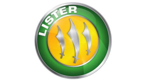
- Design: Three machetes now placed straight with the center one enlarged
- Colors: Metallic silver replacing previous gray, gradient green and yellow for shine and depth
- Changes: Moved Lister name to the border in bold white lettering and removed bottom text
- Context: Aligns with modern Jaguar-based production and continuation models
This Lister emblem delivers a stronger premium feel suited to the current range of limited-edition vehicles. The 3D metallic treatment gives the design greater presence across both digital and physical applications.
The Lister logo history shows a clear progression tied to the company’s ownership changes and evolving product focus. From the original fan symbol representing its Cambridge engineering roots to the modern metallic machete design, each version has marked an important chapter in the brand story.